NOTE: This document was originally written for Visual dBASE 7.0/7.01, it has been updated for dB2K (release 1) to include information about new properties, events, etc., and any new controls since the document was first written. If a control is new it will be noted. Further updates for later products may be noted as well.
In addition, this document refers to dB2K a lot, but unless it is about a dB2K specific aspect, the text can be used for Visual dBASE 7.0 through Visual dBASE 7.5.
So, I decided to create a bit of a tour through the various designer surfaces in dBASE, so that a developer can be more productive by configuring their setup in whatever way works best for them.
NOTE: This is not a HOW TO use the form designer, or HOW TO use the report designer, or HOW TO build an application ... this is simply a discussion about the design surfaces and their components, with an eye toward helping you be more productive in your development. There are some HOW TO documents in the Knowledgebase that cover various of these areas in varying detail, including a tutorial (which is a walk-through creating an application from scratch).
I'm not going to spend a lot of time on this, but ... there are some options you should be aware of ...
First off, there is a menu, which as you change from one window to another, and one designer to another, will change based on context.
Under this is a set of toolbars, which also will change. Some of the toolbars that will appear are ones that are removeable from the top of the screen and can become floating palettes.
Next there are two primary windows in the dBASE IDE -- The Navigator and the Command Window.
The "Look in:" combobox at the top of the Navigator is used to display where you are currently working, and it allows you to change that to some other location. If you commonly switch between several locations, there is a listing of up to 9 or 10 folders there that you can select from.
If you are set on the "Tables" tab of the Navigator, this combobox will list any BDE Aliases available to you (there are a few that are created if you install the Sample applications). These databases will appear with a small "database icon", and if the center of that icon is green, this means that the database is currently active.
Next to this is a "folder" button that will bring up a standard Windows dialog to find a folder or directory. (Did you know you can do the same thing with your own applications using the GetDirectory() function? Check it out in online help!)
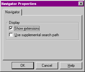
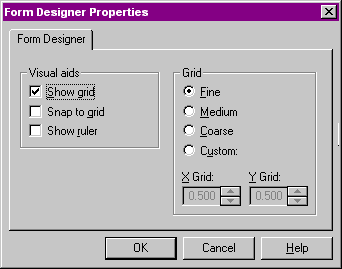
It is possible to make a couple of changes here. There are only two. These can be seen by making sure that the Navigator window has focus (click on it anywhere). In the dBASE menus is the "Properties" menu. Select this, and then select "Navigator Properties". You will see a dialog:
The first option is to "Show extensions". By default this is checked. If you turn it off, you will see files listed in the navigator without their extensions. This may be a problem if you have a lot of files in the "Other" category, as you may not know what they are ...
The other option is "Use supplemental search path". If you check this, it will display an entryfield with another folder button. You can select a secondary path for dBASE to look for files in. This may be useful, it may not, depending on your own environment. If you keep a bunch of custom code somewhere, you may want to set this, as it will tell dBASE to show you the files there, as well as in the current directory.
Note that it has two parts -- this is a Window with two "panes". The first is the one that is used to enter commands, the second is an output pane. The default setting is for the output pane to be on the bottom.
There is a "Command Windows Properties" dialog available if the Command Window is up on screen and has focus.
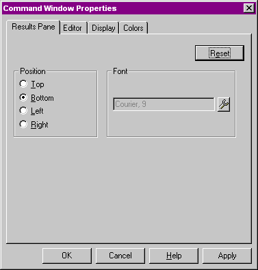
There are four tabs, the first one we'll discuss here. The others have to do with the editor, but making changes for the editor may also affect the command window (colors, fonts ...).
You can set the position of the results pane (note the default is bottom), and you can set the font. It's probably a good idea to use a non-proportional font, but that's really up to you.
NOTE: details can be gotten in online help ...
Country
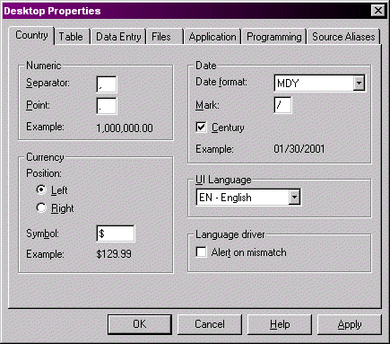
The 'Country' tab is aimed at settings that affect developers using dBASE and applications that will be used outside of the US.
The "Numeric" options allow you to set the separator between large values (anything greater than 999) to whatever is normal for your region. In the US this is a comma (i.e., 1,000). The point is the decimal point -- in the US this is a period, and in some countries it is something else.
The "Currency" options allow you to set the currency symbol (the default is the dollar sign ($)), and whether it appears on the left or on the right.
The "Date" section allows you to set the date format (the default is MDY for "Month Day Year or "MM/DD/YYYY"). The mark option lets you set what the separator is between "parts" of the date (i.e., the normal US "mark" is the slash (/), but you might prefer a dash (MM-DD-YYYY)). The most important setting here is the century setting -- if you check this, you will see all four digits of the year, otherwise the default will be to use just two digits.
The last option is the "Language Driver" option to "Alert on Mismatch". It is probably a good idea to uncheck this ...
Table
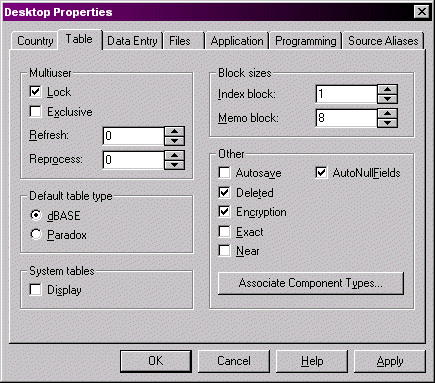
The table options are many and varied. Most of these you may wish to leave "as is" for now. One interesting thing to note is the "Associate Component Types" button -- this will bring up a form to allow you to change the default components associated with specific field types.
Data Entry
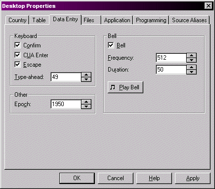
Most of this is pretty standard. The one option you may wish to set is the "Epoch" setting -- the default is "1900" and as such, if a user enters "00" for a year in a date, dBASE will assume that the date is 1900. More details can be found in online help under "SET EPOCH".
Files
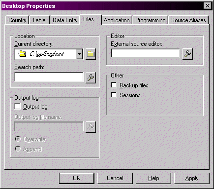
There is a lot here, but not much that I feel needs explanation ...
Application
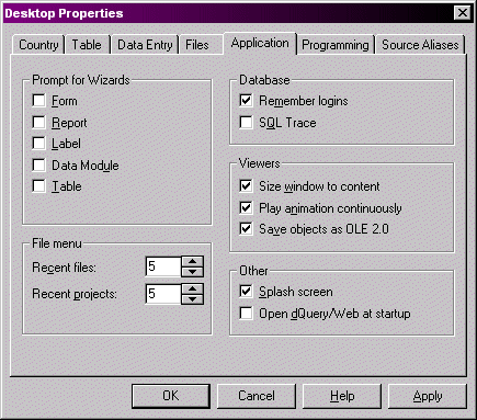
A couple of areas of interest are the "Wizards" section -- by default dBASE will prompt you if you wish to use the Wizards when you choose to create a new table, form, etc. If you uncheck these, it will not prompt you anymore and take you straight to the design surface. This is a matter of preference, obviously, but most developers stop using the Wizards after awhile.
Programming
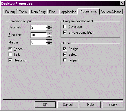
The Programming tab is the next to the last one, but again there isn't much to talk about. I generally prefer to have "Talk" unchecked, "Ensure Compilation" checked, and "Fullpath" unchecked. The rest I leave "as is".
A lot of the options we have looked at in the properties dialog have command equivalents with "SET someOption". You can find these in online help for more details.
Source Aliases
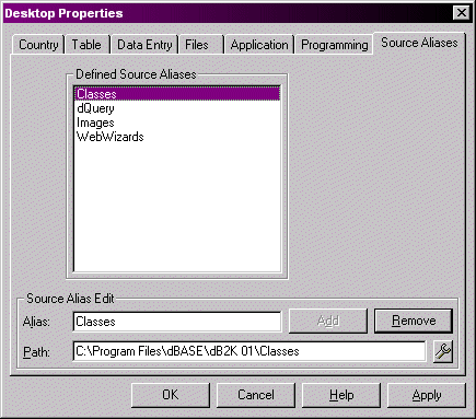
New to dBASE. The Source Aliases tab gives you the area to define your Source Aliases. The image shown has the "dUFLP" alias defined, which is used for the dBASE Users' Function Library Project, in the Knowledgebase (see the whats.new and/or readme.txt files contained in the library for instructions). The other three aliases shown are the ones that are installed with dBASE.
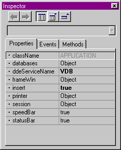
This very useful tool can also be called from the command window when testing code. You can examine any object using the inspector. Try the following (by typing it in the Command Window):
inspect( _app )
This will bring the inspector up, and show the properties, events and methods associated with the dBASE application object (_app).
You can close the inspector by using the 'x' in the titlebar.
When you are inspecting objects from the Command Window, the Inspector's "Always On Top" option is automatically on (and cannot be turned off), which can be handy (it can be a bit frustrating at times, but ...).
Tabs
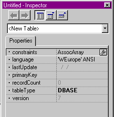
The Inspector has three tabs, one each for Properties, Events and Methods. If
an object being inspected does not have accessible Properties, Events or Methods,
then that page will be blank.
There are some interesting options with the inspector that have surfaced in dBASE (i.e., these were not available in Visual dBASE 5.x).
There are five buttons at the top of the inspector. The first two are arrow buttons. These will move to the previous or next object you have inspected. An example of this might be if you were inspecting the _app object, and clicked on "printer", and then clicked on the "I" (Inspect) button. This moves you down one level in the object hierarchy.
To go back up in the hierarchy, in the case of some objects, you could click on a parent property, and then the "Inspect" button. In the case of some objects, there is no parent property, and therefore no obvious way of moving back up. You could close the inspector and start over, but it's easier than that. Use the "Previous" button (which is now enabled). This will take you to the previous object that you inspected.
The "Next" button works the same way, if you have been going up and down the hierarchy ...
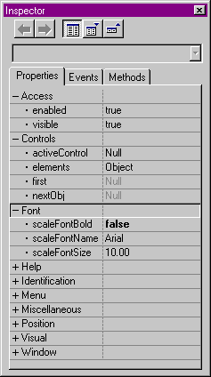
Next to this are three buttons that affect the layout of the inspector. The first is a toggle button -- it is either up or it is down (you can use this functionality in your own forms by using the toggle property of the pushbutton object -- see HOW TO on Form Controls in the Knowledgebase). If it is "Down" (which is the default), you are in "Category" view. What this means is that you see the properties grouped by categories. Some objects have categories, some do not. Most of the UI objects (Forms, objects that can be used on Forms, and the same for Reports, aas well as most of the data objects). However, you may be more comfortable with looking at the properties in an alphabetical listing. Click on this button, and it moves to the "Up" state, which is an alphabetical view.
If the Inspector is in a Category view, the two buttons to the right can be used to expand or collapse all of the categories in the inspector. If the Inspector is in an alphabetic view, these buttons are disabled.
Above the buttons is a combobox. This will be available in the design surfaces -- it is used to find objects that can be inspected, and bring them to the inspector. It can be a very useful way to see the object hierarchy on a form or report as well ...
Selecting/Modifying
Properties, Events and/or Methods
When you use the inspector it is possible to view, as well as to modify properties
events and methods of an object.
Viewing is pretty straightforward, but if you wish to change an object's property, you have to click on it. Then you may either enter a new value, or in some cases, you may click on a button or a series of buttons.
An example might be if we were inspecting a form object. To see this, at the command window type the following:
   f = new Form()
   inspect(f)
HINT: When developing code, if you cannot remember the properties, events or methods of a specific control or object, create a "dummy" object and inspect it. An example might be that you wanted to create a program that did some work with a query, but you can't remember the properties of the query object. Try the following at the Command Window:
   q = new Query()
   inspect(q)
Now you can examine the properties, etc., and work on your code at the same time ...
Properties
Click on the "Expand all categories" button, so you see all of the properties.
Some numeric values have text associated with them as well. An example of this might be the metric property of the form. If you move down in the inspector until you see this, you will see something like "0 - Chars". If you click on this, a combobox will appear with a listing of the options. However, if you were to programmatically change the value, or even do so at the command window, you would enter the numeric value -- entering the character value would not be accepted!
You may, however, decide to use the "tool" button, which will bring up a dialog. In some cases, the dialog is a pre-designed dialog either from Windows or dBASE itself.
Try this: click on the scaleFontName property, and then the tool button. You will get a "getFont()" dialog. (Click the "Cancel" button ...)
Try this: click on the helpFile property and then on the tool button. You will get a "getFile()" dialog (Cancel ...).
Try this: click on the statusMessage property and then on the tool button. You will get a "String Builder" dialog, which was designed for dBASE. The other two are either Windows dialogs or ones that were designed for dBASE to act like standard Windows dialogs.
If the object reference shows anything other than "Null", it is possible to select the "I" (Inspect) button, and actually inspect that object (remember the bit about the object hierarchy?). At that point in time, the properties, events and methods will be those of the new object, not the form.
Note that any time the value part of a property or event is yellow, it means that you are changing it - if you leave this property or event without pressing the <Enter> or the Up/Down arrow keys, you have abandoned those changes!! In other words -- if you want the change to "stick", make sure you press <Enter> or up/down.
Events
Events can have code attached to them by a developer -- these are events that
Windows polls for, and if a specific situation comes up, the event is fired
(whether or not you have any code assigned to it). For example, a form has onGotFocus
-- when the form gains focus, this event will fire.
Since we are not in the designer, we cannot assign any code to these events. However, when we get to the designer we will take a look ...
Methods
Methods are code that is already written. These can be called by the developer
in their own code (possibly in an event ...), and sometimes these methods can
be over-written. In most cases you do not want to do this, but there are times
you might ...
Other Options
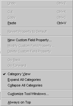
If you right click on the inspector, you will see a "Popup Menu" appear. This
menu has the following options:
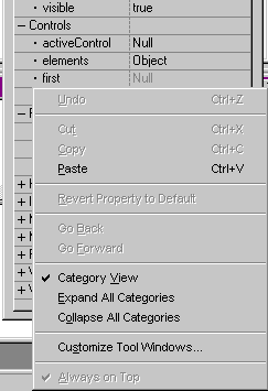
The "Customize Tool Windows" menu option mentioned above defaults to whatever tool or component you were using when you selected it, although you can move to other components ...
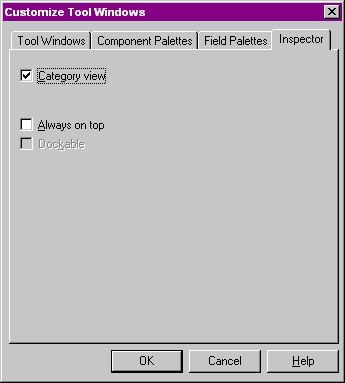
There are only three options in this dialog for the Inspector. Category View, Always on Top and Dockable. The "Dockable" option is only selectable if the Inspector is set to "Always on Top". What it means is that if you want the inspector to always be on top, you may want the inspector to be docked to the top, bottom, left or right of the screen. It will stay there unless you "tear" it off by clicking on the top and dragging it. Most developers don't particularly like this option, but it is there in case ... You may want to experiment a bit ...
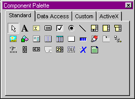
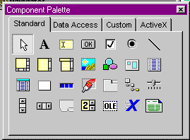
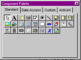
This palette may have several tabs, depending on what you are doing, and whether or not you have any custom components available.
If this palette is not on screen, you can bring it up by right clicking on the design surface and selecting it. You can also turn it off in the same way.
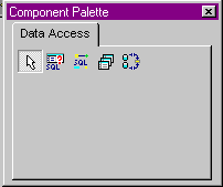
In the Datamodule designer (in dBASE there is no "Datamodule designer" -- this was replaced with dQuery/Web, and doesn't work the same at all as the older Datamodule designer), the Component Palette will only display a "Data Access" tab, with four objects on it.
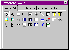
In the Form designer, the Component Palette will display "Standard", "Data Access", "Data Buttons", "Custom" and "ActiveX" tabs, each having images and/or text (depending on your preferences - see below) for each object.
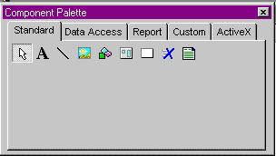
In the Report designer, the Component Palette will display "Standard", "Data Access", "Report", and "Custom" and "ActiveX" tabs, just like in the form designer, but the available components will be different.
Each page of this component has an "Arrow" icon, which sets you back to the pointer. The reason for this is that while in the designer you can click on an object and then click on the design surface. This will place an instance of that object on the surface. There is an option (again, below) to "Revert to Pointer" which is set to "True". If this is changed to "False", what it means is that if you click on the surface a second time, you will get another instance of the same object, unless you go back to the component palette and click on the arrow ...
Options
Like the Inspector, if you right click on the component palette, you will get
a popup menu. The options here are:
There are ways around this. At the command window you could type:
set procedure to mycc.cc additive
and any controls contained in that .CC file will be available in the designers until you exit dBASE, or close the procedure file. This is the simplest ...
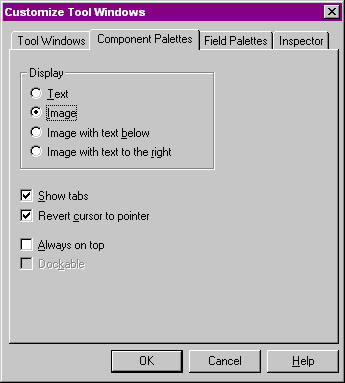
Display: "Text", "Image", "Image with text below", or "Image with text to the right". The default is "Image", but if you have a lot of custom controls, you may want to experiment so you find the layout that works best for you.
Show Tabs -- unchecking this will turn off the tabs in the palette and jumble everything together on one page. This is probably not a good idea, but if you'd rather not use tabs ...
Revert Cursor to Pointer -- this was discussed above -- it means that when you drag an object from this palette to the design surface, you want the mouse to revert back to a pointer. Otherwise, the next time you click on the design surface, you may get another instance of the object you just placed on the surface.
Always on Top -- as it says. If this is true, it allows the developer to set the "Dockable" option.
Dockable -- as with the inspector, you may wish the component palette to be "docked" at the side of the screen ... most developers don't, but ...
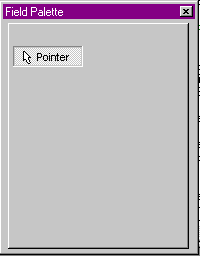
If there is no table open, and no query object or datamodule object available, this palette is empty.
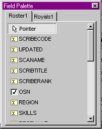
If you have a query object or datamodule object on the form or report, you will see something like this:
You can drag fields directly from here to the design surface. However, if you read other HOW TO documents in this series, you will see that this is not a good idea (use custom controls, really! see CONTROLS.ZIP for details).
If, however, you wish to use this, there are some options.
If there is only one table open or rowset available in the designer, there will be a single tab with the fields available listed.
If there are multiple tables available, there will be a tab for each, with the fields for each table listed on each page of the palette.
Right clicking on the palette will bring up a short menu:
There is a request in to the developers to make it possible to associate custom controls with field types, but at this time this is not available as an option.
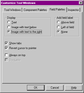
Display -- options are "Text", "Image with text below" and "Image with text to the right". The default is the last one.
Add field label -- options are "Above field", "Left of field" and "None". What this means is that when you drag a field from the palette, a descriptive text control (or a "heading") can be placed on the form or report, either above or to the left of the control. This is a nice feature, but can be annoying, so you can turn it off, as well.
Always on top -- as previous tools
Dockable -- as previous tools
This is only active in the designers when text controls are the current controls, and it defaults to not being available. You can turn it on by right clicking on the design surface and selecting it from the menu. When a form is running you have some options to turn this on or off for editor controls.
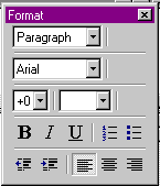
There are quite a few options here that can be used to modify your text.
You have some styles (Paragraph and Heading) -- this is the first combobox at the top of the palette. You can select a font from the combobox under that, which is kind of nice -- selecting the font will change the fontName property of the text control, unless you choose to only change the font for part of the text (highlight it and select a new font -- only that text will get that value) -- in which case the text gets HTML tags.
You can change the size of selected text within the control, the color of the text or selected text, set bold, italic or underline (and again if it is selected text, HTML tags will be inserted).
If you have a large text object you can set list styles, you can set indentation, and alignment of text.
This is rather spiffy, but the problem is that the HTML interpreter for the text control adds a lot of overhead to a form.
Options
Note that right clicking this, there is only one menu option, and that is the
"Customize Tool Windows ..." option, and if you select that, there is no setting
for the Format Toolbar.
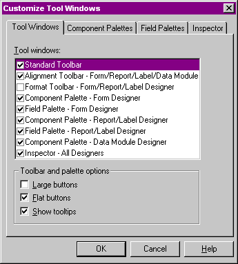
This is the "Tool Windows" option. This allows you to select which tool windows will be available by default when a designer is opened, and to affect the display of these tools.
If you select "Large Buttons", every toolbar in dBASE, as well as each of the tools for the designers will get larger buttons than the default. I don't recommend using it, but that's up to you. NOTE that if you do this, the size of your windows changes to handle the larger buttons ... this may be a bit disconcerting ...
If you select "Flat Buttons", you get the appearance that most of us are used to now in Windows applications -- the buttons are flat unless the mouse is over them, in which case you get an outline ... If you turn this option off (the default is on), you get individual pushbuttons appearing everywhere, including the standard toolbar of dBASE.
Show Tooltips -- this option turns off the speedTips that appear when the mouse is over a control. Unless you have text set for the component palette, I don't recommend doing this ...
Each of the designers will be discussed in the sequence they are laid out in the Navigator's tabs:
When you decide to create a form you will normally see up to three of the components that we discussed above: the Inspector (of course), the Component Palette, and the Fields Palette. The Format Toolbar may or may not be available automatically, depending on how your settings where when you last exited the form designer, and while the other three are commonly available, they may have been turned off and not appear when you bring up the designer.
This discussion will not be about how do design forms, or the differences between MDI and SDI applications or any of that stuff. That's for other discussions. We just want to examine the design surface and some of the options.
The whole purpose of the form designer is to create the user interface, dialog boxes, and so on for your application. (You should use Custom Forms -- HOW TO on Custom Forms.)
Without going into all of the form properties, events and methods, suffice it to say that you have a lot of control here, and can do a lot. (See Beginning Forms HOW TO in the Knowledgebase.)
Popup Menu
When you right click on the form designer surface, you will see a popup menu
with the following options (some of them may be greyed out/disabled based on
whatever you are currently doing ...):
In any case, I recommend that you experiment a bit to find the settings you prefer. These settings will remain until you change them -- they are not form specific (i.e., if you design one form the settings will be set one way, and if you design another, they will be set another way -- the overhead of tracking all that is horrid!)
Alignment Tools (Toolbar
and Menu)
When you have multiple controls on a form, it is often desireable to line them
up, and such, making the form look more "professional" (as it were). You can
do this manually, moving each control one by one. You can do this by finding,
say, the top property of a control, and then setting the top property
of the other controls you want to line up on top to the same.
Or you can do it the easy way -- by using the alignment tools.
If you have the toolbar active in dBASE, you will see a series of buttons on the right side that can be used to line up the controls, and you can also have controls resized so that a selection of controls are all the same size.
If you do not have the toolbar active, there are matching menu options under the "Layout" menu.
To use these options, you must select multiple controls. This can be done in one of several ways:
In any case, once you have selected multiple controls the menu options for alignment and the toolbuttons (if available) are now enabled.
The alignment options are:
The size options are:
In addition to these, there are spacing options in the menu that can be used to set horizontal and vertical spacing for controls. The results may not be what you expect, but it may be worth experimenting with these.
Layout Menu
After all of the above, there is only a bit more to discuss with this menu.
There are several options that can be used when you overlap controls, or more particularly when you use controls like shapes or rectangles. You may need these to be "on top" of some other controls, or "under" them. If you, for example, place a set of controls on the form, and then decide you want a rectangle under them, if you lay the rectangle onto the form, it will be on top of the controls and you won't see any controls that are under it. There are toolbuttons for these options as well. They are to the left of the alignment toolbuttons discussed above.
What these options are really doing is working with what is called the "Z-Order" of controls on a form. This is the order that they are defined in the constructor code of the form -- this order is what tells dBASE in what sequence to render each control on the form when it opens. Once the control is rendered that is it's "layer". So, if you have the rectangle being rendered after controls that are "under" it, then you will not see those controls ...
In addition, Z-Order is important when a user (someone using the form) tabs (uses the <Tab> and/or <Shift>+<Tab> keys) to navigate between controls -- the order the controls are rendered is the order in which the tab sequence will work. This means that you could really confuse a user by allowing them to tab to the first control in the upper left, and then to the last control on the lower right, skipping everything in between.
Layout Menu -- Set Component
Order
This menu option is related directly to the discussion of Z-Order above. If
you select this option, you will get a dialog that allows you to change the
"Z-Order" or order of the form.
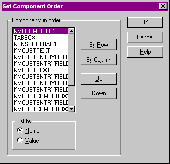
By using this option you can set the exact order each control will be rendered in. This has the effect of changing the order the code is written out (streamed) to the source code when the form is saved. You can move controls up and down in this dialog either with the buttons, or by clicking on them and dragging them up and down ...
Note that in the toolbar are two buttons "Layout View" which is the default in the form designer, and "Order View" -- this shows the order the controls are currently in -- it does not let you change that order, however. But it shows the order by using numbers ...
Moving Multiple Controls
You can move multiple controls around on a form, which is handy. To do it, you
would use the same instructions given above for the alignment tools that refer
to selecting multiple controls (lasso, <Ctrl> and selecting multiple controls,
etc.). Once you have those controls selected, you can move them by dragging
them around on the form.
Changing Properties
of Multiple Controls
It is possible to change the same property of multiple controls by simply selecting
multiple controls, going to the inspector, and changing the property for each
of those controls. This will affect each control that was selected ...
Copy/Paste Controls
You can use the standard Windows copy, cut, and paste menu options (or the "Edit"
menu) to work with controls. The source code for these controls will be placed
in the Windows clipboard, and you can then paste these controls back out of
the clipboard to either the same form, or even to a different form (and in the
case of text, image, rectangle and shape controls, to a report!).
Format Menu
If you have a text control selected, you can work with the Format menu. The
options in the Format menu, except for one, are all the same options that are
in the Format Toolbar. You can, in a text control, select just some text,
and any changes made in the Format menu will affect just that text. This can
be useful, but it can be a bit odd ... this stores HTML tags into the text control,
which can be edited if you so desire.
Format Menu -- Set Scheme...
This is something most people don't think about, but ... you can set your own
color schemes for each of the standard controls that can be placed on a form
by using this option.
Selecting this will bring up a new dialog:
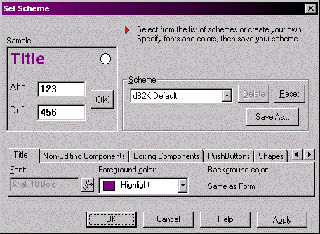
You can make changes to the current 'scheme', use a pre-defined scheme, or create your own.
Be careful -- this will affect all forms that you create in the future unless you change it again.
While this is useful, it's probably a better idea to use custom controls and set the color properties there ...
Method Menu
The method menu is useful when you are working with code in a form. It allows
you to create a new method (function) that is not associated with the standard
events or methods of the form or its controls, to delete a method or to edit
a method. In the case of these last two, you are shown a list of possible methods
to edit or delete.
You also have the option of Editing Events, Linking Events and Unlinking Events. These events are ones that are associated with the form or controls on the form. The nice thing here is that you can actually link events so that one event is used for several controls. This is particularly useful for radioButtons, where you may want all of the radioButtons in the same group to use the same onChange event, for example.
See also "Beginning Forms" in the Knowledgebase.
The basics here are that you add Menu Objects to a menu by typing the names in and then moving around in the menu.
For example, if you were to create a set of top level menus such as "File", "Edit", and "Help", you would type "File" (or if you wanted the "F" to be underlined -- which means that you can use <Alt>+F to activate it -- &File). Then you would press the <Tab> key to move to the right. At this position, you would type "Edit" (or &Amp;Edit), and then <Tab> again, to enter "Help" (or &Amp;Help).
To go back to the left, use a back-tab (<Shift>+<Tab>).
You can add menu objects that are "under" the top-level by using the down arrow. When in the "sub" menu, you can add menus off the right by using a <Tab> and then type the first option in this menu. And so on.
You can drag menu items on the design surface, which means that if you have something in the wrong place, rather than deleting it and starting over, you can move it ...
As you can see, this is pretty easy to use.
There are other options, such as separators that can be set for some menu options -- if you have a menu that has a group of options and you want to separate that from another, just set the separator property on a menu object, and there you are ... a line.
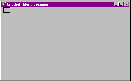
"Menu" Menu
When you are in the menu designer, there is a special menu option titled "Menu"
at the top of the screen in the standard dBASE menu.
The options are:
In all other ways, these are the same design surface.
To learn how to create reports, you should see the HOW TO document on "Beginning Reports" in the Knowledgebase. This discussion is really about the design surface, but not the details on how to create a report ...
When you bring up the report designer, you will see the design surface (which is radically different in appearance from the other design surfaces in dBASE) and normally you will see the Inspector, Component Palette, and the Field Palette. Of course, these latter will depend on if you turned them on or off (the default is on), and how large the design surface is on screen -- it is possible that these components are there but underneath the design surface.
The design surface is quite different in appearance, because the layout of a report is very different than a form, datamodule, or menu.
To start off, there are two panes to the window -- one on the left and one on the right. The one on the left is used to show the relationship of the report objects to each other, while the one on the right is used to actually design the report.
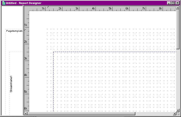
If you do not open the left pane (use the mouse) you may not even realize it is there. You ought to consider doing so, as the left pane can be useful.
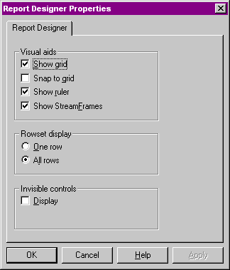
The Popup Menu
If you right click on the report designer surface, you will see some options
which you will see in other designer surfaces, but you will see "Report Designer
Properties" as opposed to the "Form Designer Properties" (for example).
Selecting this will bring up a dialog that looks like:
Alignment, Multiple
Controls, etc.
Many of the options discussed in the form designer will work in the report designer.
The one big one that doesn't exist in the Report designer is the "Layout Order" option. For whatever reason, while the "Z-Order" is important to the report engine, you cannot set the "Layout Order" in the report designer (I think it may have been an issue of "not enough time" for the developers to create this ...). If you have a control in the wrong sequence, the only way to change the sequence is to open the report in the Source Editor and move that set of code in the constructor portion of the report.
Bug Warning: If you use any metric (a property of the report) other than the default (twips), the size tools may give you some odd results due to some bugs in the conversion from twips to other metrics. Sometimes using the sizing options will end up with all of your controls being, for example, 3000 inches wide -- which might be correct as 3000 twips, but not in inches (which is what the designer will attempt to display). Be careful, and consider yourself warned. In dBASE, many of these issues have been resolved, but if you find a reproduceabel case, please report it to us ..
Under the Layout menu you will see, however, a new menu option.
This option allows you to define groups and summaries. The option reads "Add Groups and Summaries ..." -- this brings up a new dialog.
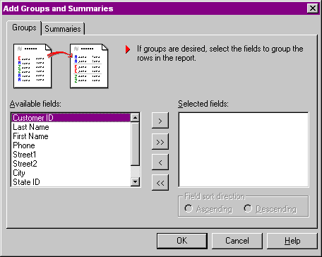
Without discussing all the "how tos and whyfores", this is an easy way of getting the report designer to do some of the work for you. Note however that it uses some color combinations and font changes you may not like. However, these are easily changeable, so ...
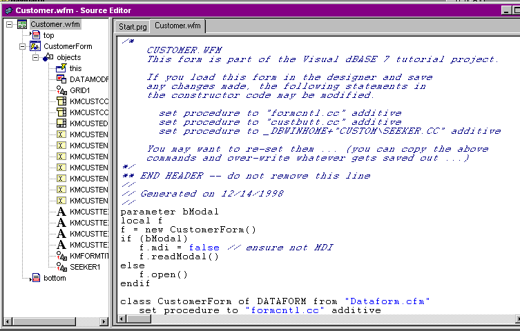
The Source Editor has two panes in the window. The left pane is used to show the objects and functions in a "treeview" type layout.
You can click on any specific icon in the treeview, and you will be moved to that location in the source code itself in the pane on the right.
The pane on the right is where the actual source code resides. You can edit the code, add new code, etc. here. The editor does syntax highlighting, which is handy, and there are some options that can be used as well.
Build Menu
When you have code in the editor, there is a menu that allows you to run, compile
or debug the code. This is useful for quick checks to see if everything works.
There are toolbuttons you can use for this as well.
Method Menu
The Method Menu will allow you to insert a new method, delete one, or verify
one (make sure it works).
Multiple Files in the
Source Editor
You can have several files (programs, forms, whatever, or a combination of same)
in the source editor at one time.
This can be quite useful. When you do this, you have tabs at the top of the right pane. When you select a different file to examine, the left pane changes to match the new source code.
The Popup Menu
When you right click on the right pane of the editor, you get a menu with the
following options:
The options numerous. The best way to deal with this is to experiment a bit.
The source editor is a useful tool, and you should get used to working with it. You will be seeing a lot of it as you develop your applications in dBASE.
Doing this should give you something like:
Of the components mentioned above, the only one available here is the Inspector.
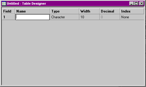
This is where you define fields, field types, field sizes, indexes (you can do them simply or by using the menus you can do more complex or primary indexes).
The inspector can tell you information about the table you are creating.
If a field is selected, it will tell you about that field, and allow you to set some constraints (see the Developer's Guide for details).
If you right click on the inspector while a field is highlighted you will see three new options in the popup menu that weren't there when we discussed this earlier:
Yes, you can add custom properties to fields. Details on this can be found in the Developer's Guide. While these can be useful, they can also cause some problems with some of the database object methods (packTable, reindex ...). Use them with caution, if at all.
One advantage to custom properties for fields is that you can set pictures for the display and data entry of some of your fields. The other options may not be a good idea, but ...
I do not, personally, recommend using it much for your application development except to see how to set up a Join between multiple tables. (I have used it for setting up reports where I wanted to get the correct syntax for the actual joins, but did not use the streamed out SQL itself except as the model for what I ended up using ...).
In theory you can use the SQL designer to create a .SQL file, which may be used by reference in the SQL property of a query object. To use an external .SQL file instead of a standard SQL select, the syntax is: "@ORDERS.SQL" where "ORDERS.SQL" is the name of the SQL file. There may or may not be some problems in doing this, and again I don't recommend it ...
If you are interested in learning more about SQL, there is a HOW TO document XDML commands to SQL statements in the 'Advanced' section of the Knowledgebase.
You can double-click on the "Untitled" icon and dBASE will bring up PaintBrush ...
You can also view quite a variety of image types. This is as simple as double-clicking on the image file in the Navigator. dBASE will bring up the image in a window, so you can view it.
If you do this and then right-click on the image, however, a small popup menu comes up with three options:
Well, there isn't much else I can say here about the image options, but ...
I didn't expect this document to end up as large as it is, but there you go. You should spend some time working with the options for the various designer surfaces so that you are comfortable with the layout, and the look and feel.
If you have questions about dBASE, you should use the newsgroups provided by dBASE, Inc. Details about these newsgroups can be found at the dBASE, Inc. website:
http://www.dbase.com
DISCLAIMER: the author is an employee of dBASE, Inc., but has written this on his own time. If you have questions regarding this .HOW document, or about dBASE you can communicate directly with the author and dBVIPS in the appropriate newsgroups on the internet..HOW files are created as a free service by members of dBVIPS and dBASE, Inc. employees to help users learn to use dBASE more effectively. They are edited by both dBVIPS members and dBASE, Inc. Technical Support (to ensure quality). This .HOW file MAY NOT BE POSTED ELSEWHERE without the explicit permission of the author, who retains all rights to the document.
Copyright 2004, Kenneth J. Mayer. All rights reserved.
Information about dBASE, Inc. can be found at:
http://www.dbase.com
EoHT: DESIGNERS.HTM -- January 22, 2004 -- KJM