The Component Palette
This is a short guide to using the Custom Classes that are installed with dBASE, and can be used in your own applications. There are two areas that you will find these useful, the form designer and the report designer. This paper does not discuss the creation and use of your own custom classes, just the ones that appear, by default, when you start the designers, on the "Custom" tab of the Component Palette. Some of these controls are specific to dBASE Plus, you may not find these controls. Also, please note that many of the paths and/or source aliases have changed in dBASE Plus from prior implementations of these classes.
Forms
When creating a form in dBASE, by default a Component Palette appears, which contains
the visual objects that can be placed on a form, as well as a few data objects (all
of this is covered in other parts of the Knowledgebase).
On the Component Palette are some special tabs. The first is "Data Buttons" -- this is a series of button or image controls that are designed to interact with the data on a form. In dBASE Plus you will see two others -- "Form Controls" and "Custom", in earlier versions of dBASE you will see "Custom". Whether or not you actually see the "Custom" tab may depend on whether you have any custom controls ready to be used, and/or what version of dBASE you are currently using.
Data Buttons
The Data Buttons tab of the Component Palette contains a series of pushbuttons that can
be used on your forms for working with your data. These pushbuttons have a lot of
code behind them to do some of the work for you. They are stored
in the Source Alias :FormControls: and in the file "DataButtons.cc".
If you wish to examine the code, you can do so from the Command Window by typing:
MODIFY COMMAND :FormControls:DataButtons.cc
For our purposes, we are just going to examine the basics of these, and we're not going to look at the code itself. If you did the above, close the source editor, and let's move on.
Make sure that the Navigator in dBASE is set to the "Forms" tab. Create a new form, by double-clicking on the first "(Untitled)" icon.
The form designer should appear with a new form.
If the Component Palette does not appear, right click over the form surface, and select "Component Palette". It should now appear (by default in the upper left corner of the screen).
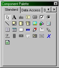
The Component Palette looks like this:
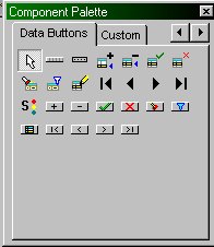
If you want to work with the Data Buttons, you need to select that tab. If you look at the image above, however, it isn't there. Click the right arrow on the upper right corner, and you should see the "Data Buttons" tab. Click on it, and the Component Palette should now look like:
When a form uses data, these controls can be used to interact with the data, including such things as navigating through the data, and/or setting filter states, and so on.
In addition, while there are several individual controls, some of them are stored in a container object, and can be placed on the form directly.
If you hold your mouse over the controls on the Component Palette, you will see a speedtip appear that tells you what that control's name is.
For example, there is one called "BarEditData". If you click on this (right mouse click) and drag it over to the form, you should see six pushbuttons with images on them. These are standard editing buttons (add, delete, save, abandon, filter and locate).
If you were to run this form right now (you can do so by clicking on the "Lightning Bolt" button in the toolbar -- this means "Run"), however, you would see that these buttons do NOT appear on the form! Why not? Because there is no data associated with the form. There is code in these buttons that tells dBASE to display the buttons only if there is data to interact with. If you drag a table to the form in the designer, and then run the form, you will see these controls.
The following is a brief description of the controls that appear on the Data Buttons tab of the Component Palette (the pushbuttons with the word "Bitmap" as part of the name all have an image and no text, the others have text but no image):
BarDataEdit -- a 'toolbar' of pushbuttons that include Edit, Delete, Save, Abandon, Filter and Locate buttons.
BarDataVCR -- a 'toolbar' of pushbuttons that are used to navigate in a rowset -- First, Previous, Next, and Last.
BitmapAppend -- a pushbutton object that can be used to append a new row.
BitmapDelete -- a pushbutton object used to delete a row.
BitmapSave -- a pushbutton object used to save changes to a row.
BitmapAbandon -- a pushbutton object used to abandon changes to a row.
BitmapLocate -- a pushbutton that puts your form into "Locate by Form" mode.
BitmapFilter -- a pushbutton that puts your form into "Filter by Form" mode.
BitmapEdit -- a pushbutton that puts your form into "Edit" mode.
BitmapFirst -- a pushbutton for navigation to the first row in the table.
BitmapPrevious -- a pushbutton to navigate back one row in the table.
BitmapNext -- a pushbutton to navigate forward one row in the table.
BitmapLast -- a pushbutton to navigate to the last row in the table.
RowState -- a text control that shows the current state of the rowset on the form. (See the State property in online help.)
ButtonAppend -- a pushbutton with the text "Add" on it, same code as "BitmapAppend".
ButtonDelete -- a pushbutton with the text "Delete" on it, used to delete a row.
ButtonSave -- a pushbutton with the text "Save" on it, used to save changes to a row.
ButtonAbandon -- a pushbutton with the text "Abandon" on it, used to abandon changes to a row.
ButtonLocate -- a pushbutton with the text "Locate" on it, that puts your form into "Locate by Form" mode.
ButtonFilter -- a pushbutton with the text "Filter" on it, that puts your form into "Filter by Form" mode.
ButtonEdit -- a pushbutton with the text "Edit" on it, that puts your form into "Edit" mode.
ButtonFirst -- a pushbutton with the text "First" on it, for navigation to the first row in the table.
ButtonPrevious -- a pushbutton with the text "Previous" on it, to navigate back one row in the table.
ButtonNext -- a pushbutton with the text "Next" on it, to navigate forward one row in the table.
ButtonLast -- a pushbutton with the text "Last" on it, to navigate to the last row in the table.
Custom
Note: in dBASE Plus, the controls shown below will be on the "Form Controls"
tab of the Component Palette, in earlier versions they will be on the "Custom"
tab. The Custom tab of the Component Palette may vary in appearance,
depending on whether or not you have loaded any of your own custom controls or not.
The following controls should appear when you create a new form in dBASE on the either the Component Palette's "Form Controls" or "Custom" tab. The discussion below is about each individual control, and the basics of how to use each.
Seeker
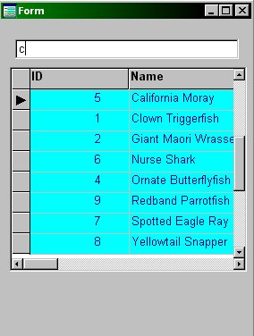
Seeker is a control that can be used to perform what is called an Incremental Search --
meaning that when used with a table, it can be used to search through a rowset
based on what is typed. For example, if your current index is on the last name field,
if you type the letter "M" in the Seeker control's entryfield, the first name that
starts with the letter "M" will be found, and if you then type "a", the first name that
starts with "Ma" will be found, and so on.
So, how do you use the seeker control on your own form? It's pretty simple. There are only three rules:
That's it. When you create your index, make sure it done using the upper() function. (In the table designer you have to use "Specify with expression", in code INDEX ON ... UPPER(...), and so on).
Seeker will attempt to use the OODML method of accessing the table first (it relies on the form's rowset property being set), but can use the older XDML commands as well.
If you are using OODML, make sure that the rowset's indexName property is set to the appropriate index tag, drag a copy of Seeker to the form, and that's really all you need to do. If you want to see an example of it working, follow these steps exactly as given (these are fairly detailed because we have to create a new index on one of the sample tables that ships with dBASE):
    use fish excl
    index on upper(name) tag uppername
    use
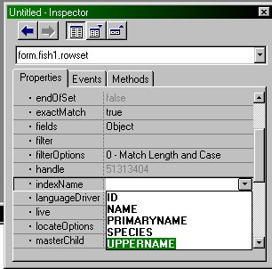
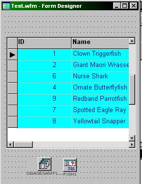
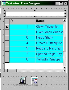
Seeker itself is pretty easy to use. The above sequence seems a bit complex because it includes instructions to modify a table's structure, and to put a grid on a form ... If you have an existing form, and the table is set to use the appropriate index tag, all you have to do is drag the seeker control to the form and use it ...
Using SEEKER with Numbers?
Seeker itself was written to work only with character fields. However, Peter Rorlick
posted in the dBASE newsgroups quite some time back a way to subclass the
seeker control so that it can work with numeric fields instead of character
fields. The way you do that is to copy the code below to a new filename
such as "NumSeeker.cc".
   CLASS NumSeeker( fArg ) of Seeker( fArg ) from :FormControls:Seeker.cc CUSTOM
      FUNCTION normalizedValue
       // Here we override the super's method.  Instead of returning
       // upper( trim( this.value )), we'll convert this.value to numeric
      RETURN val( this.value )
   ENDCLASS
If you want to use this, then all you have to do is (very similar to other examples):
set procedure to NumSeeker.cc additive
And you will find this new control on the component palette. Make sure that the form's rowset is set to an index that is based on a numeric field. Otherwise this should work exactly like the normal version of seeker.
It is probably a good idea to store this subclassed version of seeker in your own code library, with your own source alias, and use it that way. With a bit of work you might be able to use seeker for dates, or other field types, but we leave that exercise to the developer.
Animate
This control is new to dBASE Plus, and may not appear on the component palette
at first. If it does not, all you have to do is go to the command window, and type:
set procedure to :formcontrols:Animate.cc additive
When you go to create a new form now, this control will be on the Custom tab of the Component Palette. (This is only temporary, unless you go through the steps to place it permanently in the Component Palette, discussed in other papers in the Knowledgebase.)
So, what does it do? It is used to display a "single stream" .AVI file on a form. dBASE Plus ships with a series of .AVI files that can be used on a form, in the "Media\Movies" folder (referenced through the Source Alias :Movies:).
There are some example files that you can examine that use this, and these are what were used to give the details on how to use this control. Check the folder: ".\dBLClasses\Forms" and you will see "AnimateDisp.wfm" and "AnimateAbout.wfm". You can run these from anywhere using the source alias :Forms: in the Command Window:
   do :Forms:AnimateAbout.wfm
      // or:
   do :Forms:AnimateDisp.wfm
In addition, in the samples folder is a form that can be used to examine these .AVI files frame-by-frame or to run them ...
do :Samples:AnimateDemo.wfm
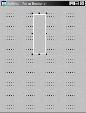
The Animate control appears on the Component Palette as a Paintbox object, and if you drag it to a form's design surface, all you see is a square.
To use the Animate control on your own form, follow these steps:

this.open(":Movies:dBASESmall.avi")
Click the "OK" button.
Note that you can use the name of any of the .avi files in the folder ".\Media\Movies", there are quite a few interesting ones there.

You could use this kind of control on a form that displays while performing a long process, so the user feels like something is happening, and so on. There are quite a few interesting .AVI files in the movies folder, and it's worth looking them over. These little movie files include ones that show data transfer, moving files (to a box, a trashcan, a shredder ...), sorting, and a lot more.
There is a sample form in the SampleCode zip file that comes with this document, that can be used for this purpose. It was written to be flexible, and allow you to set the animation ... if you open it in the Source Editor and read the comments at the beginning you can get a complete list of what's available. Here's some sample code to show how it works:
       set procedure to AniMessage.wfm additive
       fMessage = new AniMessageForm()
       fMessage.text = "Indexing Tables"
       fMessage.Title.text = "Indexing Tables"
       fMessage.Detail.text = "Indexing table: SomeTable"
       fMessage.AniFile = 29 // SortAlpha
       fMessage.open()
       // Start your index operation ...
Calendar
A calendar class ships with dBASE Plus, and can be placed on the
component palette (if it's not already there) in the same way that
other controls can be used.
set procedure to :FormControls:Calendar.cc additive
If you place this component on a form (NOTE: The form's metric needs to be set to 6 - Pixels) you will see a container with some text and a lot of pushbuttons.
To use this control, the steps are like this:

At this point, that's the absolute basics. If you do nothing else, the calendar will start at today's date.
However, if you want to set the date to a specific date, you can do this when you open the form, or you can do this in code in one of several ways ...
Using the Calendar control's OnOpen event (click on the form, in the Inspector select the Events tab, select onOpen, and click the Wrench button -- when asked if you want to over-write the code, click "Yes"), you can set the date to any specific date:
   function CALENDAR1_onOpen
      this.setDate( {01/01/2003}, "Y" ) // the second parameter tells the control to repaint
   return
Note that the value placed inside the parenthesis must be a date, but it
can be a variable that references a date, a property of a form, or just
about anything, as long as it evaluates to a date.
The cool thing about the calendar is that you can select a date using it, and return the date to some code.
There is a method of the calendar control that allows this, called "getDate()". To use it, you might want to place a pushbutton on the form that has the control (one that is outside of the container), that might be a multi-purpose button, for example, one that closes the form but also returns the date. In the onClick event for the pushbutton, you could do something like:
   function pushbutton1_onClick
      dDate = form.calendar1.getDate()
      form.close()
   return
In addition, the calendar class is set up to allow you to "hook" into a method of the class, but only if you "register" the form with the class. This is done by overriding the form's open event, and calling the calendar's "registerOwners" method:
      function form_onOpen
       // register form controls with Calendar
      ///// Register dateFields with calendar
      this.calendar1.registerOwners(form)
   return
What this allows you to do, is when the user selects a date, you can get that value and work with it, with pretty much no effort. This requires that you create a method of the form (just add a section of code like the following), and in this case, it requires an entryfield named "entryfield1" on the form:
   function setDate(dDate)
      // This is called automatically by the
      // calendar class, but ONLY if you use the registerOwners
      // method, as shown above in the form_onOpen event.

      // set defaults for missing params:
      dDate = iif(empty(dDate),date(),dDate)
      // set value of entryfield1:
      form.entryfield1.value = dDate
   return
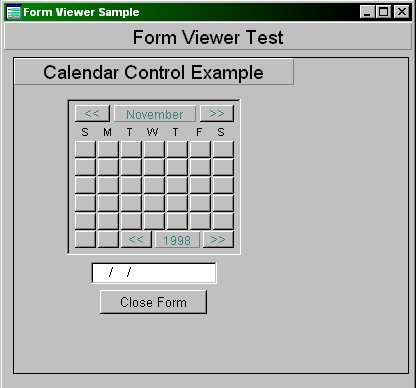
A very simple example form that does something like this is available in the sample code zip file, called TestCalendar.wfm (with thanks to Michael Nuwer for showing me about the registerControls() and setDate() methods). This form looks like below when run:

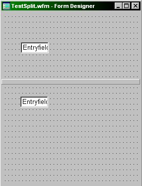
Splitter
There are two forms of the Splitter Control, HSplitter and VSplitter, where "H" is
for "Horizontal" and "V" is for Vertical. The examples given here will be done
using the VSplitter control, but the options are the same, as internally the big
difference is that one is subclassed from the other.
What is a splitter control, and why would you want to use one on a dBASE form? A splitter is used to split a screen or form, and when dragged left and right, or up and down (depending on the splitter being used), the screen updates and changes the surface available on that part of the form.
This control is new to dBASE Plus, and may not appear on the component palette at first. If it does not, all you have to do is go to the command window, and type:
set procedure to :formcontrols:Splitter.cc additive
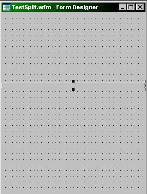
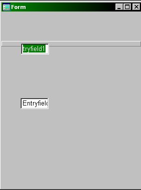
The Splitter classes are based on the stock rectangle class, and will appear on the Component Palette as rectangles. When dragged to a form, they appear exactly as rectangles. You will need to size them, and perhaps work with the borderStyle to get the appearance you want for your splitter control (for example, the splitter used on the dQuery form uses the "raised" option for the borderStyle).
The splitter classes have two methods that can be used to update the form -- onMoving, and onMoved -- the first one fires as the splitter is moved by the user, the second one fires when the move is complete.
There is a property called AllowDoubleClickMove, which defaults to true -- this allows the user to double-click on the splitter and have it move to a default position using the DoubleClickPosition property (the position is based on the form width or height, and defaults to 50%). If you do not want the user to be able to double-click on the splitter and have it shift to the default position, set the AllowDoubleClickMove property to false.
Okay, now that we've covered the basics, let's put a form together that uses the Horizontal Splitter control ...
      function HSPLITTER1_onOpen
         // set function pointers and properties:

         // If allowing the double-click to reset,
         // you can set the doubleClickPosition here.
         this.DoubleClickPosition := 50

         // For this example, I'm turning it off:
         this.allowDoubleClickMove := false

         // Tell it what to do:
         this.onMoving := class::SplitterMoving
         this.onMoved := class::SplitterMoved

         // create custom property to handle "current"
         // position of control
         form.nCurrentTop = this.Top
      return
Once you have that, you need to add another method to the form's code. We'll start simple, and then start doing more complex code. In the Source Editor window for the form designer (where you already were), go before the form's endclass statement, and add:
   function SplitterMoved
     ? "SplitterMoved event"
     ? form.hSplitter1.top
   return

   function SplitterMoving
     ? "SplitterMoving event"
     ? form.hSplitter1.top
   return
If you look at the command window, you should see text similar to:
    SplitterMoving event
           112.00
    SplitterMoving event
           111.00
    SplitterMoving event
           110.00
    SplitterMoving event
           109.00
    SplitterMoved event
           109.00
Note that the last two lines tell is that it is DONE moving, because that's when the SplitterMoved method fired (the value shown for the top position is the same in the last two times it was displayed).
Once you know how to access the information, you can adjust the height of containers, or the width if using a vertical splitter. There are two sample forms called "SplitterTest.wfm" (Vertical splitter) and "SplitterTest2.wfm" (Horizontal splitter) in the zip file with sample code for this HOW TO document.
If you look at these in the source editor you should be able to see more details about working with the splitter class. It can get a bit complex, as you have to deal with changing the height and top (or width and left) properties of containers, based on the splitter object moving.
HINT: It is probably a good idea to use containers to hold the controls on either side of a splitter. If you do, then when the splitter moves, you only have to update the properties of two controls (the container on either side of the splitter). If you chose NOT to use a container on either side, then when the splitter moves you have to update the position properties of every control on either side of the splitter, and that can get ugly really fast.
The following is an example of a form using HSplitter, and two containers, with an entryfield on each -- there are two screen shots, one showing the form when it opens, the other after moving the splitter up the screen a ways.
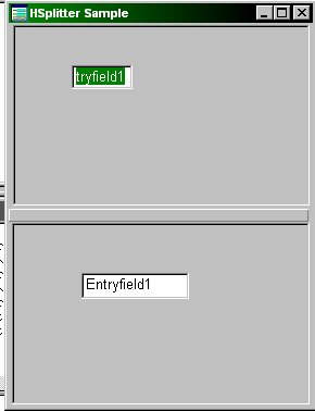 Splitter Control Just Opened |
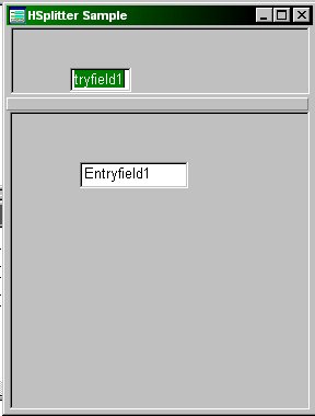 Splitter Control Moved Up |
Form Viewer
The Form Viewer class is used specifically for the purpose of viewing forms -- note
that the form displayed is not actually running in an interactive way. This is not
the same thing as subforms, either -- that's a totally different topic.
This class is used in the new Project Manager in dBASE Plus, but if you need to use it, it's available for use in your own applications. The control is in the dBLClasses\FormControls folder, and can be accessed using the :FormControls: source alias:
set procedure to :FormControls:FormViewer.cc additive
Once you have done that, the next time you design a form, the control will appear on the Component Palette's custom tab as a container object.
To display a form, you use the class's method: Display( cFormName ), where "cFormName" is the name of the form file (formname.wfm or formname.cfm) that you want to display.
For example, in a form's onOpen event, you could decide to display the test calendar form that comes with this document. To do so (assuming the same folder that the form is in), you could place a formViewer control on a form, and then go to the inspector and make sure you've selected the form itself, and select the form's onOpen event, then enter:
{; form.formViewer1.display("TestCalendar.wfm") }
When you run the form, you will see that the TestCalendar form appears, but it is not running -- you cannot interact with it.
You can close the currently displayed form by using the control's closeCurrentForm method (form.formviewer1.closeCurrentForm()).
Reports
The following control is the only custom control currently available for
reports (that ships with dBASE).
Pagenumber
The PageNumber control can be used to display text that is updated as
you navigate through a report (which includes printing).
When you design a report, the "Custom" or "Report Controls" tab of the Component Palette should have a text control that shows a number 1 icon. If it does not, go to the command window, and if you are using dBASE Plus, type:
set procedure to :ReportControls:report.cc additive
If you are using dB2K use:
set procedure to :classes:report.cc additive
In either case, click back on the report design surface, and continue.
To use it, simply drag this control to the place on the report you need to use it. There is no setup, unless you want to change the font or color properties of the text.
It is suggested that you drag the control to the pageTemplate (the white grid of dots), rather than the streamFrame (the yellow grid of dots), as it's really designed to be used on the pageTemplate, and you could confuse the issue if you place it on the streamFrame.
Thanks
To the folk who helped me ensure this information is correct and useful. These folk read the paper and tested the code and gave me feedback to make it all that much better: Dan Howard, Michael Joyce, Martin Kay (dBASE R&D), Michael Nuwer, John Staub, Barbara Betcher, and Paul Franks.
DISCLAIMER: the author is an employee of dBASE, Inc., but has written this on his own time. If you have questions regarding this .HOW document, or about dBASE you can communicate directly with the author and dBVIPS in the appropriate newsgroups on the internet.HOW TO files are created as a free service by members of dBVIPS and dBASE, Inc. employees to help users learn to use dBASE more effectively. They are edited by both dBVIPS members and dBASE, Inc. Technical Support (to ensure quality). This HOW TO file MAY NOT BE POSTED ELSEWHERE without the explicit permission of the author, who retains all rights to the document.
Copyright 2002, Kenneth J. Mayer. All rights reserved.
Information about dBASE, Inc. can be found at:
http://www.dbase.com
EoHT: ShippingCustomClasses.HTM -- October, 2002 -- KJM