
Developing a Database Application:
The dBASE PlusTutorial
Ken Mayer, Senior SQA Engineer, dBASE Inc.
Michael Nuwer, dBASE user
|
Developing a Database Application:
|
|
Creating Custom Components |
Goals and Objectives
The goals of phase IV of this tutorial are:
Let's begin with a control. Controls are the objects that appear on the Graphical User Interface. They sit on top the form or report and control functionality. There are several different kinds of controls. Command buttons, entryfields, listboxes and comboboxes are familiar to all Windows users. Each type of control has a different visual appearance and a different purpose. Moreover each control has a set of properties that define its characteristics, a set of events that it can respond to, and a set of methods that define its actions.
In the previous Phase of this tutorial, we introduced the idea of creating and using a custom class. A Class is a definition of an object -- it stores within its definition all of the properties,events and methods associated with the object (this is, by the way, 'encapsulation'). A Custom Class is a developer defined class, based on one of the classes built-in to dBASE Plus. A Custom Class definition is usually stored in an ASCII file, and uses the extension ".CC" (although this is not necessary, dBASE Plus knows what to look for if you use that extension.).
The primary reason you should use Custom Classes is that you will be able to make a single change in one location in your code which is passed along to all the objects based on this class. The next time you load a form the change will take effect, and every object that is subclassed from the custom classes in this file will inherit those changes. This is where the true power of custom classes comes from!
For example, your customer decides that he wants all text controls on every form in your application to use a different font than the default "Arial", and he wants the fontsize to be 12, because his eyes are going. If you have a single custom text control that you have used on all your forms, the changes can be made in your custom control file. If you do not do this, then you will have to go through each form either by code, or in the designer, and make the changes.
The same can be said for other properties -- colors, mouse pointers, and more. In addition, if you decide to attach code to events for some of your controls, you can change the behavior in one place, rather than trying to do it in every single instance of a specific control.
A secondary reason to use custom controls for every control you use on a form is that you make your application's appearance more uniform. If you always use instances of the same text control, the same entryfields, the same notebook controls, and so on through out the application, you have consistency that you won't necessarily get (by design or by accident) if you do not use custom controls.
The tutorial application is going to use many controls on it's forms and reports. This means we need to create our own set of Custom Classes. When it comes time to develop other applications you will not need to create your custom classes from scratch because you will already have a file to start with. You will only need to add the file we are about to create to the new project. But this is a tutorial and one important thing to learn is how to create your custom controls from scratch.
The tutorial application will require 15 custom controls. Most of these controls will be derived from built-in controls and include a custom title, label, entryfield, combobox, spinbox, image, grid, container, radiobutton, pushbutton and tabbox. We will also need to create a custom tool bar which contains a set of buttons for data entry purposes.
The instructions for creating the custom controls in this document will not include complete steps for each control. The first few times a custom control is created the steps are quite complete. Then the steps are only for what applies to the control currently being created. "After all," as Barbara Betcher reminds us, we "have to learn how to do this and if the tutorial tells every single step every time [we're] not really learning."Every control will have a name. Most of the events are entered as codeblocks but if you enter then as a method that's okay. You should save your work after each new control is created, and every control must be saved as a custom control.
The simplest method of creating a visual custom control is to bring up a new form, and design the control on the form. After you have designed the custom controls, you can save the form -- this will allow you to change the custom control visually.
Now we will create a new form for designing the custom controls. Go to the navigator, and select the "Forms" tab. There are several "Untitled" icons -- the one that is green and blue is the one we want (if you right-click on it with the mouse, it will show "New Form" in the popup). Double-click on that icon. You will be placed in the "forms designer". If you are asked if you want to use the Wizard or the Designer select Designer. As noted elsewhere, for the Tutorial, always use the Designer unless told otherwise.
Along with the new form surface, you should see the Component palette and the Inspector.
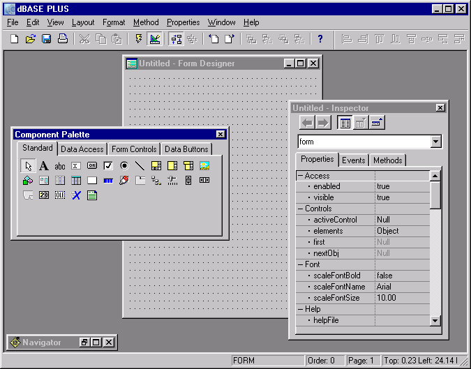
Note: If you do not see a "Component Palette" -- a floating window on screen with this text in the title bar -- you should right-click on the design surface, and select "Component Palette" from the menu. If you do not see the Inspector (another floating window), you can do the same, or press <F11> to get it to appear. You will need both of these in all of the design surfaces we will be working in for this project.If one of these tools (Component Palette or Inspector) is simply not visible (i.e., the designer surface is over it, or one of the other tools is over it), you can use the "Window" menu in the dBASE Plus menu at the top of the screen and select the one you want.
Preference Issue: There are a lot of options in the dBASE Plus development environment, one of which has to do with the way the components are displayed on the Component Palette. If you right click on the Component Palette, there is a "Customize Tool Windows" option. You can select this and change the way the items appear here. You may want to experiment with the options here, including the two: "Image with text below" and "Image with text to the right". Note that this will carry over to the other design surfaces (Forms, Reports) and may be useful when we get to working with custom controls (of which there are quite a few). However, this is all a matter of preferences. Ken prefers to view just the image and use the speedTip to let me know which control is which, while Michael prefers images with text to thier right. It's up to you! You can always change it later.
All of our custom classes will be created on this form. The first control will be an enteryfield. The Entryfield control is the most basic of the data entry controls. Nearly all forms that deal with data entry use entryfields for a lot of the data.
Go to the Component Palette and select the "Standard" tab. The controls on this page are the dBASE Plus built-in controls, and this is the only time we will use these controls. Click the EntryField control and drag it onto the form.
We have found that we always make specific settings for our entryfields. These settings include, for example, the color when the field is highlighted. You should set these "base" or personalized properties now. While the EntryField is selected, switch to the Inspector.
On the properties tab, find name. The name property is very handy when working with any of these controls. When you place any control directly on the form from the component palette, it is given the useful name of "classnameN" where "classname" is the name of the class (i.e., Entryfield), and "N" is a number (i.e., 1). So the first entryfield you place onto a form from the component palette would be named: Entryfield1. This is not the most useful name you could have.
Therefore, it is a good idea to use descriptive names for your controls, because otherwise, particularly on a complex form, it will get very difficult to know which object is which.
Click on the "name" row in the inspector, and type MYENTRYFIELD in the space to the right. Be sure to press the "Enter" key (or use the up or down arrow key), otherwise the change will not take affect.
Next find the selectAll property. Set this to false. With this setting the full text will not be selected when a user tabs into the enteryfield.
The next property to modify is value. Set this to "MyEntryField". The value property is set to some arbitrary value so that when you place this entryfield onto a form you know that it's not the standard entryfield (which says "ENTRYFIELD1" in the value). When you actually datalink this to a field in the table, the value property will change the value of the actual field. Setting the value property is only for design purposes.
We also want to set the colorHighLight. In this case, click on the colorHighLight property in the inspector, then click the wrench at the far right. A color selector dialog form will appear. Notice at the top of the dialog you can change the foreground and background colors. Click the foreground radio button and enter "White" in the entryfield. Then click the background radiobutton and enter "Blue" in the entryfield. Click "OK".
Finally, select the Event tab on the inspector and find onGotFocus. Click the right most icon, the one with the "T", and select codeblock from the dropdown list. Type this.keyboard( "{Home}" ) in the field (overtyping the default text). This codeblock will execute when the entryfield gains focus. It simply ensures that the cursor goes to the beginning of the text.
At this point let's save the form. Press <Ctrl>+S and enter "CustomControls.wfm" as the file name.
Before we create additional controls on our CustomControls form, let's convert this form object into a custom class. The idea is that we will create various objects and change their properties and events in the CustomControls form. After the controls are customized for our application, we will export the control to a CC file. We will export the entryfield control now, then return to create the other controls that will be used in the application.
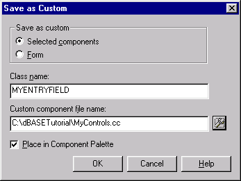
Make sure that the entryfield is highlighted on the form designer, then go to the file menu and select "Save as Custom ...". A dialog form will come up. The class name should already be filled in as "MYENTRYFIELD". This is the name we assigned to the control. In the "Custom Component file name" field, enter c:\dBASEtutorial\MyControls.cc. You should make sure that the "Selected components" radiobutton is selected and that the "Place in Component Palette" checkbox is selected. Click "OK."
You will see that a new file called MyControls.cc has been created. If you open that file in the Source Editor, you will see the code for the new entryfield class.
For some reason there are times when a newly created custom control does not appear in the Component Palette, even though the "Place in Component Palette" checkbox is selected. This tends to occur most often with subclassed controls (i.e. controls based on other custom controls). If you find that a custom control is not placed in the Component Palette, and you're sure you have exported it, there are a couple of option to try.First switch to the command window and type the following commands:
   compile mycontrols.cc
   set procedure to mycontrols.cc additive
(Don't forget the key word "additive" in the second line!)
If this doesn't work, you should close, and then restart, dBASE Plus.
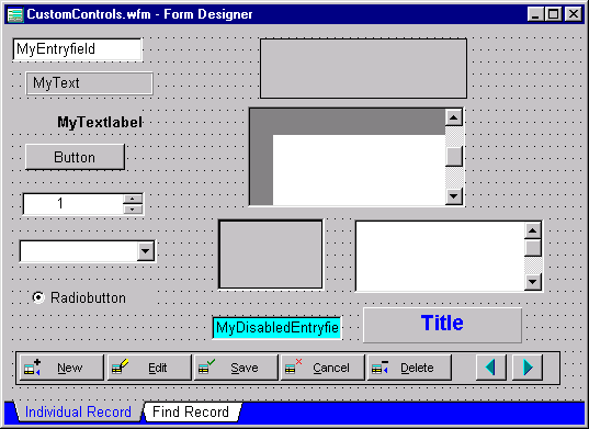
As we continue adding and customizing controls with our custom control's form, it will look similar to the following image. You can use this image as a guide for creating the additional controls.
Text
The text control is a highly flexible, very versatile control. It will
evaluate HTML tags, rotate text, maybe even sing and dance. It can be used
on forms to display text and, because it can evaluate codeblocks, it can
be used on reports to display field data. The price for all this
power is that there is a significant amount of baggage that gets dragged
along with a text object, whether you choose to use it or not. This,
in most cases, will not be significant. However, large, complex forms or
reports that contain a lot of text objects will, in all likelihood, see
performance degradation.
For our application a text control will be used to display a title on our forms; to display a message on the About form; and to display field information on the reports. Here we will create a basic text control that will be used on the About form.
Drag a text control from the component palette onto the custom controls form. Use the inspector to find the name property and enter MYTEXT.
The text property will be "MyText" which is merely the default.
In addition set the borderStyle property to 10 - Etched Out
Save the updated form. Then export this component to the MyControls.cc file.
TextLabel
The textLabel control is one of the most often used controls in dBASE Plus. It is usually placed next to some other control to give the user a visual
cue what the field is or to give some other definition to what's happening
on the form.
The textLabel is a limited version of the text control which makes it a leaner text control that uses less resources. Unless you need the extra abilities of the text control, you should use a textLabel instead.
To create a custom TextLabel, drag a standard TextLabel from the component Palette onto the form surface. In the Inspector, change the name of the control to MYTEXTLABEL and change the text to MyTextlabel. There are a few additional properties that we want to set. First, set alignHorizontal to 2-Right which will right align the text for all our labels and, second, set the font so that it is bold face (fontBold=true).
Finally, we will change transparent to true. The transparent property is for those controls with text. If this is set to 'true', the background of the form will show and you only have to define the foreground color of the text. The background will default to that of the form and, if the form has a background image, that will show through as well.
Save the updated form (File|Save or Ctrl+S). Then export this component to the MyControls.cc file (be sure the control is selected).
PushButton
The pushbutton is a control used to give the user a method of interacting
with the form. Pushbuttons are often used to navigate in a rowset, place
the user in edit or append modes, to save or cancel changes to a rowset,
delete rows, exit forms, and much much more.
In dBASE Plus a pushbutton can display text or an image or both. The disabledBitmap, downBitmap, focusBitmap, and upBitmap properties are used to set images for each of the button's states. You will find images in RESOURCE.DLL or you can use .BMP images for your buttons.
The text property is what it sounds like -- you can display text on a pushbutton. You can display text and an image on a pushbutton. It all depends on how you want your form to look. Note that if you use an ampersand (&) in the text, you will be creating an accelerator key for the button.
The onClick event is the one used the most with pushbuttons, which fires when the user clicks it with the mouse.
Pushbuttons are used everywhere in forms, and we will be using them in our application. They are, for the most part pretty straight-forward.
Our custom pushbutton will not need many custom properties. Use MyPushButton for the name and "Button" for the text. And just for fun set the mousePointer to 13-Hand.
SpinBox
The spinbox control is really just an entryfield with a couple of pushbuttons
added to the right. It is used for numeric or date values, to increment
or decrement the values by using the buttons (which show up/down arrowheads).
The spinbox has all the characteristics of the entryfield, and the following
as well:
The rangeMax, rangeMin, rangeRequired properties are used to set a
top/lower value and to enforce that value -- i.e., if the rangeRequired
property is set to "true" the user cannot move past the rangeMin or rangeMax
values or enter a value outside that range.
In addition, there is the spinOnly property -- this can be used to enforce the use of the buttons, and ONLY the buttons by the user -- they cannot enter a value by typing it if this is set to true.
The step property is used to set the value the pushbuttons increment/decrement the value of the spinbox. The default for this is 1, but it can be changed to something else.
Place a standard spinBox onto the custom controls form. The name should be changed to MYSPINBOX. And the following additional properties should be set:
ComboBox
The Combobox may seem like it's related to the listbox, but it's really related
more to the entryfield. It is an entryfield object with a pushbutton used to
"drop down" a list of selections. The source of information for the items listed
in the drop down list is the dataSource property.
The most common dataSource options are arrays and fields.
The combobox control can be quite useful for a lot of different situations, and can be automatically used with a lookupSQL property. Recall that we defined a few of these when we created the datamodules. When we build our application's forms, we will use a combobox to display the items list of the lookupSQL fields.
The style property is used to define which style combobox to use. The default is "1 - DropDown", which means that the user must click the button to cause the list to drop. The style property can be set to "0 - Simple" which means that the drop down list appears automatically. You can set it to "2 - DropDownList" which means that a) the user must click the button to see the list and b) the user cannot enter a value into the entryfield portion of the combobox. In other words, the user is restricted to using items in the list. This option is useful for controlling a predefined list of valid entries that can be put into the field.
The dataSource is not dynamic -- once the dataSource is loaded into memory, it does not get updated -- if changes are made to the table you are using the field from, it is not automatically refreshed in the combobox. You can, however reassert the datasource:
form.combobox1.dataSource += ""
The code above (using your own combobox name appropriately) will cause the datasource to be re-evaluated (the actual dataSource reference is contained in the property, adding a null character string will force the reassertion).
Place a standard combobox onto the custom controls forms. Change the name to MYCOMBOBOX. The Comboboxes that will be used in our tutorial application will have a dataSource set to a table field. Therefore we will set the style to 2 - DropDownList, so that the user is restricted to items that are in the list. In addition we want to change autodrop so that it is true. Otherwise we will use default properties.
The Combobox does not have a colorHighlight property. Therefore we will simulate this property by modifying the colorNormal when the combobox gets focus. In the inspector add the following two event handlers to the onGotFocus and onLostFocus events:
 function combobox_onGotFocus
    this.colorNormal = "White/Blue"
    return

 function combobox_onLostFocus
    this.colorNormal = "WindowText/Window"
    return
An Issue That Comes Up With Comboboxes ...
There are times when the combobox appears to be active even when it isn't. The user can select a value, and have it appear as if this value was changed in the rowset, until the user navigates off the row and back, or goes into actual edit mode (or performs any other action which causes a notification to the datalinked controls of the values in the fields).This can be a bit disconcerting. However, Gary White has provided the following work around for this problem. It requires that you hook the following code into the onGotFocus and onChange events for the combobox:
   function combobox_onGotFocus
      this.colorNormal = "White/Blue"
      this.savedValue = this.value
   return
and in the onChange event:
   function combobox_onChange
      // this = combobox
      // datalink = field
      // parent = field array
      // parent = rowset
      if this.datalink.parent.parent.state == 1
         this.value = this.savedValue
         this.datalink.parent.parent.modified = false
         this.datalink.parent.parent.abandon()
      endif
   return
Note that for this to work, you must use both of these events. (You can also add more code in the onChange, you just want to keep that code ... maybe add a 'return' before the endif statement).
RadioButton
The radiobutton control often confuses people -- this is because the
value property returns a logical (true/false) value, but what is stored
in the field of the table is the TEXT property of this control.
The purpose of radiobutton controls is to present the user with a limited set of choices for a character field. A really simple example would be setting ice cream flavors, and you only had three: Chocolate, Vanilla or Strawberry. By setting three radioButtons onto a form with the text reading "Chocolate" for the first, "Vanilla" for the second, and "Strawberry" for the third, and datalinking all three of these radioButtons to the same field, the user will only be allowed one of those three choices.
For radioButtons to work together you must use the group property for the first radioButton -- set it to true (if not done for you by the designer). And you must make sure no other controls appear in the "Z-Order" between the radiobuttons. (The "Z-Order" is the sequence the events are defined in the form's constructor code. You can modify this in the designer through the layout menu, and in the source code directly by cutting and pasting code appropriately.) If you follow this tip you should not have problems with your radiobutton controls behaving properly.
Place a standard radiobutton onto the custom controls form. Our custom radioButton will have the name (you guessed it): MYRADIOBUTTON. The transparent property should be true. Also set the group and value properties to false. This is needed because we are creating a custom class. If the group and value properties are true in our custom class, they will also be true when they get placed on a form. This would mean that all our radiobuttons will be true and they will not work together as one unit.
Note: When our custom radiobutton is place on a form, the form designer will automatically change the first button's group and value property to true. You shouldn't need to do this. If you then place a second radiobutton immediately following the first, the designer will leave the two properties false.
Container
The container object is a very useful class and you should be using it in your
applications. This particular control is great for several purposes -- one is
to group a set of controls together -- by placing them onto a container, those
controls can be moved around the form all in the same exact relationship to
each other, and you do not have to worry about it. Another purpose is to create
your own set of custom controls -- perhaps a set of controls that you will re-use
on several forms. In fact we will do this when we create a custom tool bar for
our application.
Drag a container from the Standard page of the component pallet. Change the name to MyContainer. Make the transparent property true and set the boarderStyle to 4 - Single.
Grid
The grid object is one of the most amazing controls included with dBASE Plus.
A grid can be used to display data in a tabular format and is a very powerful
tool for working with parent-child data relationships. The grids that we will
use in this tutorial are intended for displaying or reading data. We will not
let the user edit data in a grid. Therefore our custom grid control will use
properties that make it a read-only control.
Place a standard grid onto our custom controls form. Change the name property to MyGrid and modify the following properties:
Our custom grid does not have a datalink, and therefore we cannot set any of the column properties at this time.
TabBox
The Tabbox control is usually thought of as something used specifically
to change pages of a multi-page form, but it is actually quite flexible.
The default placement of a tabbox on a form is to anchor it to the bottom
-- you can, however, anchor a tabbox elsewhere, and indeed, set it with
no anchor at all, and place it where you will on the form.
The curSel property is what is used to determine which tab of the tabbox has been clicked.
The onSelChange event is fired every time the user clicks on a tab and changes the active tab to a new one. This can be used in a multipage form to change the page of the form:
form.pageNo := this.curSel
In the tutorial application, each data form will use a tab box that lets the user switch between a page containing details about the individual record and a page containing a grid that can be used to find a record. We will start by setting the following properties of the custom tab box:
To add the dataSource, you can type the text directly into the inspector or you can use the DateSource Property Builder. To use the latter tool, click the wrench associated with the dataSource property. When the DataSource Property Builder pops up, you will notice that the "Type" of the data source is an array and the array elements are the "Data source".
The DataSouce Property Builder can be used for any control that has a dataSouce, like a combobox or a listbox. In the case of the tabbox the dataSource type is limited to an array. Other controls, however, can have dataSource types other than an array, like, for example, a field from a table.
We will use this dialog to change the array elements of the Data source. Click the wrench button on this dialog form. The Build Array dialog form appears. First click the delete button to remove "Tabbox1" from the array. Then in the "String" entryfield type "Individual Record" and click Add. Next type "Find Record" and click Add again. We need only these two tabs for our tabbox, so click OK to close the Build Array dialog and in the DataSouce Property Builder click OK to close this form.
In addition we need to add code for two methods. First, add an onOpen method for the tabbox. Enter the following code:
   this.curSel := 1
   form.pageNo := 1
Next add an OnSelChange method. This fires each time the tabbox is changed. We will use this event to activate the necessary page of the form.
form.pageNo := this.curSel
Image
Image controls are used to display images on forms. These are not images
that can be modified by your users.
The dataSource property is used to determine where the image "comes from". You can get the image from a resource file (a .DLL), from a file, or from a field in a table -- the confusing factor with the field is that the inspector shows "BINARY" as the option -- it refers to a binary FIELD.
The alignment property is used to determine how to display the image. If you use the default "0 - Stretch" it means that the image will be stretched to fit within the height and width of the control. This can create some very interesting effects. You can force the image to the top left of the control, to use the "aspect ratio" meaning no matter what the size, it will not be distorted, to center within the image control, or to use "True Size" (which can make for some interesting effects as well, if the image's true size is huge).
Editor
The editor control is used for large quantities of text and is most often datalinked
to a memo field. One of the frustrating things with editor controls is that
there's no colorHighlight property. So, we will make it act as if there were
by changing the colorNormal. In addition the editor has a hand popup that allows
simple formatting of the text in the control. This feature will be turned off
for our application.
The editor control may ignore the rowset's autoEdit property, which can be a bit disconcerting and frustrating. Therefore we will add the following code to the editor control's key event, so to avoid this particular problem:
   function MYEDITOR_key(nChar, nPosition,bShift,bControl)
      /*
      This code by Gary White is provided to
      get around a problem with rowsets that
      have the autoEdit property set to false,
      and editors. The editor seems to be immune
      to this property once you make a change
      in it -- if you then save or abandon, you
      can actually edit the contents of the editor
      object ...
      */
      // this = editor
      // dataLink = field
      // parent = fieldArray
      // parent = rowset
      if type( "this.datalink.parent.parent" ) # "U"
         r = this.datalink.parent.parent
         if r.autoEdit == false and ;
            ( r.state # 2 and r.state # 3 )
            return 0
         endif
      endif
The next two controls are going to be subclassed from controls we created above. First we will create a special version of the entryfield which will be a disabled entryfield; and second we will create a special version of the text control which will work as a title for our forms.
A Disabled EntryField
A disabled entryfield control
is used to display information only. One use might be on a multiple
page form, where you may only want the user to change the data on one page,
but display more data for that record on multiple pages (or child records
from a different table associated with a parent record, which is what I
use this for).
You can create a subclassed control by using the custom controls form, however, do not begin by dragging a standard entryfield onto the form. Instead, click the custom tab on the Component Pallet and locate the "MyEntryField" control. (If this control is not on the Component Pallet, switch to the Command Window and type "set procedure to mycontrols.cc additive".)
Drag this control onto the form and change the name to MyDisabledEntryField.
MyDisabledEntryField is derived from the MyEntryfield class which means that it inherits any properties that are set in the MyEntryfield class, but also includes any changes given in this "subclass".
One method of disabling an entryfield is by setting the enabled property to false, however, the colors would not be what we wanted, and the mousePointer would not change (since the field is disabled). To get around this, we will use the when event set to "return false" -- this does the same as setting the enabled property to false but the colors do not get changed by Windows (this is default behavior and not really changeable).
In addition we should change the colorNormal to "WindowText/cyan" so that this entryfield looks different than the normal entryfield. And set the mousePointer property to 12-no (the universal "no" symbol), which is a nice visual to the user when the mouse is over the entryfield that tells them this is a non-editable field.
The Title Control
All of the forms in our appliction will use a text control to display the form's
title. This control will be subclassed from the MyText control that we created
earler.
Drag a MyText control from the Custom tab of the Component Palette onto the custom controls form. Use the inspector to find the name property and change it to MYTITLETEXT.
The text property will be "Title" which is merely a default. This will be overridden on each form where the control is used.
In addition set the following properties for this control:
Everyone who has worked with dBASE for a long time has discovered that the container class is very useful and powerful.
We will use the container to create a toolbar that contains buttons for interacting with the data and for navigating the rowset. These pushbuttons will be placed within a container object and will function as a single control when placed on a form. To begin, we need to place a standard container object on our CustomControls form. The location of this container does not matter because we will soon be exporting it to our custom component file. Change the following properties of the container:
Now that we have the toolbar's container, we need to have some pushbuttons that allow us to edit rows, add rows, delete rows, save changes, and abandon changes. Sound like a tall order? Well, not that tall, but there are a variety of new things to learn.
The first thing we need to note is that by default, a form's rowset is in "edit" mode -- meaning that when a user clicks on a field and types something, they are editing the data. This could mean that a user might accidentally change something that they didn't want to.
What's worse is that if they close the form at this point, the changes made to the row will be saved. If they click on a navigation button, the changes will be saved. So, what can we do?
The solution is to set the rowset's autoEdit to false.
Of course, we will want to allow the user to edit a row, otherwise what's the point? So we will use a button to put the rowset into edit mode. However, we'll start with a button to allow the user to add a new row to the table.
On the "Custom" page of the Component palette, you will see the custom controls that you created earlier. If you are not sure what one is, place the mouse over it, and a speedtip will appear, telling you what the object is. We want a MyPushbutton -- click on the object and drag it to the MyToolBar container.
When we created the buttons used in this toolbar, we used 1.09 for the "height", 0.0909 for the "top" and 11 for the "width" properties.
The text property of your button defaults to the name of the object, which is "MyPushbutton1" -- we are going to change the name of the button, as well as the text, because if you have a lot of pushbuttons, it gets confusing working with them if they are simply "MyPushbutton1", "MyPushbutton23", etc.
So, with the pushbutton having focus (if it doesn't, click on it), go to the inspector, and find the property "Name" -- it will be under the category "Identification". Click on the property, and on the right side, type "PBNEW" and press the <Enter> key.
Next, find the "text" property, which will be under the "Miscellaneous" category. Click on "text" and enter "&New" and press <Enter>.
You should see the text on the pushbutton change to "New" on the form.
Change the fontSize to 8.
We need to put an image on the button, using the Inspector go to the upBitmap property, and click on the tool button. This will bring up a new dialog.
In the "Location" combobox, select "Resource", and then click on the tool button to the right. Select, in the resource dialog, the button "TS_APPEND", and click "OK".
In the inspector once again, select the speedTip property, and type: "Add a new record" (and press <Enter>).
Now, at this point in time, the pushbutton will not do anything when the user clicks on it, so we must add some code to the button. The code for this button will be pretty simple, but the question is, where do we assign the code?
Look at the inspector -- you should see an "Events" tab -- click on this. When you do, you should see a set of "Events" -- you can assign code to any of these events. It just so happens, with pushbuttons, that the first event listed is the one we want to use to assign code when the user clicks the button with their mouse.
Click on the "onClick" event. Where it says "Null" you should also see two small buttons, one shows the end of a wrench, the other shows a "T" for "Type". We want to use the wrench (or tool). Click on this, and you will see a small editor window, with the following:
   function PBNEW_onClick

      return
Type the following line into this function:
form.rowset.beginAppend()
When a user clicks this button, the form will clear -- all objects that are "datalinked" will suddenly be empty, so that the user can add new data to a new row.
What you (or the user) have done at this point is created a blank row -- it is not real, however, until the user saves the row. Until they save it, the new row is in what is called a "buffer". The buffer is important, both here and in editing mode. The user can save the row by using a "save" button (that calls the save() method of the rowset), or by navigating in the rowset (using the buttons we created earlier) ... either way, the row will be saved.
Another effect of the user clicking on the "New" button is that there is a property of the rowset called state that gets changed. We will take a look at the state property later.
Since we are going to export the entire MyToolbar container as a single control, we do not need to export the New button at this time.
Edit Row Button
We need to add the "Edit" button, so do the following steps:
Enter code like the following:
   function PBEDIT_onClick
      form.rowset.beginEdit()
      return
The beginEdit() method of the rowset allows the user to modify the copy of the row -- the user is not editing the actual data -- as soon as the row is saved, the copy in the buffer is written back to the actual row making the changes in the table. This is important, because there is an abandon() method (which we will see soon) that allows the user to abandon their changes to the row.
Like with the "New" button, clicking this button (or running the code) sets the rowset into a special "state" (again we'll look at the state property later). In addition, if the user changes the row in any way, we set a property of the rowset called modified to true (it defaults to false). This property can be quite useful, and we'll come back to it later.
Save Row Button
We need to add the "Save" button, so do the following steps:
Enter code like the following:
 function PBSAVE_onClick
 form.rowset.save()
 return
Abandon Changes Button
We need to add the "Cancel" button, so do the following steps:
When abandoning changes, you may want to ask the user first ... if adding a new row, abandoning would release the new row in the buffer. If editing a row, abandoning changes the copy of the row in the buffer back to what the row looked like before editing the row. A person may have done some real work to get all the data just right, and accidentally hitting the abandon button could wipe all that out.
Enter code like the following:
   function PBCANCEL_onClick
      if form.rowset.modified
	     if msgbox( "Abandon changes to this row?", "Abandon changes?", 36 ) == 6
		    form.rowset.abandon()
		 endif
	   else
         form.rowset.abandon()
	   endif
       return
Delete Row Button
We need to add the "Delete" button, so do the following steps:
The problem with deleting a row in a table in dBASE Plus, using the OODML (as we are doing here) is that the row is not easily recoverable. To all intents and purposes, it is completely gone. You may want to ask the user if they really want to delete the row by adding a quick dialog box that asks. If the user clicks the "Yes" pushbutton, then go ahead and delete the row.
   function PBDELETE_onClick
      if msgbox( "Delete this row?", "Delete Row?", 36 ) == 6
         form.rowset.delete()
      endif
      return
The Navigation Buttons
The last two buttons will be used to navigate through the rowset.
Pushbuttons are the standard Windows method of navigating through a table.
What are the standard navigation buttons? Well, you need to be able to
step through a table row by row, so you need "Next" and "Previous" buttons.
Many applications also use buttons to go to the top of the table and to
the end of the table (first row/last row), but the tutorial application
will not include this feature.
First, we will add two MyButtons. Place the first one near the "Delete" button and set it's "width" 4. The name for this button will be "PBPrev". Place a second MyButton to right of this PBPrev. It's "width" is also 4 and it's name will be PBNext.
The "Next" Button Let's work with PBNext first.
Now we get to the more interesting part of this. The code can be very simple, and we will do the simple version first.
Enter the code:
form.rowset.next()
In the editor, so that your onClick event code looks like:
   function PBNEXT_onClick
      form.rowset.next()
      return
There is, however, a problem with this function. When the row pointer is at the "end of rowset" a blank row will be displayed in the form. We don't really want our users to see this because they might think this is a valid row, and try to enter data ... this won't do at ALL!
So, how do we deal with it? How do we, rather than display the "end of rowset" display an error message for the user? We need to modify the code, obviously.
The next() method of the rowset object returns a logical value (true or false) -- if next() is successful, the method returns the value "true", if it wasn't we return the value "false". We can check for that in our code ... if we get a "false" value, we don't want to be at the end of rowset (endOfSet -- we'll look at this later), so we want to tell the user that they cannot continue, and display a message.
What we want to do is to try to navigate using the next() method of the rowset, and if the method returns "false", it means we hit the "end of rowset", so we need to back up one row (we can do this using the next() method, and use the optional parameter for the number of rows to navigate, in this case we will use "-1" -- the negative sign means to go backward). We will then display a message to the user that says we can't do this. The code is actually fairly simple:
   if ( not form.rowset.next() )
      form.rowset.next( -1 )
      msgbox( "At end of rowset", "Can't Navigate", 64 )
   endif
For details on the use of the msgbox() function, see online help -- it gives a lot of detail.
The "Previous" Button
Now we will work with the PBPrev button.
Enter code like the following:
   function PBPrev_onClick
      if ( not form.rowset.next(-1) )
         form.rowset.next()
         msgbox( "At beginning of rowset", "Can't Navigate", 64 )
      endif
      return
Note that this code is almost, but not quite, identical to that used for the "Next" button ... it works very much the same, except we are going in the opposite direction. The "if" statement checks to see if we can navigate "backward" (if you will) through the rowset, and so on.
That should do it for our custom tool bar. We now have an object (a container object) that has five data access buttons and two data navigation buttons. These buttons also have code which will execute on a form's default rowset.
Save the updated custom controls form. To export this component to the MyControls.cc you need to select the container. This container and all the object it contains will be exported as a single control.
There is one last thing that we need to do before we can use our newly created custom controls. Open MyControls.cc in the Source Editor and look at one of the Class declaration lines. The MyEntryField class looks like this:
class MYENTRYFIELD(parentObj, name) of ENTRYFIELD(parentObj, name) custom
You will notice that each class has two parameters: "parentObj" and "name". For reasons that are byond the scope to this tutorial, we do not want to use the "name" parameter. The general rule about costom classes is do not include the "name" paramater in your custom class unless you are actually passing the name to the class. When we build our forms in the next part of this tutorial, we will not pass the "name" paramater, so we need to remove the parameter here.
This is actually easy and quick to do. You should still have MyControls.cc open in the Source Editor. Click the "Replace Text..." button on the toolbar. In the "find what" entryfield dialog enter ", name)" without the quote marks (that is: comma + space + the word "name" + a right parenthesis). In the "Replace with" field enter ")". Then you can click the "Replace All" button (or if you're a bit cautious like me, click "Find Next" and "Replace" until it has found all the occourances of the string).
Save this file and it's ready to use with the forms.
In this phase of the tutorial, we have create a number of custom controls that can be used on our application's forms. The advantage of using custom controls, which you may have noticed requires a good deal of "up front" work, is that if you wanted to change a property or the behavior of a control for all of your forms that use it, you could change it in the custom class definition. Any forms that use this control will automatically get the new property or behavior.
Another advantage of using custom controls is that the next time you need to do this layout, all you have to do is reuse this custom control file (MyControls.cc, that is). The controls are already laid out and tested (we will test the controls in the next phase by using them on our tutorial forms).
This brings up an issue about modifying the properties of a control that you have created. Developers who are comfortable with editing properties in a Source Editor can open MyControls.cc and directly make their change. Others who are less comfortable working with controls and properties may wish to use CustomControls.wfm and the form designer to make their changes. If one does make changes in the form, the control will need to be exported again (the name parameter should also be removed after the export), and MyContols.cc should be recompiled.
After you have completed this tutorial, you may want to look at some other custom control files. The first place to look is the file FORMCNTL.CC -- this file is a part of the dUFLP library which is found in the dBASE Knowledgebase. The library is freeware code, and you should, at some point, examine it. There are, for example, custom entryfields that handle dates (using some other routines that are not included here) -- when you leave the entryfield, they can check to see if the date entered is a holiday or non-working day and change it to a standard work day. The possibilities are virtually endless for this sort of thing. The complete dUFLP library has a wide variety of custom code that you can use or adapt for your own applications. The idea is "Why re-invent the wheel?". If someone else has already written code and is willing to share it, feel free to use it!
Last Modified: November 11, 2002
The Legal Stuff: This document is part of the dBASE Plus Tutorial created by Ken Mayer and Michael Nuwer. This material is copyright © 2002, by Ken Mayer and Michael Nuwer. dBASE Plus is copyrighted, trademarked, etc., by dBASE, Inc., the BDE (Borland Database Engine) and BDE Administrator are copyrighted, trademarked and all that by Borland, International. This document may not be posted elsewhere without the explicit permission of the authors, who retains all rights to the document.