
Developing a Database Application:
The dBASE PlusTutorial
Ken Mayer, Senior SQA Engineer, dBASE Inc.
Michael Nuwer, dBASE user
|
Developing a Database Application:
|
|
Creating The Forms |
The goals and objectives of Phase V of the tutorial project are:
Before Starting. If you haven't taken a break you may want to consider doing so now. The following section of the tutorial is pretty lengthy and will take some time. Take a breather -- walk away from it for awhile. The tutorial will still be here when you get back.
Note: Save often. While working on any form (custom or otherwise) you will want to save your work regularly by pressing <Ctrl>+S. The first time you do this, of course, you will need to provide a name for the file.
A Form is the basic "window" in "Windows". It can be used for a myriad of purposes. One of the many things a form is used for is to allow a user to interact with any Windows application.
This interaction can happen via dialog boxes (such as those called with the MsgBox() function in dBASE Plus, or any "File Open" dialog), or they can be designed to interact specifically with your data, which is what we will be concentrating on here (although we will create some dialog boxes as we go). In addition, you may have a form that simply displays to a user what is currently happening while some long process occurs. This application does not use this kind of processing, but many do.
The problem is that we could write a whole paper on working with forms in dBASE Plus and not cover everything in the detail it deserves. The purpose of this tutorial is to get you through the process of creating an application. There are a lot of things that there just isn't time to get into in depth here. See the recommended reading list for some HOW TO documents that cover a lot of the material we will be briefly touching on here.
Using Custom Controls
dBASE Plus has a lot of stock controls. However, using them "as is" means that
if your client/users want a change in the appearance or behavior of all the
controls of a specific type (say, an entryfield), then you have to modify every
form in your application. If, however, you use custom controls for everything
the change(s) can be made in your custom control definition and you will not
have to do more work than changing them once. The changes that can be effected
this way can be simple appearance issues (fontName, colorNormal, whatever),
or they can be complex code changes (onGotFocus).
It is a good idea to get into this habit, so we're going to do it in the tutorial.
The controls we will be using are ones that are in MyControls.cc which we created in the previous Phase. The options and code used in those controls have been intentionally kept simple for this Tutorial. You will find a more robust set of custom controls in the dBASE Users' Function Library Project (a library of freeware code). This library is contained on the dBASE Plus CD. The custom form controls are in the file named Formcntl.cc.
Briefly stated, a custom form is a form used to store some basic form definitions that are inherited by any forms that are "derived" from it. Any changes to the custom form will affect every form that is derived from it. This can be good (and it can be weird if you aren't paying attention). If, for example, you have a logo that is being used and the customer changes the logo, you do not have to modify every single form in your application that uses this logo, if you use a custom form -- change the logo on the custom form and all inherited forms will automatically show the new logo. You can change the background color of all forms in an application by changing it on a base custom form. You can change the behavior of all subclassed forms by changing some code. The possibilities are endless.
For our application we will create three custom forms. One will be as generic as possible, another will be used to design "dialog" forms, and the last will be specifically for working with the tables in the application. The second two will be derived from the first one, inheriting any properties and code we define in that custom form.
One thing you may notice is that we are sharing code between forms -- the idea is to reduce the amount of duplication of the same code throughout an application. By only writing the code in one location, we can call it from a variety of locations and use it -- this is object-oriented programming working here.
Before we begin, we need to configure the dBASE Plus development environment so that it will use the custom controls that we want to use. We will create a program file so that we can rerun it any time we exit and restart the tutorial project. Open Configure.prg in the source editor and uncomment the two lines following:
//  Setup custom controls for use with forms
set procedure to mycontrols.cc additive
set procedure to :FormControls:seeker.cc additive
Save this program files and run it.
Creating the "Base" Custom Form
Custom Forms are created by going to the navigator, and selecting the
"Forms" tab. There are several "Untitled" icons -- the one that is yellow
is the one we want (if you right-click on it with the mouse, it will show
"New Custom Form" in the popup). Double-click on that icon. You will be
placed in the "forms designer".
Note: If you are asked if you want to use the Wizard or the Designer. As noted elsewhere, for the Tutorial, always use the Designer unless told otherwise.
The first custom form is going to be a very simple one that we will call "Base". This one will be the base form that we use for every other form in the system. This form will also have some code that will be available throughout all of the forms that are derived from it.
Let's save it (even though you have not done anything with it) and give it a name now -- press <Ctrl>+S and enter "Base" as the form file name (dBASE Plus will assign the class name of the form. In this case it will be "BaseCForm").
In the component palette, click on the "Custom" tab, and place the mouse over the icons with the letter "A" on them (these are all text controls).
Find the text control that displays the text (on the speedTip -- hold the mouse over the controls until you see the speedTip appear with the name of the control) "MyTitleText", and drag it to the surface of the form (click and drag with the mouse). Set the anchor property of this control (in the inspector) to "2 - Top" so that it is always at the top of the form, and fills the whole top. Click on the text control itself (the text will shift to the left, and you can change it here, and type "BaseForm" -- do not press <Enter> here -- simply click elsewhere on the form designer surface. (Pressing enter while adding text to a text control will place a carriage return (actually the HTML <P> tag) in the text, which is not wanted in most cases).
Note: When entering text in a text control on a form, report, or label, you can do this by clicking on the control itself and setting the text, or you can use the inspector.If you do it directly on the form (as discussed above) do not press the <Enter> key unless you really want a line break in your text (which may be desirable for some situations, just not here).
If, however, you change the text in the inspector, you must use <Enter> or the up or down arrow keys for the inspector to save the change in the text.
Set the form's text property to "Base Form". Save the form (press <Ctrl>+S).
Go to the "Method" menu, and select "New Method ...". This will place you in the source editor for this new method.
We are going to place a method into the form that will be "unattached" to any specific event, but is useful none-the-less. It is used to repaint the form (in some cases, a form may not repaint properly - this forces it).
Change the statement "function Method" to "function Repaint", and add the code below (the "function" statement and the "RETURN" statement should already be there, but you will want to modify them so that they look like what is shown below):
   function Repaint
      parameter oForm
      if type( "oForm" ) == "U" or empty( oForm )
         oForm = form
      endif
      if type( "UpdateWindow" ) # "FP"
         extern CLOGICAL UpdateWindow( CHANDLE ) USER32
      endif
   RETURN UpdateWindow( oForm.hWnd )
This uses what is called the "Windows API" to do it's trick, and we're not going to spend any time on explaining that in this tutorial. (Briefly: there are times when a form that overlays another form blanks out the parts of the form under it that it covers. This method can be used to force a repaint of the form ... otherwise your application looks really sloppy!)
We are also going to add some code that will be necessary when we start hooking up the forms that are derived from this custom form to the menu. When a form gains focus we want the application to know that it is the current form (this will be needed for the 'close' menu option), and we will also want to null that reference out when the form loses focus (this is to avoid some possible errors).
In the inspector click on the onGotFocus event (this will mean clicking on the Events tab at the top of the inspector) and click the tool button. In the source editor window enter the following code:
   function form_onGotFocus
      // set application reference to this form:
      if type( "_app.framewin" ) # "U"
         _app.framewin.currentForm = this
      endif
      form.repaint()
   return
Now go to the form's onLostFocus event and set the following code:
   function form_onLostFocus
      // null out application's reference to this form:
      if type( "_app.framewin.currentForm" ) # "U"
         _app.framewin.currentForm := null
      endif
   return
In addition to this we need to add some code in the form's canClose event. In this event we need to keep the user from closing the form while a row is being added or edited (the row gets locked, and any attempt to re-edit it will cause the error "Row is locked, retrying lock ..."; the only way out of this is to close the application and restart). To avoid this we will use code to check the rowset state property, and if the row is being appended or edited, we will ask the user if they wish to save or abandon their changes, which will release the row lock. This code is created by going to the inspector, then clicking on the events tab. Click on the canClose event, and the tool button. Enter code like:
   function form_canClose
      // avoid closing the form in the wrong state
      // If we have a rowset on the form, we need
      // to check the state -- 2 = Edit, 3 = Append
      if form.rowset # NULL and;
         (form.rowset.state == 2 or form.rowset.state == 3)
         // if the row's been modified ...
         if form.rowset.modified
            nAnswer = msgbox("Save changes before leaving record?",;
                             "Data has changed",32+3)
            // check the answer returned by clicking a button
            // in the message box
            do case
               case nAnswer == 6
                  form.rowset.save()
               case nAnswer == 7
                  form.rowset.abandon()
               otherwise
                  return false
            endcase
         endif
      endif
   return true
The last event that we need to add to this base form is an onClose event. (Remember "can" events fire before the event -- closing the form in this case -- while the "on" events fire after the event.) Here we need some code to release the form object when the form is closed. Otherwise, if our forms get opened and closed frequently, the application will run into some Windows resource problems. So create an onClose event and add the following code:
   function form_onClose
      this.release()
      return
Save and exit the source editor (<Ctrl>+W). We now have our BASE form.
Creating a Dialog Custom Form
We will end up needing to create at least a couple of dialog forms
in this application, and in order to do so it would be useful to have a
custom dialog form which is derived from the BASE form that we just created.
To do this, create a new custom form (double-click the Untitled custom form icon). But, before you do anything else follow these steps:
It may look like very little has happened, but what has happened is that the form you are about to create is now derived from the form in "Base.cfm". It will inherit any properties, controls (the title text control, for example) and methods that you set there (the Repaint, onGotFocus and onLostFocus methods we just added).
Set the form's text property (in the Inspector) to "CustomDialogForm". Click on the MyTitleText control at the top of the form and change the text to read "DialogForm".
For our Dialogs we will want to set some other properties. In the inspector, set the following:
Now is probalbly a good time to save this form. For a filename use "DialogForm" (the form's class name will be "DialogCForm"). We will use this later in this part of the tutorial.
Once you have done this, there are a few other things we should do. Each of the dialogs we will be creating will have a "Save" and a "Cancel" button, and we need to deal with the potential that the user may want to close the form incorrectly (using the "x" in the titlebar, or using <Alt>+<F4>).
We need to drop a couple of pushbuttons onto the form, one will be used to save the other to cancel. Both of them will close the form.
Drag two "MyPushButton" controls onto the form toward the bottom and line them up next to each other.
Set the text property on the left button to "&OK", and the right
button to "&Cancel".
Set the name property on the "OK" button to "PBSAVE", and the
"Cancel" button's name to "PBCANCEL".
Set the speedTip property on the "OK" button to "Save", and
the "Cancel" button's speedTip to "Cancel".
The code for these two buttons is very simple. The first one (the "OK" button) looks like:
   function PBSAVE_onClick
      // Save and close the form:
      if form.rowset # NULL
         form.rowset.save()
      endif
      form.close()
   return
The other button's code looks like:
   function PBCANCEL_onClick
      // abandon changes and close the form:
      if form.rowset # NULL
         form.rowset.abandon()
      endif
      form.close()
   return
Note: Any event with the word "can" as part of the name (i.e., canClose, canNavigate, canRender) must return a logical value, whether it is in a form, a report, or using an event from a rowset in code. Most other events or methods may use a return value, but it is not required ... (there are some specific events for some controls, like "valid" that require a logical return value as well.)
Save and exit the designer by typing <Ctrl>+W.
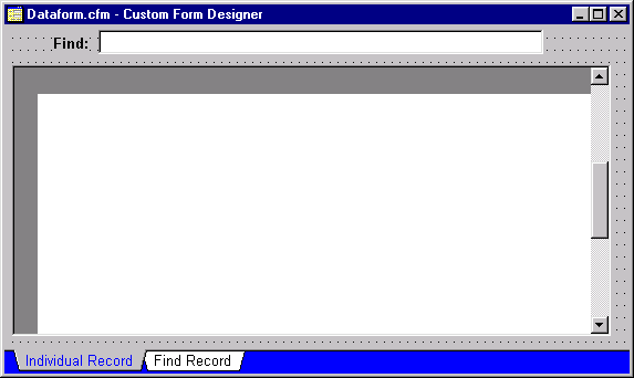
Creating the Data Custom Form
The next thing we will do is create a custom form that is also derived
from the base form, which will be used for nearly all of our data forms
(which
is what most of this part of the tutorial is all about). This custom
form will be more complex than the previous two in that we will be adding
a set of controls that will be inherited by all the subclassed forms and
a set of code that will be used by all of them.
In the Navigator double-click the Untitled custom form icon. Note that we should not need to set the custom form class; it is already set to Base.cfm. If, for some reason, you do NOT get the "Base" class appearing (you will see the text control at the top of the form), then go back and set the custom form as we did for the DialogForm custom form in the previous part of the tutorial.
Set the form's text property to "CustomDataForm". Click on the MyTitleText control at the top of the form and type "DataForm".
Save the custom form (<Ctrl>+S) and call the file "DataForm" (the form's class name will be "DataFormCForm").
The next part of this is going to assume that you have the custom controls set up so be sure you have run Configure.prg.
Note: What is this Seeker control?It is a custom control that ships with dBASE Plus that is used to allow your user to enter a value in what is called an "incremental search" -- meaning that if all is correctly set up on your form and in your data, a user looking for the name "Smith" can enter "S" and get the first name that begins with the letter "S". If that name is not what they are looking for, they can enter "M" and the seeker control will find the first name that starts with "SM", and so on. This is called an "incremental search".
The control requires that your controlling (active) index for the active rowset on the form be indexed using the upper() function (to convert the value to upper case). It also requires that you DO NOT set a dataLink (it is a subclassed entryfield object).
That is all that is necessary for a seeker to do its "magic" for you. This is a control that appears on nearly every data form I use for every application I generate, because it makes it easy for a user to find data ... This is particularly useful when a grid is near it to show where the user is in the table.
On a historical note, Ken Chan wrote the original Seeker control for Visual dBASE 5.5 before he was hired at Borland to work on the documentation for Visual dBASE 7. He worked with the samples developer for VdBASE 7 to modify (for the new Visual dBASE 7 OODML) and add the Seeker control to the custom controls that ship with Visual dBASE 7 and now with dBASE Plus.
You will want to move the controls around a bit (you can resize them by clicking on them and dragging corners around), so that they look something like:
Once you have the controls where you want them, click on the "Previous Form Page" button in the toolbar, so that you are back on page 1 of the form.
Since this form is going to work with data and we will need a way to navigate around in the data we need to add one more control (which is really a collection of controls) to the form.
Go to the component palette once more, and select "MyToolBar". Drag this to the surface, and move it to the left under the title. The form should look like:
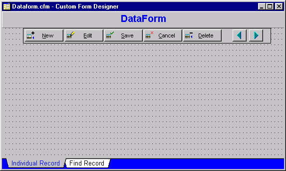
Note: The buttons shown in "MyToolBar" assume that the rowset that is associated with the form (form.rowset) has the autoEdit property set to false, which is why we will make sure in the form's onOpen event that we set that particular property for each.The dUFLP contains a robust set of custom buttons in CUSTBUTT.CC. There is a lot that can go on with buttons, so you might want to open the file CUSTBUTT.CC in the source editor at some point and examine the code. It is very heavily documented, and while not "easy reading", it should be self-explanatory.
Form Event Code
Click on the form's surface and in the inspector go to the escExit
property and set this value to false. This will keep a user from closing
a form with the <Esc> key, which can cause problems if a row is being
added or edited (the row gets locked, and any attempt to re-edit it
will cause the error "Row is locked, retrying lock ..."; the only way out
of this is to close the application and restart).
Next we want to make sure that when a data form is opened that we move to the top of the rowset. We also want to call another method we will be adding that is related to the code we entered above in the canClose event, and we are setting the rowset's autoEdit property to false. This is done easily enough by adding the following code to the form's onOpen event:
   function form_onOpen
      if form.rowset # null
         // don't allow automatic editing
         form.rowset.autoEdit := false
         // assign this method to the rowset's canNavigate:
         form.rowset.canNavigate := class::rowset_canNavigate
         // go to the first row ...
         form.rowset.first()
      endif
   return
The canNavigate code looks like the following. Make sure that the
form itself has focus (click on the form's surface making sure you don't
click on a control on the form). This can be added by going to the "Method"
menu option, and selecting "New Method". Change the name of the method
(the designer will insert: "function Method", change it so it looks like
the following):
   function rowset_canNavigate
      /*
          Check to save any changes before allowing navigation.
          For whatever reason, this gets called twice. If the
          user chooses Yes to Save, or No to abandon, then
          the next time through the rowset.modified property is
          false so there's no problem. If the user chooses to
          cancel the navigation, they'll get prompted twice.
          For that reason, we set a flag to indicate it's been
          here once. If the flag exists, we null it, if not we
          run the validation.

          BIG Note: If a future version of dBASE Plus corrects the
          behavior so the canNavigate routine does NOT fire
		  twice, this code will not work correctly.

          Applies to all dBASE builds through dBASE Plus.

          Code by Gary White
      */

      local bYes, nAnswer
      if type("_app.cancelNav") == "L" and _app.cancelNav
         _app.cancelNav := null
         bYes = false
      else
         bYes = true
         if this.modified
            nAnswer = msgbox("Save changes before leaving record?",;
                       "Data has changed",32+3)
            do case
               case nAnswer == 6 // Yes
                  this.save()
               case nAnswer == 7 // No
                  this.abandon()
               otherwise         // Cancel
                  bYes := false
                  _app.cancelNav = true
            endcase
         endif
      endif
   return bYes
The code we just added is used to keep the user from navigating in the rowset by accident using the <PageUp>, and other keys that affect navigation in a form (<PageDn>, <Ctrl>+<Home>, <Ctrl>+<End>), when the user is editing or adding a row (this causes a call to the rowset's save() method, which we don't want to have happen automatically). The code shown above checks to see if the row was modified, and if so it then asks if the user wants to save or abandon their changes (and adds a 'cancel' option so that they can forget that they asked to navigate).
By inserting this here, we can avoid a lot of duplication of code throughout the application.
You might note that the canNavigate event is a rowset event, but that we are entering it in a custom form. This could be a bit confusing if one thinks about it for a minute or two. Actually, this demonstrates one of the more powerful features in object oriented programming. We are assigning an event handler "on the fly". That is, each time this custom form is used to open a datamodule, it will assign this canNavigate event to whichever rowset is assigned to the form's rowset property. This can be pretty useful at times.
Save the form with <Ctrl>+W and name it "DataForm" (if you have not already saved it).
We have now created three custom forms. All the other forms in our application will be derived from one of these three forms.
The customer form should be fairly easy to set up. We have already done a bunch of the work necessary with the custom forms set up that we've done.
Start the Form
To get started, we need to first start a new form and then make sure
we are using the correct custom form.
In the navigator, in the "Forms" tab, double-click the first "Untitled" icon. If you are asked about using the wizard, click on "Designer". Next, do the following:
Note: When you work with a form derived from a custom form you do not need to make any changes to the custom form for the one you are working on. For example, if the customer form that you are creating now is not large enough just widen this form in the designer. There is no need to modify the custom form at all ... this is really the point of object-oriented programming.In this example, the derived form inherits the properties of the custom form, but you can change those properties in the derived form if necessary ... this means that any other form that is derived from the same custom form will still inherit the properties of the original custom form.
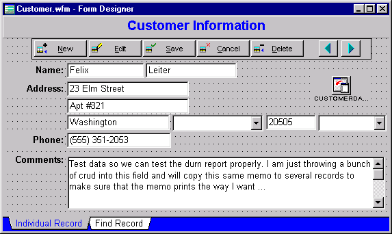
The first two changes are purely cosmetic, but ... change the form's text property to "Customer Information" using the inspector, and then do the same for the title text control at the top of the form by clicking on it and changing the text.
Next we need to put a datamodule on the form. The datamodule we will use is the one we created awhile back in this tutorial that works with the customer data. The simplest way to do this is to click on the navigator, click on the "DataModule" tab, and drag the "Customer" datamodule to the design surface.
Note: In the first edition of this Tutorial, when you dragged a datamodule onto a form, you created a dataModRef. Visual dBASE 7.5 introduced a new data access object called the dataModule object. The current Tutorial uses dataModule objects rather then dataModRef objects. DataModule objects can be contained by the form and therefore the dataModule's objects, rowsets and fields, can be referenced like any other object on the form.The dataModRef object prevents you from parenting a dataModule to the Form. Alan Katz notes that "it's one more level of indirection, adds a lot of complexity and often causes circular references. The dataModRef should be used only when you want to share a dataModule between multiple forms."
Save your form, and call it "Customer" (<Ctrl>+S).
Note: When you drag a datamodule onto a form, if you set the datamodule's rowset property to point to a rowset contained in the datamodule the form designer will automatically set the form's rowset property to the rowset defined in the datamodule (which is why we did that when we created our datamodules).This is an important thing to note -- the form now contains a reference to a specific rowset (in this case, the Customer query's rowset) which is used by any control or any code that references "form.rowset".
This is very important for the use of the SEEKER control that is contained in the custom form, the buttons at the top of the form, and so on.
The first thing you should notice is that the "Fields" palette is showing the fields in the customer table (if you do not see the "Fields" palette, right click on the form's surface and select it in the popup menu). Even though you see these fields in the palette, do not use them. Remember, we are going to use custom controls
Now let's place a "MyTextLabel" control on the form from the Custom tab of the component palette. Click on it (it should be toward the top), and drag it to the surface of the form. Use the Inspector and change the text property to "Name:". This will change the text displayed on the form for that control. When you click on the form's surface, you should see the text aligned to the right -- this is how this particular text control is designed (the alignHorizontal property is set).
NOTES: Naming controls: It is actually a good idea to change the name property of the objects you are using when you place them on a form (or report). In order to speed up the tutorial (which is already fairly lengthy) this step has been left out. However, you may wish to do so. (The names should be meaningful, like "FirstNameEntryfield".)Layout of the controls on a form: we will not spend a lot of time here on it here, but the sequence controls are placed on a form can make a huge difference in how they act in relation to each other. This is called the "Z-Order". When a form is executed the sequence the controls are laid out on the form is the sequence that they will be "hit" by the user if they use the <Tab> key to navigate between them (and if you use code that loops through the controls on a form the same sequence will be used). There is a menu option under "Layout" that can be used to set the "Z-Order" for the controls ... this is something you may wish to examine after you have a few controls on a form.
Next drag a "MyEntryfield" control onto the form surface, and place it to the right of the "Name:" text. You will probably want to widen this because we are going to link it to the first name field of the customer. To set the datalink, go to the inspector and select the dataLink property. Click the Tool button. In the dialog that appears select the "First Name" field. When you click "OK" in that dialog the field is now datalinked (and should show you the first name of one of the customers in the table). Remember this -- you will do it often.
Drag another "MyEntryfield" over to the form surface and place it next to the first one. This one will be used for the "Last Name" field. Set the dataLink to the "Last Name" field like you did for the previous entryfield.
With these controls all next to each other you will want to move them around a bit so that they line up. The simplest way of doing this is to hold the <Ctrl> key down and click on both entryfields and the textlabel control so that all three are selected, and use the alignment options (at the top of the screen in the toolbar on the right are some buttons you can use to line up multiple controls). (You could also use the "lasso" option (hold the <Ctrl> key down and drag the mouse so that the "lasso" that appears includes all of the controls), but I have found that this can get a bit weird and it's easy to miss one control in the process. After 'lassoing', check the controls to see if they all have handles. If not, hold down the shift key and click on the unselected conrol or controls and then you will have them all.)
You will want to put a MyTextLabel control for the address under the one for the name and then put the two street fields on the form using the same technique used previously (put two MyEntryfields on the form, and dataLink them).
Under the second street address, put the "City" field in the same fashion.
Setting up the Lookups
Now for the fun part. You may have forgotten, but in the dataModule
we created for the customer table we set up lookups for a couple of the
fields. For these to work properly you need to use combobox controls. Go
to the component palette and drag a "MyCombobox" to the surface, which
will be used for the "State ID" field. Normally with a Combobox control
you need to set the dataSource -- in this case, you do not. All
you have to do is set the dataLink and dBASE Plus will do the rest. This
is due to the lookupSQL property we defined in the datamodule. ("MyCombobox"
is a "style 2" combobox -- it does not allow the user to enter new values,
which is exactly what is needed here.)
Place the Postal field on the form in the same way as the others that use an entryfield (MyEntryfield).
Next we are going to place the "Country ID" field on the form in the same fashion as we did the "State ID" (use a "MyCombobox").
For the "Phone" field place a "MyTextLabel" control on the form under the other field headings (set the text to "Phone:"), and place a "MyEntryfield" on the form, dataLinked to the "Phone" field.
We have one field we haven't dealt with yet -- the "Comments" field. Place another "MyTextLabel" control on the form (set the text to read "Comments:"), and then place a "MyEditor" control on the form. Set the dataLink to the "Comment" field. You will want to resize the editor so that it fits on the form.
Your form should look something like this:
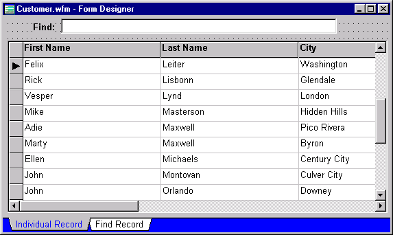
There is one connection we need to make, and that is on the second page of the form. To set this information, switch to the second page (use the "Next Form Page" tool button at the top of the screen).
The grid control that is there appears blank. We need to do a couple of things -- the first of which is to set the dataLink property of the grid. In the inspector select the dataLink property, and set it to "Customer1". Amazingly enough all the columns are suddenly filled up!
However, what we want to do is to set a bit more information for the grid which is the columns array (this lets us have control over which columns in the table are displayed, and gives us "programmatic" control over the grid). This is done by going to the columns object in the inspector and clicking the "Tool" button. Select only the fields you want to display. For example, in this case we are only going to display the Last Name, First Name and the City fields. You may need to readjust the height of the grid, so that all the rows are filled up.
Page two of your form should look like:
Before you "save and exit" the form switch back to page one using the "Previous Form Page" button. The reason for this is that the form designer will store the current page in the pageNo property of the form -- and when you run the form it will start on that page, which may not be the one you want.
One last thing, try moving the form up and centered in the design area. These coordinates will be saved by the designer when the form is saved. This may or may not be important later, but when testing the form, you will want to see it in a place that makes sense.
Save and exit with <Ctrl>+W. If you did not save the form earlier enter a filename of "Customer" (if you did then you will not be asked for a filename). This will take you out of the designer and back to the design surface of dBASE Plus.
Testing the Form
To see this form in action double-click on it in the Navigator.
Try navigating using the buttons on the form. Try switching to the second page of the form. On that page use the "seeker" control by typing some characters and see what happens. Go back to the first page.
All things considered you did no code (well, not in this form -- you did a bunch in the custom forms, but you never have to re-write that code for any forms derived from those custom forms!), and you have a fully functional form. Not too shabby.
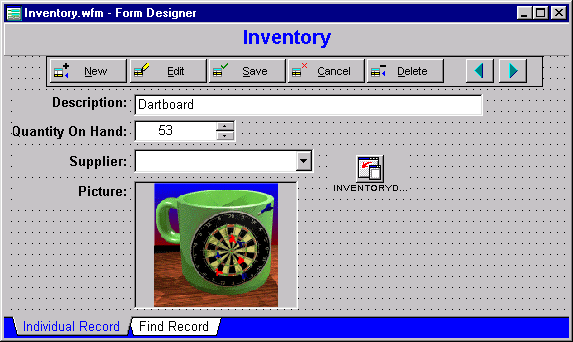
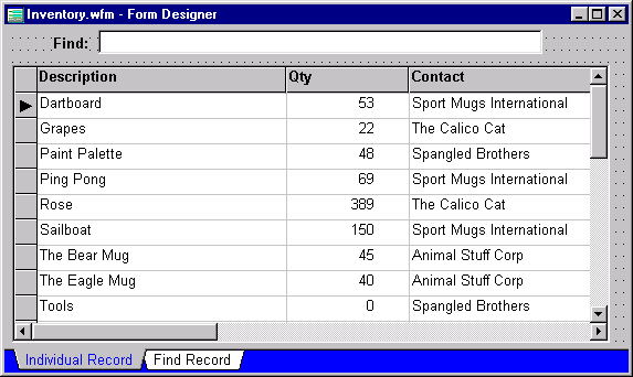
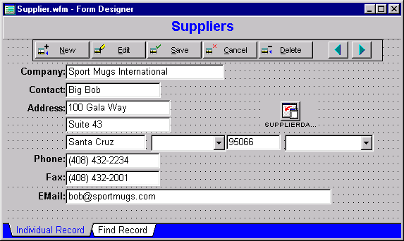
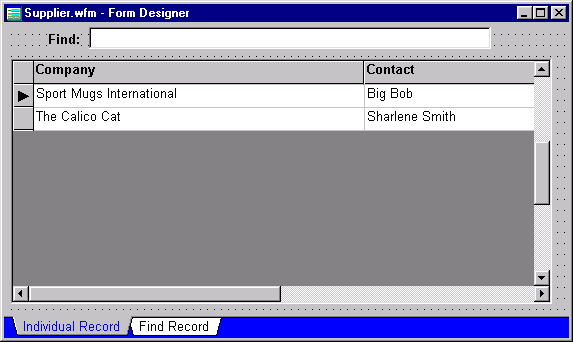
Based on what you did above, you should be able to do the same sort of thing with the Inventory and Supplier tables. There are screen shots of the first and second page of both forms below so you can compare to see if you have them correct.
Hints:
This form will take a bit more work than the others we have done because invoices are more involved. An invoice requires information about Customers, payments (from the Invoice table), and the Line Items -- the individual items the customer has ordered for this Invoice.
The form itself is going to be a "read-only" form -- it is only going to allow the user to view the information. Any adding or editing of data will be done by calling dialog forms (we'll get there).
To implement this it may be easiest to show the data on the form in a parent/child/grandchild type relationship by displaying everything in grids.
Note: The invoice form you are creating for this application is simply one way of handling it. There are many ways to create invoices and invoice forms. This one made sense at the time the tutorial was put together.The reason this is being done this way is, among other things, to show how to use parent/child/grandchild type relationships in forms.
As with any real-world application the final judge on what is correct is your client.
We'll create a new form that is inherited directly from the base custom form, rather than the data custom form. The data custom form has more controls on it than we want, and in the wrong places. It is easier to just start with a fresh form that has practically nothing on it for this one.
Start a new form like we have so far. However, we are currently inheriting from the data custom form class so we need to:
As we did for the other forms drag the correct dataModule (Invoice.dmd) on the form design surface. You should recall that this dataModule contains queries for the Customer, Invoice and Lineitem tables.
Set the form's text property to "Invoices", and the title (text control at the top of the form) to "Invoices".
This is a fairly complex form and you should save often, just in case something happens. Save this form (<Ctrl>+S) as "Invoice.wfm" before moving on.
The only problem with going back to the base form for our custom form reference is that it doesn't have some code that we inserted into the dataform custom form.
We need to insert the following code:
   function form_onOpen
      // call the onOpen method of the dataform custom
      // form ...
      set procedure to dataform.cfm additive
      dataformCForm::form_onOpen()
   return
From here it's going to get more interesting.
The Customer Query
First we need to set up controls to let the user locate customers.
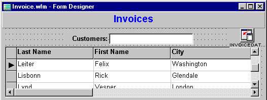
First, grab a "MyTextLabel" and place it on the surface of the form. Change the text to read "Customers:". Place a Seeker control next to it (this will be used to find the customer by last name).
Now, let's grab a "MyGrid" from the component palette, and drag it to the design surface. Set the dataLink to "customer1", and set the columns to display the last name, first name, and city fields (that will give us enough, for now to find unique customers, although in a large system, this would probably not be enough, and you might want to display the customer id field).
The form should look, at the moment, like:
We have the information we need now to allow us to find a customer (and if the user wants to add or edit the customer table, he/she will be able to call the customer form). So the next thing we need to do is put a grid on the form to display any (and all) invoices for a specific customer.
The Invoice Query
The tricky part of this is that we are going to be displaying some
of
the information about invoices, but we will want to be able to add or edit
them. In addition the customer may cancel an order, in which case we will
want to be able to delete the order, and we may want to print a specific
invoice.
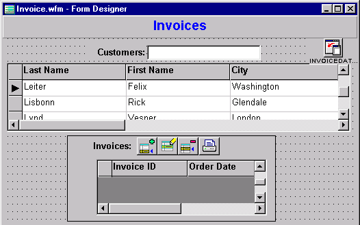
First let's place a container on the form which we will use to separate the Invoice data from the customer data (and later the line item data) in a visible fashion. Drag a "MyContainer" to the design surface ... as you add more controls you will end up needing to resize the container accordingly ... (we could use a rectangle instead, but the container is a lot more useful -- it is easier to move the whole group of controls at once which can get a bit tricky with a rectangle (making sure all the controls you wish to select are selected, etc.)). Set the name of the container to "InvoiceContainer".
Find the "MyTextLabel" control, and drag it onto the container's surface (be sure you drop it inside the container). Change the text to "Invoices:".
Add/Edit/Delete/Print Buttons
Before we place the grid on the container let's put some pushbuttons
on the container that will allow the user to add, edit, delete, or print
the 'highlighted invoice'. We'll hook up code for all of this later.
The problem with just dropping a bunch of controls like pushbuttons onto a form is that if you decide you need to move them you often spend a lot of time manipulating them. We're going to make things easier -- by using another container object and putting the pushbuttons on the container. The advantage is that if we want to move things around on the form, we can move the container, and everything on the container maintains its relative position.
To do this go to the component palette and drag a "MyContainer" to the Invoice Container surface. We'll take care of the border in a moment since we really don't want the border to be there. We will need to tinker with the size of the container, as it will be too tall for our needs and we'll probably need to widen it. Go to the inspector and change the name to "InvoiceButtonContainer".
Next, on the custom tab of the component palette, you should find "MyPushButton". Drag this to the container surface.
We need to put an image on the button, using the Inspector go to the upBitmap property, and click on the tool button. This will bring up a new dialog.
In the "Location" combobox, select "Resource", and then click on the tool button to the right. Select, in the resource dialog, the button "PS_APPEND" (Pushbutton, Small, append), and click "OK". Before you click "OK" in the first dialog check the "Split Bitmap" checkbox, or the image will look rather odd.
In the inspector once again, select the speedTip property, and type: "Add an Invoice" (and press <Enter>). Change the name property to "AddInvoice"
We'll come back and add some code in a bit.
Let's place the other three buttons we need on the container all next to each other. Each button will be an instance of the "MyPushButton".
The upBitmap for the next one should be "PS_EDIT", and the speedTip should read "Edit this Invoice", the name should be "EditInvoice". The next button will have "PS_DELETE" as the image, and "Delete this Invoice" (name should be "DeleteInvoice"), and the last one will use the image "PS_PRINT", the name should be "PrintInvoice", and the speedTip will read "Print this Invoice".
We will come back and deal with adding code for all four buttons. For now line them up so that you are happy with their appearance. Click on the InvoiceButtonContainer, and in the inspector, set the borderStyle property to "3 - None".
Add the Grid
Now let's add the grid for the invoices. Drag a "MyGrid" onto the design
surface (on the container) and place it under the text and buttons. Set
the dataLink to "invoice1" and set the columns array to display
the fields "Invoice ID" and "Order Date". Readjust the grid's
width,
height
and position on the container.
Once you have everything lined up in the container, try moving the container a bit so that everything on the form looks good.
The form should look something like this:
Pushbutton CODE
The code for the pushbuttons needs to be added, we're going to go back
and do that.
Click on the AddInvoice button. In the inspector, go to the "events" tab, and find onClick. Click on the tool button. This will place you in the source editor. Enter the following code:
   function ADDINVOICE_onClick
      local fInvoice
      set procedure to invoiceEdit.wfm additive
      fInvoice = new InvoiceEditForm()
      // add a custom property (note that the
      // form.rowset is pointing to the customer rowset)
      fInvoice.CustomerID = form.rowset.fields["customer id"].value
      // let the invoice form know we're in "Append" mode
      fInvoice.Mode = "Append"
      // open the form:
      fInvoice.readModal()
      // close the procedure file:
      close procedure invoiceEdit.wfm
      if form.invoicedatamodule1.lineitem1.rowset.endOfSet
         // go to last row, which is the one we just added
         form.invoicedatamodule1.invoice1.rowset.last()
         // because an invoice is useless without a line item
         class::AddLineItem_onClick()
      endif
      // refresh the controls on screen ...
      form.invoicedatamodule1.invoice1.rowset.refreshControls()
   return
This all assumes a form called "invoiceEdit" which we have not created -- we will get there. Notice the statement 'fInvoice.Mode = "Append"' -- this will allow us to force the form when brought up on screen to "Append" mode. The statement above it is so that we can store the appropriate link to the customer.
Note: Peter Rorlick correctly notes that the call to the last() method is a rather simple way of handling finding the row that was just added.In many real world situations there may not be an index set, or the index may be set differently than how we're doing it. For situations that are different than the simple one shown here, the code necessary to ensure that you are pointing at the correct record gets a bit more complex. This would involve storing some key value or values from fields in the table in the lookup form (in this case, the invoice, and you could probably just save the value of the invoice id field), and then doing either a findKey() if using an index, or a locate (applyLocate()) otherwise.
For our purposes we are keeping things simple, but Peter's point is an important one, and should be kept in mind if you attempt to do something along these lines in your own applications.
In addition it has been noted by at least one beta tester that in a real world application, adding an invoice for a customer that already has one -- it would be useful to simply duplicate the payment information for that customer from the previous invoice. This is correct, but again, the code involved is a bit more complex than we want to get into here. (This is, after all, a tutorial, not a full-fledged application.)
This also assumes that when an invoice has been created, there must be a line-item, so the last statement calls the code associated with the "AddLineItem" pushbutton's onClick event.
Now, copy the code after the "function" statement, by highlighting (hold the <Shift> key down, and move the arrow down), and press <Ctrl>+C (to copy to the clipboard).
Click on the EditInvoice button, and in the inspector, click on the tool button for the onClick event. In the source editor paste the information that is in the clipboard (<Ctrl>+V) and change the "Append" statement to "Edit", and then delete the last couple of lines before the return statement. Make other changes as shown below so that the code looks like:
   function EDITINVOICE_onClick
      // Check to make sure we have a row to edit:
      if not form.invoicedatamodule1.invoice1.rowset.endOfSet
         local fInvoice
         set procedure to invoiceEdit.wfm additive
         fInvoice = new InvoiceEditForm()
         // add some custom properties:
         fInvoice.CustomerID = form.rowset.fields["customer id"].value
         fInvoice.InvoiceID  = ;
            form.invoicedatamodule1.invoice1.rowset.fields["Invoice ID"].value
         fInvoice.Mode = "Edit"
         // open the form ...
         fInvoice.readModal()
         close procedure invoiceEdit.wfm
         form.invoicedatamodule1.invoice1.rowset.refreshControls()
      else
         msgbox( "There is nothing to edit!", "Can't do that!", 16 )
      endif
   return
There are a couple of differences between the two sets of code. First we are checking to see if we are at the "endOfSet" for the invoice rowset. If we are, we need to tell the user that we can't edit anything .. the other major difference is that the form is going to be called with the property "Mode" being set to "Edit", so that when we bring up the form we will be editing the current invoice information. We are also going to make sure we can find the invoice we are looking for in the dialog form.
The delete button will be different code completely. It must check to see that we are not on the "endOfSet" marker that occurs at the beginning or end of the table (and in this case should only occur in the case of an empty rowset -- i.e., no invoices for this customer), before allowing the user to attempt to delete an invoice. It should also check to make sure the user really wishes to delete this invoice.
Click on the DeleteInvoice button and go to the source editor by using the tool button for the onClick event. Enter the following code:
   function DELETEINVOICE_onClick
      // shorten the rowset reference:
      r = form.invoicedatamodule1.Invoice1.rowset
      // check for endOfSet
      if r.endOfSet
         msgbox( "Cannot delete -- there are no rows to delete!",;
                 "Can't do it!", 16 )
      else
         // otherwise check to see if they really want to
         // delete this row!
         if ( msgbox("You are about to delete the current row." ;
                    + chr(13) ;
                    + "Click Yes to delete the current row.", ;
                      "Alert", 4) == 6 )

             // delete it:
             r.delete()

             // move to previous row, unless we're at
             // the first one, and then step off
             // the endOfSet marker ...
             if ( r.next( -1 ) )
                r.next()
             endif
         endif
      endif
   return
The last button must assume that we have a report which we haven't gotten to creating just yet. This report will print just the current invoice.
Click on the PrintInvoice button, and go to the source editor by using the tool button for the onClick event. Enter the following (we'll add the code later when we're ready to design the report):
   function PRINTINVOICE_onClick
      // code will go here:
   return
LineItem Query
The LineItem table is the break-down of each item ordered by the customer
for this particular invoice. We are going to do something similar for lineitems
to what we did for the Invoice table. We need some pushbuttons and a grid,
and we will need to create a new form just to handle the LineItem table.
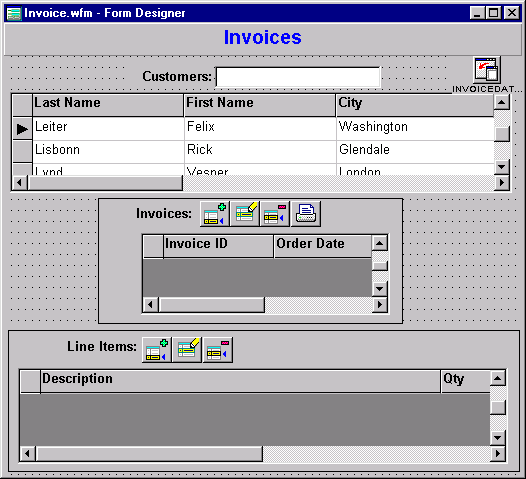
First let's place a container on the form which we will use to separate the Line Item data from the Invoice data in a visible fashion. Drag a "MyContainer" to the design surface ... as you add more controls you will end up needing to resize the container accordingly. Set the name of the container to "LineItemContainer".
Next let's put a "MyTextLabel" control on the container surface, set the text to "Line Items:".
Add/Edit/Delete Buttons
We need another container (MyContainer) on this one. Set the name
property to "LineItemButtonContainer", and resize it a bit.
Place a "MyPushButton" on the button container. Set the name property to "AddLineItem", set the speedTip to "Add new Line Item", the upBitmap property to the same as previous (resource, "PS_APPEND" and "split bitmap"). Then we'll put the following code into the pushbutton's onClick event handler:
      local fLineItem
      // don't allow it if there's no invoice:
      if not form.INVOICEDATAMODULE1.invoice1.rowset.endOfSet
         set procedure to LineItemEdit.wfm additive
         fLineItem = new LineItemEditForm()
         // add some custom properties:
         fLineItem.Mode = "Append"
         fLineItem.InvoiceID = ;
           form.INVOICEDATAMODULE1.invoice1.rowset.fields["Invoice ID"].value
         // open the form:
         fLineItem.readModal()
         close procedure LineItemEdit.wfm
         form.INVOICEDATAMODULE1.lineitem1.rowset.last()
         form.INVOICEDATAMODULE1.lineitem1.rowset.refreshControls()
      else
         msgbox( "There is no invoice to assign line items to!", ;
		                   "Can't do that!", 16 )
      endif
   return
Place another "MyPushButton" on the button container and set the upBitmap to "PS_EDIT", the speedTip should read "Edit this Line Item", the name should be "EditLineItem", and the following code in the onClick event handler:
   function EDITLINEITEM_onClick
      local rLineItem
      // Check to make sure we have a row to edit:
      rLineItem = form.invoicedatamodule1.lineItem1.rowset
      if not rLineItem.endOfSet
         local fLineItem
         set procedure to LineItemEdit.wfm additive
         fLineItem = new LineItemEditForm()
         // add some custom properties
         fLineItem.Mode = "Edit"
         fLineItem.InvoiceID = ;
           form.invoicedatamodule1.invoice1.rowset.fields["Invoice ID"].value
         // In the next statement, we're getting the actual
         // item ID as opposed to the description, which we'd
         // normally get if we just used the field's value
         // property ...
         fLineItem.ItemID =;
             rLineItem.fields["Item ID"].lookupRowset.fields[ 1 ].value
         // open the form ...
         fLineItem.readModal()
         close procedure LineItemEdit.wfm
         form.invoicedatamodule1.lineitem1.rowset.refreshControls()
      else
         msgbox( "There is nothing to edit!", "Can't do that!", 16 )
      endif
   return
And finally we need to be able to delete the line items for this invoice. One more "MyPushButton" will need to be placed on the button container, set the upBitmap to "PS_DELETE", the speedTip to "Delete this Line Item" and the name to "DeleteLineItem"), and use the following code for the onClick event handler:
   function DELETELINEITEM_onClick
      // shorten the rowset reference:
      r = form.invoicedatamodule1.LineItem1.rowset
      // check for endOfSet
      if r.endOfSet
         msgbox( "Cannot delete -- there are no rows to delete!",;
                 "Can't do it!", 16 )
      else
         // otherwise check to see if they really want to
         // delete this row!
         if ( MSGBOX("You are about to delete the current row." ;
                    + CHR(13) ;
                    + "Click Yes to delete the current row.", ;
                      "Alert", 4) == 6 )

             // delete it:
             r.delete()

             // move to previous row, unless we're at
             // the first one, and then step off
             // the endOfSet marker ...
             if ( r.next( -1 ) )
                r.next()
             endif
         endif
      endif
   return
Resize the (button) container so that it is smaller and set the borderStyle to "3 - None".
Add the Grid
Now we need a grid for the lineitems so that we can see what the customer
ordered. Select the "MyGrid" control and place it on the Line Item container
under the button container. Set the dataLink to "lineItem1". Set
the columns array to display the fields "Item ID" and "Qty". Note
that the field "Item ID" shows up as "Description" in the grid -- this
is because of the lookupSQL we placed in the datamodule.
(I love
it when things like this work.)
One problem is that the grid is going to attempt to show some really large value for the quantity ordered (remember that this is a LONG Integer - it can hold numbers up to over 4 billion). Rather than displaying a value that large we could instead set a picture for the qty field. How do we do that? Double-click on the column in the designer (not the column heading), or in the inspector click on columns and then the "Inspect" (I) button. You will see a list of the columns you have. Click on "COLUMN2" and then "Inspect" button, go to the editorControl object and click again on the "Inspect" button. Click on picture and enter "999" and press the <Enter> key.
The form should look like the following:
Save and exit the designer with <Ctrl>+W.
Done?
At this point we have a form that could be used "as is", but ... The
problem is there's code attached to those pushbuttons that assumes we have
some other forms available which we do not. These are the next part of
the tutorial project. If you feel a need to take a break this is as good
a time as any.
The Invoice Table Editing Form
This form is one we are going to set up as a "modal dialog" form --
in other words, it is a form that the user must interact with before
they can do any other processing.
This form is going to be based off the "dialogform" custom form that we created earlier. Start with a new form by double-clicking the "Untitled" form icon in the navigator. Then:
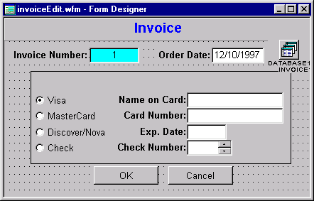
Change the form's text property, and the title control to "Invoice". This is going to take a bit of work to set up so it works properly, so in addition, let's save it now so we have a filename: <Ctrl>+S, and enter "InvoiceEdit" as the name of the file.
Next drag the Invoice table to the design surface. Note that the database reference is set for you. We have opted not to use a datamodule because this form is using only one table.
Place a "MyTextLabel" control on the form, and change the text to "Invoice Number:". Drag a "MyDisabledEntryField" to the form and Datalink it to the "Invoice ID" field in the table.
On the same "line" (as it were), place another textlabel (MyTextLabel) control, and change the text to "Order Date:".
Drag a "MyEntryfield" to the design surface and place it next to the text control. Set the dataLink property to the "Order Date" field. (You will probably want to tinker with the size of the controls, and the alignment as well, so that they line up and "look good").
The Payment Portion Of the Form
We're going to place a container on the design surface, and put some
controls on the container. This is going to be used for information about
how the customer pays for the order. There are two reasons for using the
container -- the first is that we can set a border property so that everything
on the container appears to be grouped together, and the second is that
we can then set everything where we want it, and move it as a unit
if we need to. This will come in handy later.
Drag a "MyContainer" from the Component Palette to the design surface (there are a lot of controls with the container icon so make sure you get the correct one). Place it under the controls we have currently on the form and resize it a bit, so that it's wider than when it was placed on the form and probably not as tall.
You will probably want to move the "OK" and "Cancel" buttons down a bit so that they are under the container (not layered under it, but visibly below it on the design surface) if they aren't already.
The first control to go onto the container is a "MyTextLabel" control. Set the text property to "Payment" and place it at the top of the container toward the left.
Next we want a set of radiobuttons, one for each of the possible ways the "Tutorial Store" accepts for payment of an order. Drag four "MyRadiobutton" controls onto the container and place them one under the other.
Set the text property and the name property of the first radiobutton to "Visa". Set the value property to "true" -- only set this property on the first radioButton. Do the same for the second radiobutton to "MasterCard", the third to "Discover/Nova" (the name cannot handle a slash (/), so set it to simply "Discover"), and the last to "Check". Check to make sure that the group property for the last three radioButtons is set to false, or these will not function together properly.
We could dataLink these to a field in the Invoice table, but there is a problem with this concept. The problem is that the text shown is larger than the contents of the field. The field itself is only two characters wide. What we need to do is called field morphing -- that is, we change the appearance of the contents of the field on the form. An example of this is something we've already seen done automatically for us -- the lookupSQL property for some fields used in other tables shows a different value to the user than what is stored in the table. We are going to have to do that ourselves here, because radioButtons cannot do this automatically.
We will get to the code we need to examine in a bit because we are going to actually do a bit more with it, and we might as well do all the code at one time.
Next we need to add some more controls that deal with the rest of the payment information. If a credit card is being used (one of the first three radiobuttons), we need to get information specific to that credit card (the card number, name of the customer as it appears on the card, and the expiration date), and if they are paying by check we need the check number.
This is going to be done fairly quickly ... place the following on the right of the radiobuttons:
At this point you will want to probably spend a bit of time lining the controls up and making them look good, maybe resize the container, that sort of thing.
The Form's OnOpen Event
This is a very important event for this form because we need to deal
with whether or not the form is being opened for "Append" or "Edit" and
do a bunch of things accordingly.
When the form opens, if we are going into append mode, we need to set some default values. If we are going into edit mode, we need to ensure we are pointing to the correct invoice, which will be done by using an applyLocate call.
In the Inspector, create a new onOpen event for this form. Enter the following code:
   function form_onOpen
      // This code will be used to see if
      // the form is being opened properly at all (in the
      // first place -- it's supposed to be called
      // from "Invoice.wfm"), and if so, if we are
      // supposed to be in append or beginEdit
      // mode ...
      if type( "form.Mode" ) == "C" // character
         if form.mode == "Append"
            form.rowset.beginAppend()
            // store the customer id:
            form.rowset.fields["Customer ID"].value := form.customerID
            // set default value for order date (today's date)
            form.rowset.fields["Order Date"].value := date()
            // default value for Payment Type is "Visa"
            form.rowset.fields["Pay Type"].value   := "VI"
            form.MyContainer1.VISA.value       := true
            form.rowset.refreshControls()
         else
            // find the correct row:
            form.rowset.canNavigate := {|| true }
            form.rowset.indexName   := "invoice id"
            form.rowset.findKey( form.InvoiceID )
            form.rowset.canNavigate := {|| false }
            form.rowset.beginEdit()
         endif
      else
         form.rowset.first() // just so we're at the top
         msgbox( "You shouldn't run this form except from invoice.wfm",;
                 "Don't do that!", 16 )
      endif
      class::MorphFields() // make sure we get
                           // the morphing and such ...
      class::VISA_onChange() // make sure this gets set ...
  return
Adding Some Code To Morph The Data
Now for the fun part. The code we need is going to be executed from
the radioButtons, and specifically when the value changes.
Note: The morphing we are doing for this form is a simple form of it, as opposed to some of the examples in the online help. If you have more than a few options for a field such as the payment type field being used in this example, you should use a combobox and use similar code to what is covered both in the online help and in OODML.HOW.
When the form first opens we will need to ensure that we set the value property for the appropriate radiobutton on the container, otherwise what will appear is that all of the radiobuttons are 'false'.
This code will be in its own method which we are calling in the form's onOpen event. Select the "Method" menu and then select "New Method". Change the method name to "MorphFields" and enter the following code:
   function MorphFields
      // quick routine to ensure that the radiobuttons
      // show the appropriate value on startup:
      do case
         case form.rowset.fields["Pay Type"].value == "VI"
              form.MyContainer1.VISA.value := true
         case form.rowset.fields["Pay Type"].value == "MC"
              form.MyContainer1.MASTERCARD.value := true
         case form.rowset.fields["Pay Type"].value == "DN"
              form.MyContainer1.DISCOVER.value := true
         otherwise
              form.MyContainer1.CHECK.value := true
      endcase
Next when the radioButton values are changed we need to execute some code as well. This code will determine if some of the fields are available or not as well as assigning the appropriate value to the Pay Type field.
Click on the first radiobutton on the container (Visa), and in the inspector click on the "Events" tab. Find the onChange event, and click the toolbutton next to it.
The first line shown below and the last line (the 'return' statement) are created for you. Enter the rest, which has comments that should help explain the code:
   function VISA_onChange
      // This code will be attached to each of the payment
      // type radiobuttons.
      local lCheck
      // is the "CHECK" radiobutton set to true?
      lCheck = form.MyContainer1.check.value

      // The first part of the code here is going to
      // deal with enabling/disabling the items to
      // the right of the radiobuttons -- if
      // we do NOT have a check, we DO have
      // a credit card ...:
      with ( form.MyContainer1 )
         CARDNAME.enabled := ( not lCheck )
         CARDNUM.enabled  := ( not lCheck )
         CARDEXP.enabled  := ( not lCheck )
         CHECKNUM.enabled := ( lCheck )
      endwith

      // Next we deal with "morphing" the field,
      // so that what is in the payField is
      // based on whichever radiobutton is
      // selected:
      do case
         case form.MyContainer1.VISA.value
              form.rowset.fields["Pay Type"].value := "VI"
         case form.MyContainer1.MASTERCARD.value
              form.rowset.fields["Pay Type"].value := "MC"
         case form.MyContainer1.DISCOVER.value
              form.rowset.fields["Pay Type"].value := "DN"
         otherwise
              form.rowset.fields["Pay Type"].value := "CH"
      endcase
   return
We're not quite done -- this event will currently only fire for the VISA radiobutton, but we really need it to fire for each of the other three as well. This is actually pretty easy -- with the event still showing, and the cursor IN the event code, go to the "Method" menu, and select "Link Event ...".
The dialog looks like:
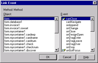
In the left part of the dialog select "form.mycontainer1.mastercard", and in the right side, make sure "onChange" is highlighted. Click the "OK" button.
Do this again for "form.mycontainer1.discover" and "form.mycontainer1.check", and you will have just linked the same event to all four radiobuttons.
The form should look something like:
That form should now be complete. Save and exit with <Ctrl>+W and let's move on to the other form we need to call from the invoices form, the line item form.
The Line Item Table Editing Form
The line item form is important because we need to be able to add or
edit individual line items for the order. The reason we need to be able
to edit is that the order may be incorrect (always assume that users will
make mistakes).
There are going to be some similarities between this form and the Invoice Editing form, but there will be less code and less controls ... (this form also uses the "DialogForm" custom form).
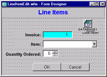
Double-click the "Untitled" form icon, and change the form's text to "Line Items" and the form title control to the same.
Save the form and call it "LineItemEdit" (<Ctrl>+S).
Drag the "LineItem" table to the form. Drill down to the rowset, then the fields, and then the "Item ID" field. Set the lookupSQL property to:
select inventory.'item id', inventory.'description' from inventory
(Make sure you press the <Enter> key after doing this.)
Set the indexName property to "INVOICE ID". We're also going to set the canNavigate event to disallow navigation in this form at all. This is done by clicking on the "Events" tab in the navigator, and in the entryfield for the canNavigate event (do NOT use the toolbutton!), enter:
{; return false }
Make sure you press <Enter> after you enter this simple codeblock.
Now we're ready to work on the adding the line item data to the form.
Grab a "MyTextLabel" control and drag it to the surface (from the Component Palette), and change the text to "Invoice: ". Grab a "MyDisabledEntryfield" to the surface and set the enable property to false and the datalink to the the "Invoice ID" field.
Get another "MyTextLabel" control and drag it to the surface, and change the text to "Item:". Drag a "MyCombobox" control to the design surface, and dataLink it to the "Item ID" field. DO NOT SET THE DATASOURCE!
And next, let's grab one more "MyTextLabel" control and set the text to "Quantity Ordered:" (you will need to widen the control a bit). Drag a "MySpinbox" control onto the surface, and set the datalink to the "QTY" field, and the picture to "999".
The onOpen code for this form is slightly different from the invoice editing form, as shown below:
   function form_onOpen
      // This code will be used to see if
      // the form is being opened properly at all (in the
      // first place -- it's supposed to be called
      // from "Invoice.wfm"), and if so, if we are
      // supposed to be in append or beginEdit
      // mode ...
      if type( "form.Mode" ) == "C" // character
         if form.mode == "Append"
            form.rowset.beginAppend()
            // assign defaults
            form.rowset.fields["Invoice ID"].value := form.InvoiceID
            form.rowset.fields["Qty"].value := 1
            form.rowset.refreshControls()
         else
            // find current row
            form.rowset.canNavigate := {|| true }
            form.rowset.indexName   := "InvoiceItem"
            form.rowset.findKey( str( form.InvoiceID, 7 )+;
                                 str( form.ItemId, 7 ) )
            form.rowset.canNavigate := {|| false }
            // start editing:
            form.rowset.beginEdit()
         endif
      else
         form.rowset.first() // just so we're at the top
         msgbox( "You shouldn't run this form except from invoice.wfm",;
                 "Don't do that!", 16 )
      endif
   return
Once you have done these things the form should look like:
and it should act very much the same as the InvoiceEdit form.
Save and exit ... (<Ctrl>+W).
Well, as you can see, the invoice form was not an easy process. You may well want to take a breather.
These forms will be very simple. The idea is to allow the user the opportunity to add states and/or countries or modify the values in these tables. Since each has only two fields, creating them is a snap. The instructions below are for the country table, but if you use the same instructions but substitute table/field names accordingly, it will all work exactly the same (you only have to set the custom form class once, though [the second step below]):
The form should look something like:
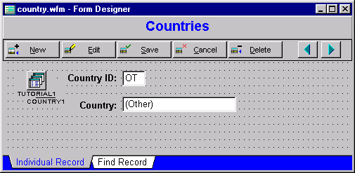
Save and exit (<Ctrl>+W save as "Country").
Repeat for "State".
We're going to add an "About" dialog. It is helpful to have a dialog that the user can call up that lets them know how to contact the developer, or whatever.
This can be small or large, simple or fancy ... in the dUFLP library is an example of one that has scrolling text on it. There is a lot that could be done.
We're going to stick with "simple" for now.
One more time, go back to the navigator, and create a new form (double-click the first "Untitled" icon). Since we closed the custom form reference earlier, we need to reset this. Select the "File" menu, select "Set Custom Form Class ...", and select "DialogForm.CFM". Click "OK".
Set the form's text property and the title text object to "About Tutorial". Drop a "MyText" control under that, and enter text like (use your own name/date) -- don't press the <Enter> key ...:
   This is a tutorial project for dBASE Plus.
   The application was created by Ken Mayer
   and updated for dBASE Plus by Michael Nuwer
   (October 25, 2002). Enjoy!
The text did not wrap! Oh no! Well, the text control probably needs to be a bit larger as well as having the wrap property set. This is pretty straight-forward. Set the wrap property to true and resize the text control a bit.
Note that the "Save" and "Cancel" buttons are at the bottom of the form -- we don't want those here, so what you want to do is hold the <Ctrl> key down, click on both of them (so they are both selected), in the Inspector find the visible property, and set it to false. While you will still see these buttons in design mode, when the form is run they will not appear. (You cannot delete these controls because they are part of the custom dialog form design -- setting the visible property to false is the best way around this -- note that this is not a bug, it is proper for a custom form's controls to work this way.)
Drag a "MyPushButton" to the form, and center it under the text. Change the text property to "Ok" and the SpeedTip to "Close this form". We also need a onClick codeblock. For this enter "form.close()".
Resize the form to so that it fits the control. Then save and exit the form designer (<Ctrl>+W), naming the form "About" as you do so.
Now we are done creating forms.
To avoid problems with the custom form class being used in your other projects it's a good idea to clear the references before we proceed. Follow these simple steps:
Last Modified: November 11, 2002
The Legal Stuff: This document is part of the dBASE Plus Tutorial created by Ken Mayer and Michael Nuwer. This material is copyright © 2002, by Ken Mayer and Michael Nuwer. dBASE Plus is copyrighted, trademarked, etc., by dBASE, Inc., the BDE (Borland Database Engine) and BDE Administrator are copyrighted, trademarked and all that by Borland, International. This document may not be posted elsewhere without the explicit permission of the authors, who retains all rights to the document.