The
TreeDropper Control
A
custom class written for Visual dBASE 7.01
by Dan Howard
- Date: March, 1999
What
is the TreeDropper control?
The TreeDropper is a new control
that is similar in functionality to the stock combobox found in dBASE.
This one though will drop down a treeview instead of the simple list. This
takes advantage of two of the most powerful classes in dBASE: the container
class and the treeview class.
Features
Whats
included in the package
-
DForm.cfm
A custom form class that the TreeDropper needs.
-
TreeDrop.cc
The source for the TreeDropper control.
-
TreeDrop.wfm
A sample form to demonstrate this control.
-
down.bmp -
A bitmap for the drop button.
-
back.png -
The background for the sample form.
-
arrow.ico,
darrow.ico,
dot.ico,
udarrow.ico - Icons used
in the sample form. Sent to me by George Burt. Thanks George!
Installation
Simply extract all of the files from
bu01tree.zip into a directory,
open up dBASE, locate the directory you unzipped the files to and double-click
on TreeDrop.wfm in
the Navigator to see the sample form.
How
to use the TreeDropper on your own forms
The first thing you should do is open
up Dform.cfm in
the Source editor and review the added methods in it. This base form class
handles an important feature of the TreeDropper and any other control you
may ever use. DForm uses iteration to look for a special method called
INIT() in either the form
or any control on the form. If it finds one, it runs it before the
form opens. This gives you the advantage that all initialization of the
form itself or any control on the form can be done while the form is off
screen. This prevents a lot of flickering when you open the form. The DForm
class can be implemented as a base class for your own forms or you can
simply cut the code out and paste it in you own base form class. DForm
has a few other goodies as well!
To ensure that the TreeDropper
is always loaded when dBASE starts up, open up a form in the form designer,
right-click on the component pallet and choose Setup Custom Components
from the menu. Youll see a dialog box which lists all of the custom class
files which you currently use. Click the Add button
and locate the TreeDrop.cc file
then click OK. Now this class will be added to your
vdb.ini file and will
be automatically loaded next time you fire up dBASE.
Now go to the Custom tab
on the Component pallet, find the TreeDropper object and drag in onto the
forms surface. What youll see is something similar to what is shown in
the image below. Notice that the  button is missing? This is because I create this button dynamically
before the form opens and position it at the right edge of the entryfield.
This saves you the trouble of having to reposition it yourself in the designer.
You also dont have to worry about the widths of the entryfield or the
treeview itself. They will resize themselves to the width of the container.
button is missing? This is because I create this button dynamically
before the form opens and position it at the right edge of the entryfield.
This saves you the trouble of having to reposition it yourself in the designer.
You also dont have to worry about the widths of the entryfield or the
treeview itself. They will resize themselves to the width of the container.
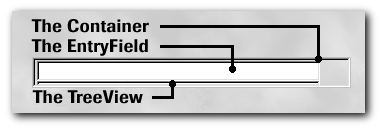
Notice also the thin line under the
entryfield. This is the treeview itself. I make it small so as not to take
up too much space on your form. This treeview will be resized and repositioned
at run-time depending on the width of the TreeDropper control itself. Its
available in the designer so you can customize the treeview any way you
want.
If you want to add treeitems to
the TreeDropper in the form designer, use your mouse to expand the container
downward and then expand the treeview. You can use this treeview the same
as any standard one in the Designer.
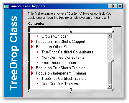
You can add, edit and delete items
all you want and the information will be saved in your form. There are
other ways of filling the treeview with items but Ill get to that later.
The TreeDropper has a few custom
properties which you can use as well. Since dBASE does not yet support
custom property streaming they have to be defined in either the
Init() or
onOpen() methods of your
form.
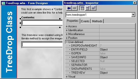
They are:
-
DropDownHeight:
This property specifies the actual height of the treeview when it drops
down (in char metrics).
It defaults to 7.
-
ShowParents:
This property affects how the result of the users selection appears in
the entryfield. When set to true,
the current selections text and each of its parents texts will appear
in the entryfield. When set to false
it shows only the current
selections text. It defaults to
false.
-
Separator:
This property is used in conjunction with the
ShowParents property.
Its a string which will show as a separator between each treeitems text
in the entryfield. It defaults to ..
-
Selected:
This is a reference to the currently selected treeitem object.
-
IsOpen:
This property tells you whether a particular TreeDropper is open or not.
Do
not assign to this property. Its for read-only purposes.
-
OnChange:
If defined, this will fire when the user changes their selection on the
TreeDropper.
See the TreeDropForm (TreeDrop.WFM)
to see how these are implemented.
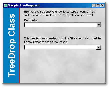
Some
ideas for its use
-
This control could be one component
in an attractive help system.
-
You could use this to replace a regular
combobox. How about a list of states or provinces with their flags as images?
-
It could be used to show parents and
relations in genealogy.
-
If youre brave you might consider
the concept of making this control data-aware. Very doable.
Nuts
& Bolts
This class implements some interesting
techniques. One of the challenges posed by this control is its z-order.
If it is dropped below pushbutton for instance, the treeview will show
up below it. Not exactly what we want. My solution is to use the Win API
SetParent() function.
This function will attach an object to another object. It takes two
hWND properties as parameters.
See the TreeDropper code to see how it works. There is a limitation
to this: a comboboxs list will drop outside the form if necessary
the TreeDroppers list wont. I havent quite figured out how
to do this yet so if you come up with a way, let me know.
I like the ability to create and
move objects before the form opens. This allows you to define two
types of functionality: design-time and run-time. It also simplifies the
use of containers in the form designer as you dont have to deal with repositioning
all of the containers components. You can define your own rules
on how the containers components will look at run-time.
I create a form property called
ActiveTreeDropper in this class. It is a pointer to the currently active
TreeDropper control. I use it to ensure that only one TreeDropper is open
at a time.
I also added several new methods
to the treeview which you could move into your own base treeview class.
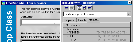
-
Fill():
This method will fill the treeview from an array. The array can be a simple
array, an array containing other arrays or an array of TreeItemInfo objects.
The TreeItemInfo objects are simple objects to hold information about a
treeitem like its image properties etc. You could create a table
to store this information and then use it to fill the treeview.
-
Iterate():
This method will run a code block against each item in the treeview. You
can see how to use this in the sample form. The TreeDropper uses
it to make sure that every treeitem is expanded before it opens up.
-
AddItem():
This method simplifies adding new treeitems to the treeview for you. Simply
call this method with a string parameter and the treeitem will be created
with that text. The 2nd parameter is the parent under which you want to
create the treeitem. It defaults to the treeview itself.
Limitations
Since the lists are objects and not
simple strings you should probably not use this control for very large
lists. A few hundred will be ok but more than that and you could
run out of memory.
I didnt spend much time testing
the positioning logic with different fonts. I normally use
Arial 8 pt for my forms
and controls. You might find that the drop button doesnt position itself
correctly if you standardize on a different font. Improvements in this
area would be greatly appreciated. Also this only works with
char metrics. It would
need more tweaking to handle others.
The
DropDownHeight property
doesnt really do what I want. This should specify how many items will
appear in the treeview regardless of the font or font sizes used. Currently
it simply sets the treeviews height to its value.
Finally I would definitely not
call this a production control. It does the basics but there is a
lot of extra functionality that could be added to it. Let me know of any
ideas you have for this control and Ill implement them for the next version.
Conclusion
You can see that the container class
gives us a whole new avenue for custom control creation. With the
container we can create composite objects. You can create virtually
any type of control that you can dream up. If youre looking for inspiration
for your own controls, have a look at the software sitting on your desktop
now. Think about how other controls in different applications
operate. How does the user interact with them? How do they interact with
each other? When you see something you like, sit down, plan
it out and then code away. The possibilities are endless!
Known
Issues:
In Visual dBASE 7.01 there is a bug
with the releaseAllChildren() method.
If you add treeitems in the Designer and then try to release them in your
code they will still be visible in the inspector.
Workaround: Simply
use the treeview either as a static treeview or a dynamic one. Dont mix
them. In other words if you know that the contents of your treeviews
are going to change at some time, dont add items to them in the designer
use the Fill() method instead.
To download the TreeDropper
Control code, click here
(its a 34Kb zipped file)
Dan
Howard has been an independent software developer for almost 10 years using
Clipper for DOS and Visual dBASE for Windows. He can be contacted
at: sproket_dBulletin_@total.net (take out _dBulletin_).