Note: Move your
mouse over the form below to see an example of a multi-column
GridCombobox.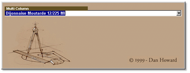
What is the GridCombobox control?
The GridCombobox is a new control that is similar in functionality to the stock combobox found in dB2K. This one, though, will drop down a grid instead of the simple list. It takes advantage of two of the most powerful classes in dB2K: the container class and the grid class.
Note: Move your
mouse over the form below to see an example of a multi-column
GridCombobox.
Simply unzip all of the files from gridcombo.zip into a directory. Then open up dB2K, locate the directory you unzipped the files to, and double-click on GridCombo.wfm in the Navigator to see the sample form.
The first thing you should do is open up DHForm.cfm in the source editor and review the added methods in it. This base form class handles an import feature of the GridCombobox and any other control you may ever use. DHForm uses iteration to look for a special method called “INIT” in either the form or any control on the form. If it finds one, it runs it before the form opens. This gives you the advantage that all initialization of the form itself or any control on the form can be done while the form is off screen. This prevents a lot of flickering when you open the form. The DHform class can be implemented as-is as a base class for your own forms or you can simply cut/paste the code out and place it in you own base form class. DHform has a few other goodies as well!
To ensure that the GridCombobox is always loaded when dB2K starts up, open up a form in the form designer, right-click on the Component Palette and choose “Setup Custom Components” from the menu. You'll see a dialog box which lists all of the custom class files which you currently use. Click the “Add” button and locate the GridCombo.cc file. When you click “OK”, this class will be added to your db2k.ini file and will be automatically loaded next time you fire up dB2K.
Click on the Custom tab of the Component
Palette and drag the newly-added GridCombobox onto your form. What
you'll see is something similar to that in the image below. Notice that
the  button is missing? That's because I create this button dynamically before
the form opens and position it at the right edge of the control. This
saves you the trouble of having to reposition it yourself in the designer.
You also don't have to worry about the widths of the entryfield or the
grid itself. They will resize themselves to the width of the container.
button is missing? That's because I create this button dynamically before
the form opens and position it at the right edge of the control. This
saves you the trouble of having to reposition it yourself in the designer.
You also don't have to worry about the widths of the entryfield or the
grid itself. They will resize themselves to the width of the container.
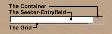
Notice also the thin line under the entryfield. This is the grid itself. I make it small so as not to take up too much space on your form. This grid will be resized and repositioned at run-time depending on the width of the GridCombobox control itself. It's available in the designer so you can customize the grid any way you want.
Note: I turn off all of the editing for the grid. You should also leave it off. I suppose you could use this grid for editing purposes when it drops down, but I never tested that. Experiment with this idea if you like.
This class implements some interesting techniques. One of the challenges posed by this control is its z-order. If it is dropped below the pushbutton for instance, the grid will show up below it. Not exactly what we want. My solution is to use the WinAPI SetParent()function. This function will attach an object to another object. It takes two hWND properties as parameters. See the sample code to see how it works. There is a limitation to this: a combobox's list will drop outside the form if necessary — the GridCombobox won't. I haven't quite figured out how to do this yet. If you come up with a way to do this, let me know.
I like the ability to create and move objects before the form opens. This allows you to define two types of functionality: at design time and at run-time. It also simplifies the use of the control in the designer as you don't have to deal with positioning all of the controls in the container. You can define your own rules on how the controls will look at run-time.
The font class is also very useful. It has two interesting methods:
You'll see these in action in the Init() method. I use a CarryFontInformation property for this. If set to true (the default), then whatever font information you supply to the GridCombo's entryfield will be applied to the grid columns. You could use this technique with your own custom grids since the grid itself has no font properties.
Well, first off, since this control is grid based, it won't work with XDML. You could use the ideas here to create a BrowseCombobox if you'd like.
This control was written using “pixel” metrics. If you use a different metric the position of the elements inside the container will be skewed.
The dropdownheight property doesn't really do what I want. This should specify how many items will appear in the grid regardless of the font or font sizes used. Currently it simply sets the grid's height to its value.
Finally, I would definitely not call this a production control. It does the basics but there is a lot of extra functionality that could be added to it. Let me know of any ideas you have for this control and I'll implement them for the next version.
You can see that the container class gives us a whole new avenue for custom control creation. With the container we can create composite objects. You can create virtually any type of control that you can dream up. If you're looking for inspiration for your own controls, have a look at the software sitting on your desktop now. Think about how other controls in different applications operate. How does the user interact with them? How do they interact with each other? When you see something you like, sit down, plan it out, and then code away. The possibilities are endless!
Workaround: Comment out any column lines in the constructor code of the form which show these properties:
rangeMax
rangeMin
editorType
Example:
// columns["COLUMN_X_"].editorType = 1 // EntryField
- OR -
// with (columns["COLUMN_Y_"].editorControl)
// rangeMax = 100
// rangeMin = 1
// endwith
Note: The author would like to thank Flip Young, my proof-reader, for the improvements she brought to this text.