
The following article is primarily intended to provide information on the Paintbox Handled Seeker class. The discussion and sample code herein is limited to using the class with seeker type controls. Note however, that in an attempt to fully describe the Paintbox Handled Seeker class, some discussion or reference may not apply to seeker type controls.
Features
Incremental Search with Auto-Complete
With each printable key press, the control performs an incremental search. If the resulting input string is found, the remaining text in the edit control is automatically completed and selected. If the resulting input string is not found, the value in the edit control remains unchanged. Input is always restricted to strings found in the dataSource rowset. Below, Carolina Golf & Tennis is found among a list of customers after the string car has been typed in the Paintbox handled seeker.
Rowset Navigation
Rowset navigation is performed by row, by page, to first, or to last when respective navigation key presses are made.
Indexed and Non-Indexed Searches
The control employs two search methods, an indexed search and a non-indexed search, the method used dependent on the controls findKey property. The indexed search uses the rowsets findKey() method while the non-indexed search uses the rowsets applyLocate() method.
Multiple Edit Controls
The control is capable of containing multiple edit controls (entryFields), each representing an alternate seeker or a read-only display.
Datalinked
The edit controls acting as seekers are emulated through the paintbox and never receive focus, allowing the seekers to be dataLinked. Therefore, in addition to being a seeker and navigation tool, the control displays live dataLinked field values. This dual purpose allows for more flexibility in designing the layout of a form.
Planning
Metric
The Paintbox Handled Seeker uses entryfield emulation to make it appear as though edit controls have focus. In reality, they do not. This emulation requires various calculations which are currently based on the metric being pixels. Therefore, in order to use controls based on the Paintbox Handled Seeker class, the forms metric must be pixels (metric = 6).
Sub-Class
The Paintbox Handled Seeker, in addition to having
the ability to handle a variable number of edit controls, can be used as
the foundation for other types of controls. Because of its versatility,
the SeekerPX class is designed as a base class with the intention that
it be sub-classed. The SeekerPX class itself does not include hard coded
edit controls, as the decision of how many edit controls to include and
how they are named is left up to the developer with the use of a sub-class.
For example:
|
class MySeeker(parentObj) of SeekerPX(parentObj) from "SeekerPX.cc" this.edit1 = new SPXEdit(this) with (this.edit1) width = 100 endwith endclass |
|
This is a relatively simple piece of code which sub-classes the SeekerPX class to create a single edit seeker control. Sub-classed controls can obviously get more involved, defining multiple edit controls and or other controls such as textLabels, images and buttons. In addition, sub-classed controls can be created for generic or specific use.
Rowsets
The SeekerPX class has two types of rowsets, a dataLinked rowset and a dataSource rowset. The dataLinked rowset is the rowset from which the fields dataLinked to the edit controls belong. The dataSource rowset, also refered to as the controls rowset, is the rowset from which the incremental search and navigation is perfomed. For seeker type controls, the dataLinked and dataSource rowsets are one in the same. For combobox type controls, the dataLinked and dataSource rowsets are two separate rowsets where the dataSource rowset supplies values to the dataLinked edit controls.
Edit Controls
The edit controls used by the Paintbox Handled Seeker must be SPXEdit controls (included in SeekerPX.cc). The SPXEdit control is specifically designed for and recognized by the Paintbox Handled Seeker class. An edit control can be used three ways, as a seeker, as a display, and or as a master edit:
Indexed searches, compared to non-indexed searches, are likely the best alternative when indexes are available as indexed searches are generally quicker and the rowset is sorted in a meaningful order. To use indexed searches, the rowset must have an active index and the controls findKey property must be true. Indexed searches expect uppercase index expressions, therefore, any character field which can have a lowercase character must have an uppercase index expression to work with indexed searches.
While you can prepare the rowset and control for indexed searches from various places in your code, consider using the controls onEditSel() and setIndex() methods which are provided for this purpose.
Non-Indexed Search
Unfortunately, required indexes are not always available to use indexed searches. This may be inherent, or a matter of design preference. Where indexes are not available, a non-indexed search is necessary. To use non-indexed searches, the controls findKey property must be false (default), this is regardless of whether the rowset has an active index or not. The non-indexed search uses the rowsets applyLocate() method with locateOptions set to match partial length and ignore case.
The speed at which applyLocate() finds a match in a non-indexed search can vary depending on a couple factors:
The downside to using non-indexed searches is that the rowset is not sorted in a meaningful order. However, this may not be a factor if data is displayed one row at a time, as apposed to using a grid, or when using SQL Order By. To compliment non-indexed searches, the use of the rowsets locateNext() method is available through the controls own locateNext() method. LocateNext() applies the previous locate criteria to search for another row. The controls locate property can be used to determine when the control is in locate mode and when locateNext is applicable.
Built-In Methods
The SeekerPX class has many built-in methods which are responsible for the operation of the control. While most of these methods are strictly for internal use, some can be used to enhance a sub-classed control by calling these methods directly or by overriding the method.
As an example, the onNavigateKey() method controls navigation of the dataSource rowset when a navigation key is pressed. Assume a sub-classed control includes two navigation buttons, Previous and Next. The onclick() event for these buttons could call onNavigateKey() to perform the navigation, passing the appropriate key code as a parameter (see keyHandler chart). This not only facilitates things, but ensures that navigation is controlled within the class.
Overriding a method is a bit more advanced and may be necessary when creating other types of controls. For example, a combobox type control sub-classed from the SeekerPX class may override the keyHandlers onKeyDown() to provide an autoDrop feature. Something less complicated would be the use of onGotFocus() and onLostFocus(), which could be overridden, for example, to change the color of the control.
Use of the built-in methods requires that you gain a general understanding of the methods, or that you base your code on existing examples. For more information, refer to the SeekerPX.cc source code.
Reference
In-Design
Following are some basic steps to setting up a seeker type control that is sub-classed from PaintBox Handled Seeker. Note that the exact steps will vary from control to control.
Required
The control uses custom properties to store variables
and objects needed to function. Internal properties are changed from within
the control and are available for reference only. External properties are
available to be changed. The following is a list of the relevant internal
use and available external use properties:
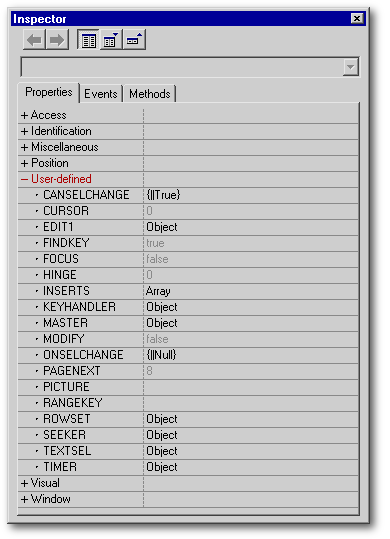 |
Internal Use
|
There are three event related methods available
to execute additional code when the related event occurs. In order to utilize
these event related methods, a function pointer must exist either in the
sub-class or the form class (added using the Source editor). When providing
the method in the sub-class, the function pointer must be in the following
format:
|
Function <Method Name> // do something return |
|
When providing the method in the form class, the
function pointer must be in the following format:
|
Function <Control Name>_<Method Name> // do something return |
|
canSelChange()
The canSelChange() event fires when the user attempts to change the control value through a change in the dataSource rowset. The return value (true or false) determines whether the change can be made.
While the control has focus, pressing a searchable or navigation key will attempt to search or navigate the dataSource rowset. If the search or navigation is successful, and the canSelChange() returns true, the controls value is updated. Note that for seeker type controls, the controls value is updated through the dataLink rather than by the control because the dataLinked rowset and the dataSource rowset are the same.
onSelChange()
The onSelChange() event fires when the user successfully changes the control value through a change in the dataSource rowset. The controls value ( master edit value) is passed as a parameter to the onSelChange() method.
onEditSel()
The onEditSel()
event
fires when the control instantiates and when the user selects another edit
in a multi-edit control. Use onEditSel()
to
setup the control for the selected edit control, which becomes the controls
seeker. The name of the edit control selected is passed as a parameter
to the onEditSel() method.
The following example uses the onEditSel()
to
set the rowset indexName and
findKey flag through the controls
setIndex() method:
|
function Seeker1_onEditSel(cName) if cName = "EDIT1" this.setIndex("Name") elseif cName = "EDIT2" this.setIndex("ID") endif |
|
Methods
The control contains many built-in methods, most of which are reserved for internal use, and some provided for external use (in your code). The following are the available external use methods:
BeforeOpen()
Required to finish instantiating the control and must be called from the forms overridden open() method.
SetFocus()
Gives focus to the control. If the control already has focus, the effect of calling setFocus() is that the controls seeker is reset (value is selected).
SetIndex()
Sets the dataSource rowset
indexName and the controls
findKey
property.
|
// Syntax SetIndex(<IndexName expC> [, <FindKey expL>]) // <IndexName expC>: The name of a valid
indexName
or an empty string (null, or "").
|
|
locateNext()
Calls the dataSource rowset's locateNext() method when the control is in locate mode. LocateNext() applies the previous locate criteria to search for another row in a non-indexed search. See also, Locate property.
KeyHandler
The keyHandler
is
the paintbox control which handles all key presses while the control has
focus. The following chart lists the various keys that are recognized by
the keyHandler,
the class method called, and the resulting action. The key code is provided
where relevant (bCtrl
is
whether the Ctrl Key is down).
| Key (Code , bCtrl) | Class Method | Resulting Action | |
| Printable Keys | onSearchKey( ) | Incremental Search | |
| ArrowUp (38) | onNavigateKey( ) | Rowset Navigation: 1 | |
| ArrowDown (40) | onNavigateKey( ) | Rowset Navigation: + 1 | |
| PageUp (33) | onNavigateKey( ) | Rowset Navigation: pageNext | |
| PageDown (34) | onNavigateKey( ) | Rowset Navigation: + pageNext | |
| Ctrl + PageUp (33, True) | onNavigateKey( ) | Rowset Navigation: First | |
| Ctrl + PageDown (34, True) | onNavigateKey( ) | Rowset Navigation: Last | |
| Ctrl + ArrowLeft | nextEdit( ) | Edit Select Left | |
| Ctrl + ArrowRight | nextEdit( ) | Edit Select Right | |
| Ctrl + C | Copy( ) | Copy selected text to clipboard | |
| ArrowLeft | onCursorKey( ) | Cursor Position: 1 | |
| ArrowRight | onCursorKey( ) | Cursor Position: + 1 | |
| Home | onCursorKey( ) | Cursor Position: First | |
| End | onCursorKey( ) | Cursor Position: Last | |
| Shift + Cursor Key | onCursorKey( ) | Cursor Position and Text Select | |
Samples
There are two sample forms included with this article demonstrating sub-classed seeker type controls. The two forms are functionally identical, however, each use a different sub-classed control. Following is some basic information about the forms and sub-classed controls used.
SPXDemo1.wfm
This sample form uses SeekerME class which is designed for generic use. The SeekerME class defines five edit controls and includes an overriden beforeOpen() method to release unused edit controls before the controls opens. The textLabels used to label the edit controls are defined in the form class, and the onEditSel() function is included in the form class.
SPXDemo2.wfm
This sample form uses the SeekerCR class which is designed for specific use (in this case, a customer form). The SeekerCR class defines a predetermined number of edit controls, textLabels, and navigation buttons. In addition, dataLinks are set within an overridden beforeOpen() method, and the onEditSel() function is included in the sub-class.
Both sample forms use a four edit seeker-type control. Three of the edit controls are seekers, one is a display only. Of the three seekers, two use an indexed search (Name, ID), and one a non-indexed search (Region). The onEditSel() event is used to prepare each seeker (set the indexName and findKey properties) when that seeker is selected. When using the non-indexed seeker, the use of locateNext() is made available through the Edit menu.
Conclusion
If you have come this far, hopefully you have gained enough knowledge about the Paintbox Handled Seeker to be able to create your own seeker type controls, or at least incorporate the samples. For those of you who beg for more, a second article on using the Paintbox Handled Seeker to create a grid combobox control will follow, when time permits.