 |
The rmToolBar Control
A Custom
dBASE ToolBar Control.
by Ronnie MacGregor
- Date: October 2006
|
The rmToolBarThe use of ToolBars is something of a personal preference. Some developers never seem to use them, while others will always use them. Very often the functionality they bring to an application is a duplicate of functionality offered by menu choices, but the big difference is that a Toolbar Button is more readily accessible than browsing through a menu hierarchy.
Even today, with high resolution screens much more the norm, screen real-estate always seems to carry a premium, and there is no doubt that a Toolbar button provides a compact visually appealing efficient use of screen space.
Back in the days of the first 32 bit version of dBASE (Visual dBASE v7.00) machines were slow and memory was very limited by todays standards. With the overhead of the dBASE virtual machine, and the additional overhead of continually firing onUpdate() code for a Toolbar, an application with a Toolbar was noticeably more sluggish than one without. This may be one reason why Toolbars historically were not used in dBASE applications as much as they otherwise might have been.
The lack of a visual designer for Toolbars meant that the developer required a good level of understanding of the required code since everything had to be hand-coded. This single factor even today may be a contributing factor in the lack of use of Toolbars, simply by moving them out of reach of the novice.
The stock dBASE Toolbar class had a straightforward appearance when running on Windows 3.11, Windows 95, Windows 98, or Windows 2000.
The fact that it doesnt have a visible bottom border didnt really help things from the appearance point of view either. The ever-increasing prevelance of XP means that there are probably few developers designing applications specifically for older operating systems, and the stock Toolbar translates to XP as follows :
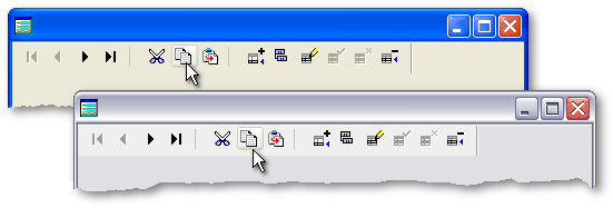
The main change to be seen is the appearance of the onMouseOver Popup Button, which in many respects is reminiscent of Apples OSX.
The harsh reality is that users are now becoming used to much more modern, more appealing Toolbar designs, and it is unlikely that dBASE will provide native support for anything other than the current stock Toolbar in the foreseeable future.
In the very first edition of the dBulletin, George Burt wrote a very good article titled Creating a Cool Desktop. Written in 1999, this article showed how with a little lateral thinking, albeit with quite a bit of work, it was possible to create an interface which at the time was a definite cut above what could be produced with stock controls. The amount of work involved to do this however meant that while developers were very impressed by this approach, I suspect few could afford the investment in time required to use this approach routinely.
In the tenth issue of the dBulletin, Robert Bravery wrote a very good article titled Visually Design a Toolbar. This article tackled the lack of a visual designer for Toolbars, and took quite a clever approach, again demonstrating a little bit of lateral thinking to allow the initial design work to be done in the Form Designer. Unfortunately this approach still required the developer to go through the code and manually edit it in order to produce working Toolbar code. In reality this meant that developers with sufficient knowledge would simply code the whole thing from scratch, and more novice users would probably find that Roberts innovative approach was a very good learning tool, but that they would soon find themselves in the same camp as the former group.
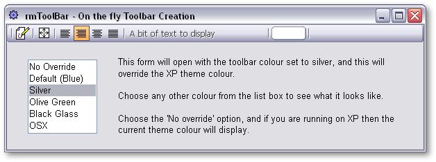
It would be nice if we had a Toolbar with a choice of backgrounds to which we could add if we wished, a Toolbar which was not restricted to merely containing buttons, a Toolbar which had a visual designer which could reload previously created Toolbar code, a Toolbar which is XP-theme aware but could override the XP-theme colour if desired, a Toolbar which doesnt move every other control down the form, and doesnt use resources by continually firing onUpdate() code. A Toolbar which is easy to use even for the novice.
The rmToolBar is designed to achieve these goals.
The rmPaintBoxThe rmToolBar is a custom control, based on a container, which is then populated with paintbox controls, one for the background, and one for each button. The rmToolBar can be created, or added to dynamically, or can be instantiated from predefined rmToolBar code. It is XP-theme aware and will respond to a change of theme colour mid-session. It uses bitmap resources contained in a dll file and is designed to be easily graphically redesigned by anyone with a little artistic ability.
Before we look at the rmToolBar in more detail, we should look at the key control required to easily produce a versatile control with good looking graphics such as this. That key control is the rmPaintBox control.
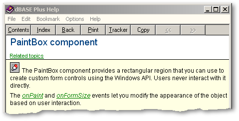
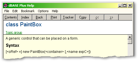
Basic AnatomyOne of the least-used native dBASE controls is the PaintBox Control. It is not obvious what it is for, and the dBASE help doesnt really provide much assistance. This is what we have for the PaintBox component:
Here we are given a clue as to the fact that this control can be used to create custom controls, but it doesnt really tell us how. It also states that users never interact with it directly. Is this true ? Does the user really interact with any form control directly ? Any visually perceived control is an illusion. The users actions are interpreted by the operating system and messages sent to the control which fire events that can be used to perform dBL coded actions, and the control can then be redrawn to further the illusion of direct interaction. How does this differ from a PaintBox control ? Perhaps not greatly.
Lets have a look at what we are told about the PaintBox Class :
Well thats pretty informative !
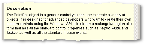
The description doesnt add much more, and could be misleading:
The use of the phrase create a variety of objects is potentially misleading here. Any new object is still a PaintBox object. Does this mean you can create objects as properties of the paintbox ? If so, then this is no different to any other dBASE object or class. Does it mean that you can paint your own control ? If so, then this is perfectly correct, and this is the true and proper use of a PaintBox Control. It is interesting to note that by on-line help definition, if you use a PaintBox in this way, then you automatically become an advanced developer ! To say that a PaintBox has all the standard events is almost true, but there is the glaring but not insurmountable omission of an onClick event.
With this lack of information on the stock PaintBox control, and the lack of sample code, it is no wonder that this control has been little used for its proper purpose.
The PaintBox is also the most misused control in custom control design, where it is used simply as a container object for non-visual controls so that they can be used in a drop on form manner. It is the best choice for this job simply because it carries the lowest overhead of resources.
In order to use a PaintBox control for proper painting, quite a bit of work needs to be done. Every last pixel must be drawn in one way or another, and it is all done by using API calls. This immediately moves it out of reach for anyone who is not able, or just not prepared, to sit down and translate API calls to do the work.
Painting is what Windows does in numerous overlayed rectangles, windows and controls, to produce the illusion that we perceive as our Graphical User Interface. The API calls that we use with our rmPaintBox control are not unique commands for use with a PaintBox, but commands for painting on any object in any window. In my opinion, the only thing which sets the PaintBox class apart from any other native visual class, is the simple fact that it has a native onPaint event, which will be fired automatically every time the operating system deems a repaint of that window to be necessary. If you are prepared to fire painting code manually then all you need to do is place it in a function and call that function passing the handle of the object on which you wish to paint, and in this way you can paint directly on the form, on a button, or any other visual control you wish.
One of the main keys to productivity in dBL programming is the use of custom controls. A subclassed control can be used to provide instant access to any and all of the work already done, or functionality already added to the superclass. With the rmPaintBox Control, my aim is to provide a base class with much of the grunt work already done, to enable any dBASE developer to easily produce results with a PaintBox. The control in its present form contains simply what I have needed since inception, in part pulled from existing controls, and the intention is that any subsequent need will be added to the base class providing growing functionality and ease of use. For this reason I will be pleased to receive any submissions from fellow developers which would add further functionality to this class.
A key bit of functionality which has been added to the rmPaintBox control is the ability to paint a transparent bitmap. This ability was first seen in the rmXPTabBook control, with the ability to paint a bitmap on a tab. It is this ability that has made it possible to create the rmToolBar control.
Another nice feature which has recently been added to the rmPaintBox is Theme Awareness. This means that the rmPaintBox can be made aware of the current XP-theme colour in force, and this will be kept up to date even if the theme colour is changed mid-session. In order to use this functionality, theme awareness has to be switched on once the paintbox control has been instantiated and has a valid handle. This is most often done in an onOpen event simply by firing the StartThemeAwareness() function. After this has been done, all that is required is that you refer to the theme-related custom properties of the rmPaintBox in your onPaint code and this allows conditional repainting based on the theme colour in force at that moment in time.
I am indebted to Gary White for providing many code samples over the years which demonstrated, in his clear coding style, many aspects of using a PaintBox.
I am also much indebted to Marc Van den Berghen, who at my request adapted some of his existing code to specifically trap the WM_THEMECHANGED message which meant that the rmPaintBox was not limited to querying the theme colour simply on opening, but would respond to any change mid-session.
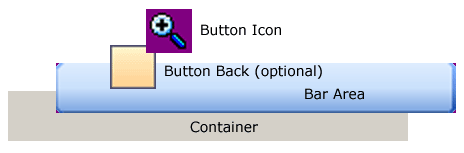
The rmToolBar class is a container which contains a BarArea rmPaintBox control. This BarArea control is sized to fit the container on opening, and is also used to trigger theme awareness. Further rmPaintBox controls are then created, one for every button.
The BarArea control is painted in three sections if Round Ends are selected, or one continuous section otherwise. The ends, if required, are painted as transparent bitmaps, and the body of the BarArea is painted by stretching a bitmap horizontally to fit. Since designing this control I have come to the conclusion that tiling bitmaps is faster than stretching bitmaps, probably because of the reduced calculation involved, but for this purpose there is no significant performance penalty.
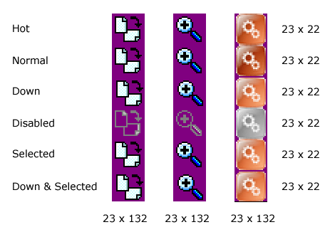
Each rmToolBarButton is painted in three stages. First of all the whole of the rmToolBarButton is painted with a section of the toolbar body bitmap. This ensures that if a change of background colour has occurred and there is no ButtonBack bitmap defined, then the button blends into the toolbar correctly. If a ButtonBack has been defined it is then painted as a transparent bitmap, and then finally the button icon is painted as a transparent bitmap.
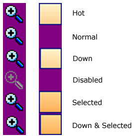
The rmToolBarButton has to be conditionally painted in order to take account of the state of the button. Is the button selected ? Is the mouse over the button ? Is the mouse button down ? All of the various possibilities are covered by six button states as listed above. So a single bitmap is defined for the button background and another single bitmap for the button icon, and then the required section or sub-bitmap is used for painting as required.
In addition to the rmToolBarButton class, there are other variations. The rmToolBarSEP a toolbar section separator control, a rmToolBarEF a custom entryfield class that accepts five numeric digits, and a rmToolBarTXT class which allows text to be written to the toolbar. These are simply the controls that I have needed so far, more may be added in the future as required.
There are two main approaches to using this control. One is to build the rmToolBar on the fly and the other is to use a pre-prepared custom class containing instantiation code for all the rmToolBar objects.
In order to use the dynamic approach the first step is to load the procedure file :
set procedure to rmToolBar.cc additiveOnce the above line of code is in the class code for your form, the rmToolBar is available from the custom tab of the component palette ready to be dropped on the form, but it is easy to hand-code an instance as follows :
this.TOOLBAR = new RMTOOLBAR(this)with (this.TOOLBAR) onOpen = class::TOOLBARONOPEN left = 0 top = 0 width = 600 height = 25 endwith Now in the onOpen event we can add components to our rmToolBar by calling built in functions, passing the required parameters to define our buttons :
// Set the resource file for the toolbar backgroundthis.Resource := "rmToolBar.dll" // Force the toolbar colour to stay put until told otherwise this.OverRideThemeColour := true // Set bar colour this.SetBarColour("Silver") // Create Separator this.CreateSeparator("Sep01", "rmToolBar.dll", 0) // Create a Normal Button this.CreateButton(; "TBB_Normal", "rmToolBar.dll", "TOOLBARBUTTONBACK_BMP",; "TBB_ANNO_BMP", 0, false, false, false, "",; "A normal button", "form.myFunction((this))"; ) There are quite a number of parameters to be passed in order to create the button, but dont waste time worrying about the apparent complexity of this for now. This example is really just to show that it is possible. It is perhaps worth noting however that the last parameter is a text string containing a line of code that will be placed in a codeblock, and is used to call a function when the button is clicked. As soon as the CreateButton function has run, there is a fully operational button on the rmToolBar. There are corresponding methods which can be used to create other rmToolBar component types. Have a look at the following sample form which uses this method to create the rmToolBar :
Run the form, have a play with it, and examine the source code to see how this has been implemented. This should show you how easy it is to use this control, and how quickly and easily the rmToolBar can be repainted with a completely different set of clothes.
There is a down-side to using this method, which is that all of the rmToolBar components are being created after the form has opened. For this reason there is often a perceptible delay while all the elements are created and painted. The conclusion therefore is that this method should really only be used in situations where there is no alternative. In other words, it is not known prior to instantiation time what elements are required on the rmToolBar. If this approach has to be used, then it might be better done in an overridden open event so that all the elements are created before the form opens.
The second, and preferred approach is to have all the elements of the rmToolBar predefined in a custom class. If this is done, then all that is required to use the rmToolBar is the following instantiation code :
set procedure to TB_Sample_ScannerToolbar.cc additive
this.RMTOOLBAR1 = new TB_SAMPLE_SCANNERTOOLBAR(this)with (this.RMTOOLBAR1) left = 0 top = 0 endwith Have another look at SamplesForm.wfm :
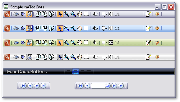
The top four rmToolBars are all instantiated from the same custom class, with just the background colour changed, and there are three other sample rmToolBar classes. Run this form and have a play with it, examine the code in the Source Editor, and then have a look at the source code for each of the four sample rmToolBars named TB_Sample_*.cc. This will provide a good guide, and an impression of how little code is actually required to produce what is quite a sophisticated control.
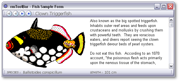
In order to better understand the workings of this control we need to look at something which is just a little closer to a real world example of the use of the rmToolBar. Have a look at Sample_Fish.wfm which has two rmToolBars, one being used as a status bar. The custom class code for the two rmToolBars has been appended to the .wfm file.
This sample uses the familiar Borland sample Fish table. In particular lets look at the navigation button which takes us to the first record in this table. It is instantiated as follows :
this.TBB_FIRST = new rmToolBarButton(this)with (this.TBB_FIRST) Resource = "rmToolBar.dll" BackgroundName = "" IconName = "TBB_FIRST_BMP" Left = 11.00 Width = 23.00 Disabled = false Toggle = false ToggledDown = false RadioGroup = "" SpeedTip = "First Record" onMiddleDblClick = {; this.ReleaseMouse(); form.rowset.first()} endwith
oRef = this.TBB_FIRSToRef.LoadDLL(oRef.Resource) this.aObjectRefs.add(oRef) this.NextObjectLeft := oRef.left + oRef.width Lets deal with some of these properties one by one :
Resource - Each rmToolBar button has its own resource file, which means that it is possible to pull bitmap resources from more than one DLL should this ever be required.
BackGroundName - This is the name of a bitmap resource in the defined resource file, and is optional. If it is not defined the rmToolBarButton will be painted simply with the transparent bitmap defined for the IconName. This allows for custom shaped buttons just as this First button is.
IconName - This is simply the transparent bitmap that will be used to paint the button icon. Note that the transparent colour is the standard dBASE transparent colour 0x800080 or RGB 128,0,128.
Disabled - This property can be set at any time as required. In this sample form this is done in the rowset_onNavigate() function. This property is also set in the instantiation code to dictate whether the button is Disabled or not when the rmToolBar opens. Note that this property has been named such that there is no conflict with the stock property Enabled.
Toggle - This property dictates whether or not the rmToolBarButton behaves as a toggle button. In other words when it is clicked, does it stay down until clicked again, or does it pop back up again.
ToggledDown - This property dictates the opening Toggle state of a Toggle button.
RadioGroup - This property is used to establish groups of rmToolBarButtons which behave as RadioButtons. In other words, only one member of the group can be selected or toggled down at any one time. Similar to the stock dBASE radioButton control, this property needs to be set to a text string, and this text string must be the same for each member of a single group. Unlike the stock dBASE RadioButton, members of a group do not need to be adjacent to each other, but in normal use it would be expected that this would be the case. In order for this mode of operation to work, each member button must also be defined as a Toggle button, and normally one member of the group would have its ToggledDown property set to true.
SpeedTip - The stock dBASE paintBox control only acquired a speedtip property in version dBASE Plus 2.01. If this control is used in earlier versions of dBASE, the rmToolBar control should work without problem, but this property becomes a custom property rather than a stock property, and needless to say under these circumstances a speedtip will not display.
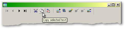
onMiddleDblClick - The stock dBASE paintBox control does not have an onClick event. It is therefore this event which is fired by the control when you click on a button. We are using a codeblock to fire a function available outside the rmToolBar control and so initiate whatever behavior we wish to associate with the rmToolBarButton. Note that the rmToolBarButton captures mouse events when the mouse is over the control. This is so that we can have MouseOver functionality in earlier versions of dBASE which did not provide so many mouse-related events. This can have undesirable effects if the action of the button is to open a modal form or to fire rowset navigation for example, and so we can, if required, use the ReleaseMouse() method of the rmToolBarButton to allow normal application behavior at the cost of losing subtle mouseover painting for a second or so.
The final four lines of instantiation code load the DLL containing the bitmap resources ready for use, add a reference to the newly created object to an array of rmToolBar component object references, and calculate the default left position of the next object to be created.
Custom properties for other rmToolBarButtons types should be self-evident and can be examined in the sample code provided, and therefore will not be expanded upon here.
We have shown how to create rmToolBars on the fly using built in methods of the custom class. We have looked at self-contained class code containing instantiation instructions for individual sample rmToolBar classes, and we have seen that this code would not be difficult to hand-code as it is very similar to form instantiation code.
One of the main criticisms of the native Toolbar class over the years has been the lack of a visual designer. Ken Mayer, who was on the Borland QA team at the time, informs me that the dBASE development team were under intense pressure to meet a release deadline, and certain features could not be dealt with in that time scale. It would seem that this omission is at least partly responsible for the under-use of this native class, and perhaps has left it out of reach of the novice.
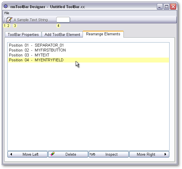
In order to make the rmToolBar as quick and easy to use as possible, we need a designer. We need to be able to quickly construct a Toolbar, be able to simply save it, and in so doing generate the instantiation code, and it would also be nice to be able to reopen the saved rmToolBar code in the designer as a quick start to designing another Toolbar
The concept of writing program code which wrote program code appealed to me when working on QR3 - Quick Reports 3 and the subsequent dBulletin article for this custom control which produces dBASE report code. The report code produced by QR3.cc could be reloaded into QR3, but this was done by using a reload function appended to the report class code which re-established the custom property values of QR3.cc that were used to produce the report code in the first place.
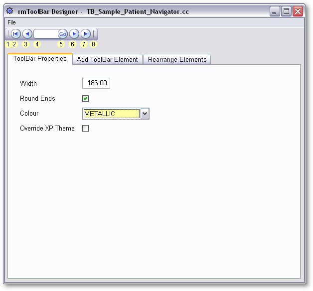
With the rmToolBar Designer I have changed approach to bring this one step closer to the sort of two-way designer tools that we already take for granted in the dBASE product. As the rmToolBar Designer adds Toolbar components, the objects are being created in memory, and the rmToolBar is fully functional as it is being designed. When the rmToolBar is saved, the object properties already in memory are being used to stream the custom rmToolBar code. When an existing rmToolBar is opened by the rmToolBar Designer, it is simply instantiated as a control in the rmToolBar Designer form.
The basic rmToolBar properties can be set from the first tab of the notebook. These properties are simply width; whether or not the Toolbar has rounded off ends or whether the main background bitmap extends to the very ends; which background colour from one of the existing colour schemes provided in rmToolBar.dll is to be used; and whether or not the rmToolBar colour is to be defined by the operating system if running on XP, or fixed as dictated by the Toolbar colour property.
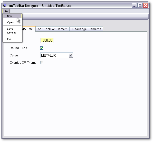
A new rmToolBar can be initiated from the menu, and opens with default settings as shown above. Alternatively an existing rmToolBar class can be reopened from the open dialogue for modification, or in order to be used as the basis of a new class, a simple Save as is all that is required.
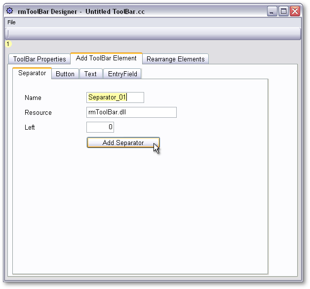
Once we have the empty rmToolBar defined, we can start adding components. The separator is used to visually group buttons of related function, or simply for cosmetic reasons. It is good practice to name the control you are just about to create, but if you do not define a name the rmToolBar Designer will generate a name automatically. Each rmToolBar element can pull its bitmap from an individual resource DLL file if required, but normally the default setting will be appropriate here.
It is important to understand the setting of the left property, which differs a little from what you might at first expect. The default value is zero, and under normal circumstances this is what should be used. This does not mean that all the rmToolBar components will pile up at pixel position zero, but instead that the component you are about to add will be allocated the next available left position to correctly add it to the end of existing components. The only time you would specify this value would be if you wanted to position the new component further to the right, perhaps at the far right end. Any further components added thereafter with the default zero left value will be correctly positioned to right of the rightmost control.
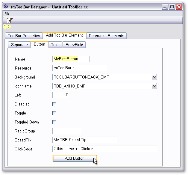
The key component of course is the standard rmToolBarButton. There are a number of properties to be set here, and these are detailed in The rmToolBarButton section.
The design of this control is intended to provide maximum flexibility, the button can have a bitmap background as default, or can have no background. This means that mouseOver effects can be implemented on the background bitmap, or with no background in use, mouseOver effects can be provided by variations on the main icon itself. The fact that this property is definable, opens the way for any other developer designed background to be used.
The ClickCode entry should be any valid dBL statement, and will be executed in a statement codeblock allocated to the onMiddleDblClick event of the underlying paintbox control. The best approach here is to use this property simply to call a function in the form in which the rmToolBar is to be used. The rmToolBarButtons are fully functional even in the designer, and while this may generate an error if the button is clicked in this environment this is irrelevant and should be coded to work in the destination environment. An alternative approach is to leave the default codeBlock code in place and then simply open the created rmToolBar code in the Source Editor to substitute the desired code later.
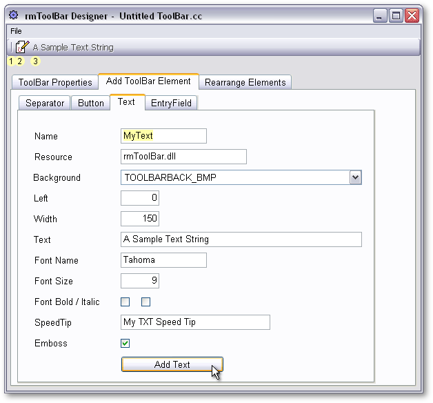
The ability to add text to a Toolbar opens up all sorts of possibilities. The rmToolBar could be used as a status bar, or to display rowset or record information. This is a big step forward, and a big saver of that precious commodity, screen real-estate. The background bitmap for this control defaults in the designer to that of the Toolbar itself, and by using the default emboss property, a very nice engraved on the Toolbar effect can be achieved. The fact that the background bitmap is definable, again leaves open the option for the developer to design whatever Text Panel design they might wish to use.
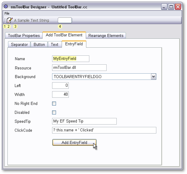
The EntryField control is a custom control which accepts user entry of up to five digits. It is designed to be used as part of the Patient navigation system that I use in my own applications where every Patient is identified by a five digit number prefixed by two alpha characters. The No Right End property simply means that the main body bitmap will extend to the far right hand end of the control to allow seamless mating to a Go button designed for the purpose. While this control could hardly be deemed generic, it does serve to show that it is possible to have an entryField on a Toolbar, and should be easily adaptable by any developer who requires differing functionality.
Basic editing functions can be performed as you go along, or with a saved rmToolBar that has been reopened in the designer. Individual components can be moved left or right or simply deleted. New components can be added to the end, and if required moved to their chosen position. The modified rmToolBar can then be saved again, or saved to a new file.
I have stopped short of being able to edit the custom properties of existing rmToolBar components in the designer. This is easy to do in the Source Editor, and it is also a simple matter to delete and recreate an element if required. That is not to say that this functionality would not be possible to add, and then we really would have a match for the native two-way designers, but for now I consider that the work involved is far in excess of the benefits this would bring.
It is possible to inspect the properties of an existing component using the native properties inspector, but unfortunately custom, or user defined properties are not editable in this way. I seem to recall that this is a long-standing wishlist item, but one which we are unlikely to see emerge.
A number of sample rmToolBars are provided in the code package. Open these in the designer, and have a play. You should find that it is very easy to modify existing Toolbars, and very easy to create rmToolBars from scratch.
As it stands the rmToolBar Designer provides the developer with the means to quickly generate working rmToolBars with a first class professional appearance that would enhance any application.
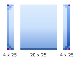
ConclusionThe next step in making maximum use of the rmToolBar control is to move beyond the supplied bitmap resources and design your own. The first step in this direction will no doubt be to create new icon bitmaps, but lets have a look at the bitmaps for the Toolbar itself first.
There are three bitmaps required. One for the body of the bar, and one for each of the optional ends. The dimensions are shown above in pixels, and you can see that the transparent colour is the standard dBASE transparent colour 0x800080 or RGB 128,0,128. Now it is simply a case of artistic ability, with any graphics software, to design whatever you wish. I use Adobe Photoshop for all graphic design work, but also a very old version of Paint Shop Pro for screen captures.
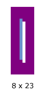
A Separator bitmap, dimensioned as above, also needs to be designed for each Toolbar colour scheme, and will automatically be used on selection of the main Toolbar colour.
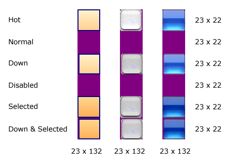
The next step is to design a ToolBarButtonBack matched to the Toolbar background you have designed. When you select a colour scheme for the Toolbar itself, the matching ToolBarButtonBack resources are automatically selected. Two features can be designed into your ButtonBack bitmaps. By displacing a bitmap one pixel to the right and one pixel down for the Down states, the illusion of movement on MouseDown can be created. Also by subtle variations of colour, mouseOver and Selected states can be designed to give the user the interactive experience they have come to expect from their experience of Web Page buttons. The first of the three samples above is matched to the BLUE Toolbar back shown above. The second is similar to what you might find in Apples OSX, and the third is similar to what you might find in Vistas Black Glass scheme.
There is no need to design new colour schemes for the rmToolBar if you are happy with those supplied, but there is no doubt that in order to maximise the potential of this custom control, you will need to design button icons.
The first two samples shown here are designed to be used in conjunction with ButtonBack bitmaps, and will be transparently painted on top of them. Some attention to the colours used is required here to ensure that there is sufficient contrast between the icon and the ButtonBack so that the result is visually clear. This type of composite bitmap is easy to produce with a high level of duplication, a single pixel horizontal and vertical displacement for the Down states, and a grey outline variation for the Disabled state.
The third sample is designed to be used with no ButtonBack bitmap, and therefore any onMouseOver or onMouseDown effects must be produced here if they are required. If you look closely, you will see that there is a subtle colour difference such that the button is at its darkest in the normal state, lights up a little when the mouse is over it, and then lights up further when pressed or toggled down. It can be difficult to achieve the appropriate amount of variation here, and individual tastes will differ. Too little variation and nobody will notice the effect, too much and it all becomes a bit gaudy and tacky !
A DLL resource editor will be required to add any new bitmaps to rmToolBar.dll or any other DLL that you choose to use for your applications. The naming of the rmToolBar bitmaps is important. The full set of bitmaps required for the BLUE colour scheme is shown above. Any new colour scheme should be named by replacing the BLUE part of the name with the description of your choice, but the following underscore and the remainder of the name must remain the same in order that the custom control can find the bitmaps it requires for the various parts.
The naming of Toolbar button icons is not important, but it might be a good idea to follow the above naming convention in order to provide consistency and keep life simple. Any suitably-sized resource icon in bitmap form with the correct transparent colour can be used, including those already found in the stock dBASE resource DLL.
When you consider that dBASE is a database focused development environment, it is remarkable that it is possible at all to create this type of paintBox-derived custom control in dBL.
The stock paintbox is an underused control, but one with tremendous potential. I hope that with the groundwork already provided in rmPaintBox.cc, that developers will be encouraged to see what they can do with this control. If there isnt a control that exactly meets your needs, and it is not possible to adapt or subclass an existing control to meet your needs, then it is almost certain that you could achieve the desired end result by using a paintBox.
The rmToolBar has been designed to be as easy to use, as flexible, and as extensible as possible. With the provision of a designer which will stream rmToolBar code for you, it really couldnt be made any easier. I hope that fellow developers will find this control useful, and can use it to good effect to provide their applications with a mixture of visual appeal, economic use of screen real-estate, and also provide the benefit of ease of use for their users.
I know from experience, and statistics from the dBASEdeveloper site, that for every hundred downloads of a given custom control, I will be lucky to receive one bit of feedback, and more often than not the only feedback is to report a bug or limitation or to request that more work is done to provide even more functionality. Perhaps that is human nature when something can simply be downloaded anonymously and used with no charge.
A considerable amount of work has gone into this control. It is free, I hope you like it and I hope you can use it to effect. All I ask in return is that you let me know. That feedback will make the effort involved worthwhile.
Have Fun !
Acknowledgments: Thanks
to Gary White for various samples of PaintBox related code which he freely
put into the public domain
over the years. Thanks to Marc Van den Berghen for his willing help with the
capture of the Windows WM_THEMECHANGED message, and in so doing, enabled the
creation of custom controls which are not just Theme Aware at start
up, but will now respond to a change of Theme Colour mid-session. Thanks to
Jean-Pierre Martel for various observations and suggestions which brought about
improvements to the rmToolBar Designer. Thanks to my wife Sarah and to David L. Stone for proof reading,
and the improvements they brought to this text.
Ronnie MacGregor started
developing dBASE DOS applications around 20 years ago
to help administer his various businesses in Scotland, and has been involved
in 16 bit and 32 bit dBASE development since then. Although with no formal programming
training, and essentially a hobby programmer, his niche applications
are in daily use by other businesses in Britain, and his custom controls are
in daily use around the world. He can be contacted at: