Introduction
The
Desktop Form
The Desktop form described in this article is a combination of styles borrowed from different programs. It is a tribute to the easy power and understandable flexibility that makes dBase a superior development platform. As is often the case, a simple looking design can mask a great deal of software complexity. It is hard to make software look easy.
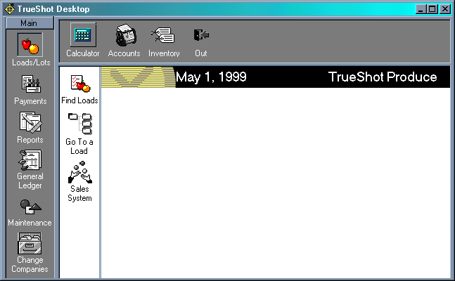
Desktop.wfm is actually a slightly modified version of a real form that the author uses in his accounting and information system designed for the produce industry. The idea was to create a simple-to-use interface that even a computer neophyte could use.
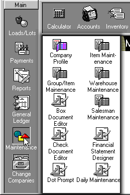
Look at the Diagram. The buttons that run down the side and across the top are «Cool» buttons. That is, they change in some way when you move over them. This helps the user know that if you they click on this area, something will happen. In this case, the buttons on the left and across the top have various behaviors and states that help the user to understand what is happening. When the mouse cursor moves over one of these areas, it rises into a button and goes from gray to color as if to say I'm an option!. When one of these buttons is pressed, it takes on a pushed in look. This helps the user remember which item was last selected.
Additionally, a push of the buttons on the left causes a panel to slide out from behind the button's container, creating an nice animated effect. The purpose, in this case, is to provide a two level choice. Each cool button brings forth choices.
The entire look and feel of this form was fabricated. Nothing about it was created automatically. If you were going to create a great many forms like this, it would pay to create various custom controls and forms with sizing and scrolling abilities. This form uses none of that. Instead, all functionality is attached to the objects themselves. This form makes extensive use of CODEBLOCKS. A codeblock is a small group of commands that attach to an object's events.
You start with a Cool Button
As described earlier, the cool buttons used on the left and top of the form react to various user events. Before getting to the events, lets look at the objects that make up a cool button.
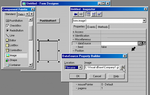
First of all, drag a button from your pallet to the form. Next drag an image and drop it on top of the button. Right-click on the image and point the datasource to the gray image, in this case company1.gif.
Change the alignment to «true size» and change the border property to «none». At this point you have an image control that has no border and exactly fits the graphic that it is displaying.
The buttons purpose is to provide an «up» appearance when the mouse moves over it. First of all, get rid of the text. Next, turn its speedbar property to true. This is so the button cannot keep focus. Next, use your arrow keys to position it so that its top left corner is lined up with the top left corner of the image. The idea is to position the button so that if you hit your down arrow once (thus moving the button down one pixel) the top border of the button will be hidden by the image. Then hit your up arrow key TWICE so that the buttons border is again visible. Do the same with the left edge. Now, hold down your shift-down arrow to size the button so that its bottom border is just revealed. Finally repeat the procedure for the right edge.
At this point, you may be wondering why it is necessary to use the button, after all, you could just change the border of the image itself to look like a button. While this approach does work and is much simpler, it causes the image to jump and shift. In contrast, making an underlying button visible creates a very smooth effect.
The onMouseMove event
So now that the parts of the cool button are in place, it is time to work on the bringing it to life. This step involves attaching code to various events. Events affect, and are connected to, an object. When the user moves the mouse over an object, that objects onMouseMove event fires; which means it runs any code placed in the onMouseMove event.
To figure out what instructions need to be run when the mouse moves over the image, think about the behavior you want. First, the button should become visible with the effect of making the image «rise up.» Also, it should be change from gray to color. This further confirms to the user that this is in fact an option that will have some effect if they were to click it.
In object oriented programming, it is helpful to think in terms of objects and what those objects can do. Pseudo code to perform this might be as follows.
Hey pushbutton 1, make yourself visibleThe pseudo code is not quite explicit enough. You might have many forms running at the time. Are these instructions supposed to be addressed to objects in this form, or some other form. Since it is this form, we need to tell it «form.»
Hey image 1, make your datasource be the file named «company.gif»
form.pushbutton1.visible = trueSo these are the instructions, where do you put them?
form.image1.datasource = filename company.gif
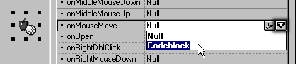
Since we want this to happen when the mouse moves over the image object, it only makes sense that the code should be placed there. Right-click on the image and bring up the Inspector. Click the Events tab at the top. Find the event named «OnMouseMove» and click it. As mentioned before, we want to use codeblocks instead of functions. You will notice that their are two buttons to the right of onMouseMove, a wrench and a «T». To create a code block, you must hit the «T» and then choose «codeblock».
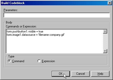
With that done, you can now hit the wrench and a small editor appears. First, click the radio button «command» and clear the supplied code «null». Next, type in:
form.pushbutton1.visible = trueAnd then click «OK»
form.image1.datasource = filename company.gif
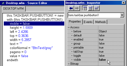
Now if you run this form, you should see a black and white image, which is what we wanted to see. But the border or «raised up» effect is already there! The default behavior for this object needs to be not visible or rather visible = false. Go back to the form designer. One of the properties that is available for any object is the visible property. All objects are always visible in the form designer, but any object with visible set to false will not be visible when the form is actually running. But here is another problem, it is hard to select the pushbutton because only a tiny portion is visible because the image almost completely covers it. You could go the inspector and use the drop down field at the top to find the object, but lets go straight to the source code. In dBase 2000, there is no difference between a change made to the source code and one made through the form designer. Right click anywhere on the form and choose «Source Editor/designer.» Next, find the code that looks similar to the following:
this.PUSHBUTTON1 = new PUSHBUTTON(this)Notice that the height of the pushbutton is 1.5909 and other properties are defined between the with and endwith. Insert a new line anywhere between the with and endwith and type:
with (this.PUSHBUTTON1)
height = 1.5909
left = 2.4286
top = 0.3636
width = 5.2857
text = ""
colorNormal = "BtnText/BtnFace"
pageno = 1
value = false
endwith
Visible = falseClose up the Editor. If you were now to inspect the pushbutton1 object, its visible property would now be set to false. This is an example of the two-way tools.
Now, if you run the form, you should indeed have a gray image, with no border around it. If you move your mouse over it, it should rise up and become colored. Now we have our Cool Button! Except, it isnt cool yet. It can only do its trick one time and then it is stuck there. This happens because there is no code that tells it go back down and turn gray. Looks like we need a new event!
Ideally, there should be an event that fires when the mouse is no longer over an object; an OnMouseOut event. While we have been promised one in a future release of dBase 2000, as of now we have to make do. Lets examine the problem: we need an event that fires when the mouse moves off of the image. Logically, if the mouse moves off of one object, doesnt it have to move onto another object? In this case, the form itself can be the event. When the mouse is moving over the form, it must not be moving over the image. So lets have the form tell pushbutton1 (whose parent is the form) to turn itself off and tell image1 (whose parent is the form) to display the gray image again.
Right Click on the form and choose the Inspector. Click on the event tab at the top then click on the OnMouseMove line. Click the «T» and choose codeblock. Click the command radiobutton and then type (after removing «null»):
form.pushbutton1.visible = falseNow run the form and it works! When you move your mouse over the image, it rises up and turns colored, when you move it off, it falls down and turns gray. If you have actually run this form, you may notice a problem. As you move your mouse around, the image flickers. The OnMouseMove event fires hundreds of times when you move the mouse around because its job is fire every time the mouse moves. Our objective is to have a smooth user interface, so we need to fix this problem. The problem is not really that the event fires a bunch of times. The problem is that it thinks it has to reassign the datasource of the image and make the button visible hundreds of times.
form.image1.datasource = filename company1.gif
The solution is to make a flag that keeps track of whether the work needed has already been done once. Once the image is colored and the button is visible, we need not change those properties until the mouse moves back onto the form. Right-click on the image and choose the Inspector. Click the event tab, click the onMouseMove line and then click the wrench. Make the following changes.
if .not. form.image1.color«Color» is a custom property, that is, it is a property that you make up. It becomes a property of the object just like height, colorNormal or name. We are going to make the property «color» true if the object is raised up and in color and false if it is flat and gray. If you were to run the form with this change, you would get an error though. Because «color» is a custom property, it doesnt exist until we create it. Since the onMouseMove event above assumes that there is a «color» property of image1, it crashes when it looks for it. Its as if the program were saying «Who? Color? I dont know no stinkin Color!»
form.image1.color = .t.
form.image1.datasource = 'filename company.gif'
form.pushbutton1.visible = .t.
endif
Again, we need a new event. We need an event that will assign the color property as soon as image1 is opened. That is what the onOpen event does for a living. Right-click on the image and choose inspector. Click on the event tab and click on the line «OnOpen». Click the «T» and choose «codeblock». Click the wrench and select Command. Get rid of the «null» and type:
this.color = falseNotice that use of the word «this». In an intuitive way, it makes sense to say «this 'color' flag is set to false.» «This» is a way to refer to the image specifically, without naming it explicitly. Because the «this» is used in code attached to the image1 object, it could only refer to the image1 object. Its like looking at someone and saying «I am looking at you» as opposed to saying «I am looking at John Smith». The difference is that «I am looking at you» will work with anyone you happen to be in front of whereas «I am looking at John Smith» is only useful if you are in fact talking about John Smith.
Another way to accomplish the same thing would have been to type:
form.image1.color = falseThink about it. This is not the only cool button that we are going to use. We are also going to have several of them. If we are smart about the way we code this, we wont have to change the code for each object. Consider what we have to do if we have five image cool buttons.
On the first one we have to say:
form image1.color = falseOn the second we have to say
form.image2.color = falseAnd so on.
Or, if we simply say:
this.color = falseThen it is always going to set its custom property «color» to false. This kind of versatility is one of the most important concepts in object oriented programming.
The code changes described solves the flicker problem when you move the mouse around on top of the image. It only turns color and rises up one time thanks to the «color» flag.
Unfortunately, the flicker returns when we are moving around on the form. This is because we havent taught it how to tell if the cool button is already gray. We need to change the form onMouseMove event in the following way:
if form.image1.colorGreat. Now we have a flicker-free cool button!
form.image1.color = false
form.pushbutton1.visible = false
form.image1.datasource = filename company1.gif
endif
Next we need to add the «pushed in» effect when it has been selected.
For this we need only change the borderstyle of the pushbutton1 from 0 (zero) to 7.
For this we need a new event to fire when the user clicks on the button. If this were done on a pushbutton, we would use the OnClick event. Since the event is going to happen to the image1 object, the closest thing available to the OnClick event is the OnLeftMouseDown event. Right-Click on the image1 and choose inspector. Click on the event tab and click on the OnleftMouseDown event. Click the «T» and choose «codeblock» Click the wrench and click the radiobutton «command». Get rid of the «null» and type:
this.parent.pushbutton1.borderstyle = 7Notice the use of «parent». This is another important aspect of object oriented programming. We use «parent» for the same reasons we used «this» in the example above. You may be noticing that we are still using the explicit name «pushbutton1». Image1 is not formally related to pushbutton1. True, they are stacked on top of each other and our intention is for them to be related, but as far as the form knows, they are two separate, independent objects. That means that the image1 object must call the pushbutton by name if it is get tell it to change borderstyles to 7 (the pushed-in look.) So if there is no formal relationship between pushbutton1 and image1, why do we use the parent reference above. Wouldnt the following work as well?
this.on = true
form.pushbutton1.borderstyle = 7Yes, it works as well, but I am thinking ahead. What good is one cool button? Usually, we will use them in combinations. This organization lends itself to using containers to hold groups of related cool buttons. A container is similar to a form or sub-form. If you move a container, all the objects inside the container stay together relative to the container. For instance, if you decided you wanted all the panel of cool buttons currently located down the left side of the form to, instead, be on the right side, simply drag the form to the right side. Thats it. No re-coding, no moving of individual objects. So how does this relate to the use of «parent» above?
this.on = true
It is simple and intuitive to work with containers, but you have to understand the relationship between a container and the objects in the container. Using the word «parent» refers to the container that holds the current object. It can be a form. So if the image1 object refers to «this.parent» and image1s parent is the form then obviously this.parent is the form. But if you place the cool button in a container, «this.parent» would refer to the container. The bottom line is that if you use «this.parent» instead of «form.», the code will work in either a form or any container.
So to recap, this is how we created the cool button
Obtain two image files that are suitably sized, one gray, the other color. Place a button on the form, get rid of the text. Put an image on the form. Set the datasource for the image to the gray image. Change the alignment to «top left» Size the image object so that it exactly fits the image it is displaying. Next, position the button underneath the image so that only its borders are showing. Set the visible property to false. Create a codeblock on the images onOpen event that sets a custom property, called «color», to false. Add a codeblock in the onMouseMove event that checks if the color property is true. If it is true, then nothing needs to be done since it is already in color. If «color» is false, then we need to raise the button (make it visible), show the color image instead of the gray image, and set the «color» property to true since the cool button is now in color. Next, we need to get the container, whether it is the form, or a container, to make sure the object is not in color and is not raised up. If the form or containers onMouseMove event is firing, then the mouse is not over the cool button. This form or container's OnMouseMove event should check the property «color» of the cool buttons image object. If it is color, then it should make the pushbuttons visible property equal to false, and show the gray image. Finally it should set the «color» property to false since the cool button is no longer shown in color. Lastly, a codeblock should be attached to the onLeftMouseDown event of the image object which should change the pushbuttons borderStyle to 7, which gives it a «pushed in» appearance. Whew!
The more advanced dBase 2000 user will recognize the opportunity for a custom control. There is no doubt that a lot of code could be re-used if this approach were followed. On the other hand, for the intermediate or beginning dbase developer can benefit from being a little less sophisticated. Having all the codeblocks attached to the objects lets them jump from object to object inspecting the interaction between the events and properties of the objects used in the form. There is not a need to jump to the source code to see anything. The codeblock editor shows the snipets of code that each event relies upon.
So now that we have a fully functional cool button, its time for make several work together.
Groups of Cool Buttons
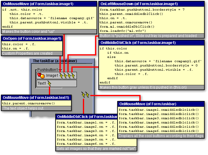
Because dBase lacks a onMouseOut event, objects have to work together to tell each other when the mouse is over them. The mouse cannot be firing onMouseMove events from more than one object at a time, so we can safely assume that if the mouse is over one object, in cannot be over another. Look at the real code that is associated with the container's OnMouseMove event from the first image in desktop.wfm.
form.taskbar.image1.onmiddledblclick()The first think to notice is that there are six commands. Each one corresponds to the six images shown in the panel that runs down the side (refer to the desktop diagram). The container that holds these six cool buttons is called taskBar. Each element of the cool button (pushbutton, image, text) is contained inside of the container named taskBar. In order to refer to it, you have to use dot notation. The code above refers to the image objects explicitly. Notice the dot notation:
form.taskbar.image2.onmiddledblclick()
form.taskbar.image3.onmiddledblclick()
form.taskbar.image4.onmiddledblclick()
form.taskbar.image5.onmiddledblclick()
form.taskbar.image6.onmiddledblclick()
form.taskbar.image1.onmiddledblclick()form refers to the form itself. The form acts as a container for all the objects used in this form.
What the heck is onMiddleDblClick? Years ago, it was common for a mouse to have three buttons. The onMiddleDblClick event is a convenient place to hold code that you don't want the user to trigger directly. While it is certainly possible for a user to have a three button mouse and to double click it while over an image, it is not likely. Experienced users will instantly protest that this is sloppy and that a custom method should simply be attached to the object. This is true, but there is a very good reason for not doing it in this case. I will elaborate on this later.
If we look at the code attached to image1's onMiddleDblClick event, it looks like this:
if this.colorEnglish pseudo code would be:
if this.on
else
this.datasource = 'filename company1.gif'
this.parent.pushbutton1.borderstyle = 0
this.parent.pushbutton1.visible = .f.
this.color = .f.
endif
endif
If this image's color flag is set to true,The image's OnMiddleDblClick event makes it gray and flat which indicates to the user that the option is not currently selected and is not the object that is currently hot.
And if this image's "on" flag is true, then do nothing.
But if this image's "on" flag is false then
Set this image's datasource to the filename company1.gif (gray image)
Set this image's parent's pushbutton1's border style to a normal button look
Make the pushbutton invisible
Because the cool button is gray and not raised up, the "color" flag needs to be set to false
When the container called taskBar receives a mouse movement, it simply tells each cool button to be flat and gray. This is the correct behavior because if the mouse is moving over the container itself, it is not pointing at any cool button.
Now we have seen that an image will rise up and turn into color if it's OnMouseMove event is fired. It will go flat and gray if it's onMiddleDblClick event is fired, what other behavior is needed? If the user clicks on the image to choose it, the coolbutton has to a) turn color, b) push in, and c) launch the appropriate action. The following code shows it doing that. This code is connected to the onLeftMouseDown event of the image:
form.taskbar.pushbutton1.borderstyle = 7English pseudo code would be:
this.parent.onmiddledblClick()
this.on = .t.
this.parent.onmousemove()
form.m1.onmiddleDblClick()
form.loadwfc("m1.wfc")
Set this form's container named taskbar's pushbutton1's border style to look pushed in.Look at the diagram to see the various events and how the events interact with each other.
Run this image's parent's (the parent is the container named "taskbar") onMiddleDblClick method which makes all the cool buttons flat and gray.
Set this image's "on" flag to true. "On" is a flag that we created and is not a normal property of an image. We could have named the property "Sally" or "Edward", instead, the name "on" is meant to tell us whether the object is pushed in and therefore is the cool button that currently is on.
Next, run this parent's onMouseMove event which will turn this object to color and turn on the pushbutton behind it (remember that we changed the border to have a "pushed in" look)
Next, run the container called "m1"'s onMiddleDblClick event. This needs much more explaining, but briefly it clears out the "m1" container so that it has no objects in it.
Finally, the form's "loadwfc" method (or procedure) is run. This procedure populates the "m1" container and then slides it into view.
The Top Panel
The top panel is a container named opBar that works like taskBar. The only important difference is that all of these cool buttons instantly launch something when they are clicked instead of sliding out a sub-menus. Since all the other coding works identically to the taskBar container, the details are skipped.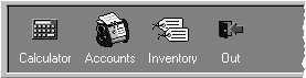
These are one-level cool buttons (no sub-menus)
Framing the Cool Buttons
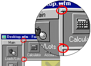
Adding the framing around the two containers (taskbar and opbar) helps the user understand that these are separate groups of cool buttons that should might logically behave differently. One method is to simply change the borderStyle of the containers themselves. I wanted to mimic the look of Microsoft's Outlook and so I looked at the framing that is used there. There are obviously multiple ways to accomplish this. I settled on the use of pushbuttons carefully sized and placed to create the desired effect. Pushbuttons are a good choice because they render (display) very quickly, use resources efficiently, and they have the needed visual characteristics. Notice that each of these pushbuttons have their speedbar properties set to true. The keeps the object from receiving focus. It's enabled property is also set to false so that if the user clicks on the frame, it won't behave like a pushbutton.
The problem with using pushbuttons for framing is that they have seams. Here the seams have been circled. These don't exactly look bad, but they give a granular effect that is not ideal. It is simple to patch up these seams by placing small paintbox objects over the seams. When you create the paintbox objects, you only have to change two properties. 1) set the borderStyle to 3 which means no border. 2) set its ColorNormal property to btntext/btnface This will set the color to the same color that the pushbuttons use. You might be interested to know that these colors are in turn, obtained from Windows. This allows your color scheme to be change to match the color scheme in effect on any particular machine.
To finish out the visual effect we have used a graphic and two text objects. These were added for stylistic reasons and perform no particular function. They have no events.
The Slide out Tray
The slide out tray introduces a whole range of new concepts. First, it has a nice animated effect by which it slides out from under the container TaskBar. Second, it uses a cool image concept rather than a cool button. Thirdly, and most importantly, it is polymorphic and uses a Just-In-Time object creation system.
form.m1.visible = .f."M1" is the name of the container that "slides out". The English Pseudo Code would be:
form.m1.width = 9.14
form.m1.visible = .t.
form.m1.left += 1
form.m1.left += 1
form.m1.left += 1
form.m1.left += 1
form.m1.left += 1
form.m1.left += 1
form.m1.left += 1
form.m1.left += 1
form.m1.left += 1
form.m1.left = 10.86
(Before this is called, M1 is moved to so that its "left" is zero)You might be wondering where the previous code is located. That answer gets into Just-In-Time object creation part and so discussion is deferred until that section. What is important here is that the animation is not difficult or mysterious.
Make the container called "M1" invisible
Make it the proper width
Make it visible again
Move it to the right one
Move it to the right one
repeat several times
Finally, make its left exactly equal to the screen coordinates where you want it to stop.
Polymorphism in this form means that the shape can be altered well after the .EXE has been created. This is accomplished by creating text files that contain the object definitions. These text files are opened at runtime (or later in this case) and the objects are generated in response to the information contained in those text files.
Why would you do this?
Compiled, this form is very small (just over 100k). Deploying a new EXE over the Internet would be no problem. But applications can be much larger. The original application that this form was designed to be a part of was originally over eight megabytes. Even zipped, it still was almost three megabytes. At 100k, you can send updates casually. At three megabytes you can't update it so casually. Because the application is so large and complex, it also has more bugs and more missing features. Traditionally, when you find a bug, you must deploy a new .EXE file to correct the bug or to add the feature. If you properly use the power of dBase, this does not have to be your only option.
The M1.WFC file
You will recall that form.taskbar.image1's OnLeftMouseDown event include the following line:
form.loadwfc("m1.wfc")This line calles the method (function, procedure, routine etc.) LoadWfc which is listed here:
function LoadWFCThe code above is really very simple. A file is passed to the parameter Mfile. That file is a text file containing the lines of valid dBase code. Mfile is processed one line at a time. It looks for any lines that begin with a curly bracket {. If it finds such a line, the code knows it is dealing with a codeblock. It assigns the codeblock to the event that is next read. Otherwise, it simply executes each line the way it finds it using macro substitution. The whole thing is contained in a try-catch block which allows you to handle errors in an elegant way. Look at a code snippet from M1.WFC
parameter Mfile
ObjInit = new file()
ObjInit.open(Mfile,"RW")
Mtemp211=0
do while .not. objInit.eof()
Mtemp211 ++
Mtemp221 = Objinit.readln()
try
if substr(Mtemp221,1,1) = '{'
Mcodeblock = rtrim(Mtemp221)
Mtemp221 = Objinit.readln()
Mtemp211 ++
Mevent = rtrim(Mtemp221)
Mtemp77 = &Mcodeblock.
&Mevent. = Mtemp77
else
&Mtemp221.
endif
catch (exception e)
msgbox("Error: "+e.message+chr(13)+"Line:;
"+tran(Mtemp211,"99999")+chr(13)+Mtemp221,"Error Message")
endtry
enddo
ObjInit.close()
ObjInit = null
form.M1.IMAGE1 = new IMAGE(form.M1)All that LoadWFC does is execute each line above. When it hits a codeblock (i.e. begins with a {), it combines it with the next line to link the code block with the event which follows.
form.M1.IMAGE1.height =1.4545
form.M1.IMAGE1.left =2
form.M1.IMAGE1.top =0.2727
form.M1.IMAGE1.width =4.8571
form.M1.IMAGE1.dataSource ="FILENAME salesman1.gif"
form.M1.IMAGE1.pageno =0
form.M1.IMAGE1.borderStyle =3
{;this.color = .f.;this.on = .f.}
form.M1.IMAGE1.onOpen
{;set proc to openapps.prg addi;}
form.M1.IMAGE1.onLeftMouseDown
{;if this.color;this.datasource = 'filename salesman1.gif';this.color = .f.;endif;}
form.M1.IMAGE1.onMiddleDblClick
{;if .not. this.color;this.color = .t.;this.datasource = 'filename salesman.gif';endif;this.parent.image2.onmiddledblclick();this.parent.image3.onmiddledblclick();}
form.M1.IMAGE1.onMouseMove
{;this.color = .f.;this.on = .f.}
Let's backup now and look again at the way that LoadWFC gets called:
form.taskbar.pushbutton1.borderstyle = 7Notice the second to the last statement: form.m1.onMiddleDblClick()
this.parent.onmiddledblClick()
this.on = .t.
this.parent.onmousemove()
form.m1.onmiddleDblClick()
form.loadwfc("m1.wfc")
The code that it executes follows:
do while this.first <> nullSince this code is executed from the perspective of the container named M1, this refers to M1. This code processes all the objects contained in the container, releasing each one. After this code has finished, the container is completely empty. Since the container is empty, form.loadwfc('m1.wfc') will execute the lines in m1.wfc which will populate the container M1. Remember that the container M1 is hidden behind the container taskBar, so the user won't see the objects being rendered. Only after the objects have been created does the container M1 slide out.
this.first.release()
enddo
It may sound like a lot of trouble to go through, and it would be without the proper tools, but look at what has been accomplished:
If the contents of the M1 need to change, all that is required is that the text file M1.WFC be replaced. This is a 3.5k file! If you had a standard application you could roll out different versions of M1.wfc to each client. Even if you upgraded the .EXE file in the future, the M1.WFC would remain in its customized state.
This polymorphic philosophy can be extended to include every visual object. Indeed, the author extracts all visual elements for all forms and includes them in these .wfc files. Before the form is opened, all visual objects get created. The net effect is that the forms look, act and feel the same. But every visual element can be changed in any way without the need to re-deploy the application's exe file. Only the tiny .wfc files need be sent. In this way, a standard application can be customized per customer while retaining the ability to upgrade the .EXE file without having to recreate the customization. It is sorta like upgrading your web browser: you can get new features, but the old HTML pages still work.
A full description of this process is beyond the scope of this article, but since the the method is used in desktop.wfm, some explanation was in order.
Conclusion
Not all applications warrant the time and energy that went into creating the Cool Desktop. In fact all of its functionality can be duplicated with a lot less hoopla. But sometimes you want to create a form that works exactly as you would like it to. Desktop is such a form. It was not merely the end result of using dBASE objects in a traditional way. Instead, with a design concept firmly in mind, the power and flexibility of dBASE made creation of exactly what was desired possible.
Hopefully, the reader will take from this some ideas for how to better present applications to the user. The same concepts can be used to create forms that look nothing like this, but utilize the same form. This is the power of dBASE.