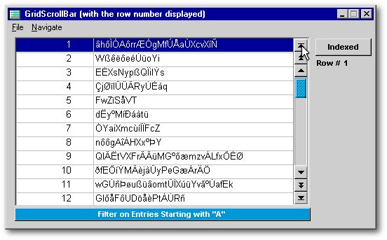
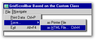
Like a foreign piece of skin that can be grafted on another part of the body, in the first part of this series we saw how the scrollbar object can be grafted on top of the native scrollbar of the grid to improve the apparent behavior of our grids. In the second part of this series, we will use the knowledge gained doing the GridScrollbar custom class to create a new scrollbar custom class from scratch. This way we will get complete control over the behavior and properties of our scrollbar. Here is a glimpse of what we will get.
This is an occasion for us to rethink what a scrollbar should be. First, the scrollbar of a grid should be a tool to browse the data displayed in that grid. Second, it should have all the navigation shortcuts that the keyboard has. Unfortunately, there is no scrollbar equivalent to the Home and End keyboard shortcuts in the usual scrollbars. There is an implicit (but not explicit) PgUp and PgDn equivalent when the scrollbar shaft is clicked above or below the elevator.
When the Windows interface was conceived at the beginning of the eighties, everybody viewed Windows at 640 x 480 resolution (the SuperVGA standards came later). Using six buttons (Home, PgUp, UpArrow, DnArrow, PgDn and End), each having a height of 16 pixels, would have occupied a significant portion of the screen real estate in a multitask environment. Thats probably the reason why the scrollbar provided by the Microsoft Foundation Class (MFC) is limited to one button at each end. That decision has not been modified since.
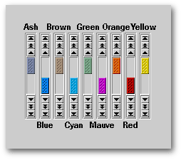
From the image above, we can see that all the keyboard shortcuts used for navigation will be represented in our custom object. We modestly call this object the MegaGridScrollbar class.
Rudimentary Skin Implementation
 Doing
custom scrollbars gives us an occasion to partially implement something
quite fashionable these days: skins. Inside
VSB.dll, there are nine sets of colors
to choose from for the elevator and a tenth, black, for the pushbuttons.
Note: Depending upon your video card, the colors may or may not match their
names.
Doing
custom scrollbars gives us an occasion to partially implement something
quite fashionable these days: skins. Inside
VSB.dll, there are nine sets of colors
to choose from for the elevator and a tenth, black, for the pushbuttons.
Note: Depending upon your video card, the colors may or may not match their
names.
Each color has two shades for the elevator: one for the color of the elevator at rest and a very slightly different shade for when it is dragged. For example, in the Cyan set, the resource to use for the elevator at rest is called E_Cyan: it is called E_Cyan_D when the elevator is dragged.
For the pushbuttons, the BMP images used for their upBitmap and downBitmap properties have a transparent background (actually, a purple background seen as transparent by dBASE). The colorNormal property of the pushbuttons was left with its default value, BtnText/BtnFace, so the background color will match the color palette of the computer on which the application is deployed.
Of course, skins are more than just different sets of colors. They represent different styles. However, once your code points to a DLL to dress an object, it can point to another DLL to dress it with a different style. Thus, everything becomes possible.
The Anatomy of the MegaGridScrollbar Class
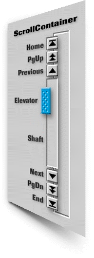 Our
scrollbar has nine parts. Its deepest layer is made from a container
called ScrollContainer. The latters surface is almost completely covered
by seven objects: six pushbuttons and a rectangle (for the shaft). The
elevator image object is superimposed over the shaft. A grid and that custom
scrollbar are both placed inside another container object called
Grid_VSB. The latter becomes the wrapper
for our custom class.
Our
scrollbar has nine parts. Its deepest layer is made from a container
called ScrollContainer. The latters surface is almost completely covered
by seven objects: six pushbuttons and a rectangle (for the shaft). The
elevator image object is superimposed over the shaft. A grid and that custom
scrollbar are both placed inside another container object called
Grid_VSB. The latter becomes the wrapper
for our custom class.
A URL appears at the end of this article which allows you to download a zipped file. It contains the following files:
Before dB2K, any form using a custom class in which a grid was placed inside a container would eventually lead to a GPF (general protection fault) when that form was opened and closed a few times in a row. This is why this custom class should not be used with Visual dBASE. However, the MegaGridScrollbar class should work properly under dB2K and dBASE Plus.
Do not use an instance of this class on forms that have a Seeker. In order to work properly, the scrollbar has to know the exact position of the row pointer. With a navigation menu, an instance of this class can trap navigation keys. With some precautions, it can even work very well when filters are applied or removed. But Seekers will make this custom class behave erratically.
I do not recommend using two instances of this class connected to the same rowset when both are active at the same time (unless you add some code to synchronize the other scrollbar when navigation takes place in one instance of the class).
dBASE developers can use this custom class and its DLL in any of their dBL applications. No permission is needed. However, using this DLL with any programming language other than dBASE is not allowed.
How to Use It
Creating a form using this custom class is almost childs play:
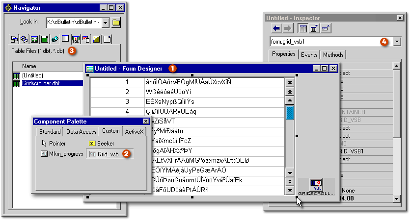
|
set procedure to Grid_VSB.cc additive |
|
If youve selected another object (thus removing focus from the custom class), and you want to select the custom class again, do so by selecting its name from the combobox near the top of the Inspector. (The first instance is always called Grid_VSB1.) Trying to select it directly from the form with the mouse is often difficult since one of its components is easily selected rather than the instance of the entire custom class.
Note: If your grid is connected to a rowset other than the forms rowset, the line that says oActiveRowset = Form.rowset in that menu file will have to be changed. You might want to give a look at ListTo.prg to learn how to pass parameters to it. The instructions are in its header.
By default, the code in the menu file will print or export the data in all the fields of the table even if only some of its fields are displayed in the grid. If you want the menu file to print only the fields displayed in the grid, you will have to edit the code specify the appropriate elements in the aFieldList and the aHeader arrays.
|
#define PUSHBUTTON_HEIGHT 18 // at least 13 (default: 18) #define PUSHBUTTON_WIDTH 19 // at least 16 (default: 19) #define ELEVATOR_COLOR "Cyan" #define UPBITMAP_COLOR "Black" #define HAS_HSCROLLBAR 0 // 16 if has a horizontal scrollbar /* Colors available: Ash Black (_not_ available for Elevator_Color) Blue Brown Cyan Green Mauve Orange Red Yellow */ class Grid_VSB(parentObj, name) of CONTAINER(parentObj, name) custom |
|
When dBASE reads a #define directive, it seeks and replaces all occurrences of the identifier (for example PUSHBUTTON_HEIGHT) with its replacement text or constant value (in this example, the number 18) in the code of the Custom class.
So you just have to replace the value of any of these five variables to change:
Many objects have to be moved to the right
places when the form opens. Moreover, the
number of rows has to be counted. This can be slow if the rowset is large
or on a slow computer. You might want to hide the form and make it visible
only after everything is ready to be shown (as we did in the sample form
Grid_VSB_cc.wfm). The
forms visible property
is set to false.
It becomes true in
the forms open()
event,
which is fired before the opening of the form, and therefore before the
onOpen() event. Moreover, you may want to count
the rows during the forms open() event.
If so, enable the line that says this.Grid_VSB1.Set_Custom_Properties()
in the forms open()
function and disable the equivalent line of code in
the custom class MegaGridScrollbar_onOpen()
function.
.
|
class Grid_VSB_ccForm of FORM set procedure to Grid_VSB.cc additive with (this) onMouseMove = class::FORM_ONMOUSEMOVE onSize = class::FORM_ONSIZE open = class::FORM_OPEN (...) visible = false endwith Function Form_onMouseMove
Function Form_onSize
Function Form_Open
|
|
In both versions, when the elevator is dragged, it doesnt really stop at its upper or lower limit. It tends to be moved over the limit and bounce back to where it belongs, especially near the top limit. This behavior is normal for a dBASE object. In order to minimize that effect visually, the shaft and the elevator have been placed below the pushbuttons in the z-order.
Under the Hood
The function
Set_Custom_Properties(), called from the
forms open() or
from the custom class onOpen()
function, creates five custom properties.
|
Function Set_Custom_Properties // this function belongs to the custom class' container local r, s r = this.grid1.datalink s = this.ScrollContainer s.nRowNo = 1 // 1st custom property s.nRowMax = r.count() // 2nd custom property this.GRID1.nonDataPixels =; // 3rd custom property iif(this.GRID1.hasColumnHeadings = true,; this.Grid1.cellHeight+this.Grid1.gridLineWidth, 0) r.first() r.canNavigate = { ; this.bookmark1 = this.bookmark() } r.bookmark1 = r.bookmark() // 4th custom property s.Elevator.oRow = null // 5th custom property return |
|
These five properties are the nuts and bolts of our MegaGridScrollbar class. Its the code that has the most effect on the behavior of the class and consolidates its nine different parts into a coherent object.
The two custom properties of the ScrollContainer
The ScrollContainer has two custom properties. The first one, nRowNo, is used to store the row number. To work properly, the scrollbar must always know where the row pointer is located. So each time some navigation takes place, nRowNo is updated.
In order to navigate proportionally in the rowset using the scrollbar, we have to know how many rows there are in the rowset. In the 32-bit versions of dBASE, the count() method of the rowset is the OODML equivalent of recno(). When this article was originally published in 2002, count() used to be slow since dBASE had to pass through each row in order to count them. This was time consuming with large rowsets. Since then, that method seems to have been replaced internally by its SQL equivalent (which is faster). So according to which version of dBASE you are using, that method could be slow. So this is why it is done only once, when the form is initialized. The result is stored in the nRowMax property of the ScrollContainer object. Thereafter it is used at will. It is important to know that the value of the nRowMax property will have to be updated each time a filter is to be applied or cancelled.
The custom property of the grid
When a grid is clicked, the onLeftMouseDown() event of the grid returns a parameter called row. The row parameter represents the horizontal pixel which is clicked. When the grid doesnt have a header (in other words, when the hasColumnHeadings property of the grid is set to false), and when the tip of the mouse pointer touches the top border of the grid, the onLeftMouseDown() event will return zero as the value of the row parameter. If hasColumnHeadings is set to true, the actual height of the header is different according to the borderStyle property of the grid. However, as soon as the tip of the mouse pointer is below that header, the onLeftMouseDown() event will return a row value equal to one pixel more than the sum of the values of the cellHeight and the gridLineWidth properties of the grid whatever the actual height of that header.
Moreover, if we take the height of the grid (in
pixels), subtract the value of the nonDataPixels
custom
property, then divide the result by the height of each
row, that
gives us how many rows are displayed in the grid. Thats the number
of rows
that should be navigated when the PgUp or PgDn
pushbutton is clicked.
|
01 Function PgDown_onClick 02 local g, n 03 g = this.parent.parent.Grid1 04 n = floor((g.height - g. nonDataPixels)/; (g.cellHeight + g.gridLineWidth)) 05 g.datalink.next(n) 06 return |
|
In the code above, line 03 creates a shortcut for the grid. Line 04 takes the part of the grid that displays some rows and divides its height by the height of a row: This gives the number of rows displayed in the grid. If the result carries a fraction, it is ignored by floor(). At line 05, the grids datalink is the rowset. That line navigates the number of rows found at line 04.
The two custom properties of the rowset
Bookmark1 is a custom property that will be used to store the current position of the row cursor in the rowset when we are about to navigate (i.e., immediately before navigation). It will be used to go back to the previous row to calculate how many rows were navigated when the grid was clicked.
The custom property of the elevator
The custom property oRow
is
used for three purposes. First, when the left mouse button is pushed over
the elevator, the value of the row parameter
(the horizontal pixel) is stored in the oRow
custom
property. If the left mouse button is released, oRow
is
given a null value. On the contrary, when the mouse is dragged, the
top
property of
the elevator is updated as soon as there is a difference between
oRow
and
row.
So that code keeps constant the distance between the mouse cursor and the
top of the elevator and moves the elevator programmatically. The end result
is that it gives the impression that the elevator is dragged with the mouse.
So
row,
which is the distance from the top of the object, would change only for
a few milliseconds (just the time needed to move the elevator and complete
the illusion).
|
Function Elevator_onMouseMove(flags, col, row) if not empty(this.oRow ) this.top += row - this.oRow endif return |
|
Note: In the code above, the line that says this.top += row - this.oRow means this.top = this.top + (row - this.oRow)
Second, after pushing down the mouse button over
the elevator, if the user drags the mouse laterally and releases the mouse
button over another object, the elevator.onLeftMouseUp()
event
will never fire. In anticipation of that possibility, when the mouse cursor
is moved over some objects placed around the elevator, the value of the
oRow custom
property is checked. If it is found to contain anything but zero or a null
value, that means the elevator.onLeftMouseUp()
event
has not fired properly. If thats the case, it is then fired programmatically.
For example:
|
Function Elevator_onLeftMouseDown(flags, col, row) this.oRow = row // anything but zero or a null value would fit return Function Grid1_onMouseMove
|
|
Third, when the shaft of the scrollbar is clicked,
the grid navigates one screenful. To obtain that result, the
onLeftMouseDown()
event
stores a value other than null in the
oRow property of the elevator. If the
shaft.onLeftMouseUp()
event is fired when
the value of the oRow custom
property is still not null, navigation is allowed.
|
Function Shaft_onLeftMouseUp(flags, col, row) local e e = this.parent.elevator if not empty(e.oRow ) // this is the code to move one "screenful" if the scrollbar shaft is clicked do case case row< (e.top - this.top) // if the user clicks over the elevator this.parent.pushbutton2.onLeftMouseUp() // 2nd = PgUp pushbutton case row > (e.top - this.top - 2) + e.height this.parent.pushbutton5.onLeftMouseUp() // 5th = PgDown pushbutton endcase endif return |
|
In the code above, there are two possibilities. If the mouse button is released over the part of the shaft that is located above the elevator, the onLeftMouseUp() event of the PgUp pushbutton is fired programmatically. On the other hand, if the mouse button is released over the part of the shaft that is below the elevator, the onLeftMouseUp() event of the PgDn pushbutton is fired programmatically. It should be noted that there is no need to foresee the possibility that some mouse actions are done over the part of the shaft that is masked by the elevator because no event of the shaft would be fired. Only events of the elevator can be fired.
Clicking on the Grid
Writing the code to be fired when a row is clicked in the grid was one of the biggest challenges doing this class. It is very easy to know precisely which pixel was clicked in a grid and hence, which row was clicked among the ones displayed. However, there is no way to know if that new row is above or below the one that was highlighted just before, except when the row cursor was previously at the end of set. When the row cursor is anywhere else, it is impossible to know the position of the highlighted row in the grid. It could be located at the top of the grid, at the bottom, or somewhere in between. There is a solution. Here is the trick.
If we bookmark the row we are about to leave when another one is clicked in the grid, and if we take a snapshot of the row we moved to, then we just have to jump to the row that was bookmarked and navigate row by row (counting the number of rows that we have to cross), comparing that row with the snapshot we took until we find the right one. That gives us the number of rows navigated. We can use that information to update the values of the nRowNo custom property and consequently, the position of the elevator.
Actually, the real code is more complicated than that but the description I gave is essentially what the grid.onMouseDown() event is doing.
Applying / Removing Filters
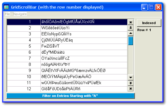
In the sample form Grid_VSB_Ancestor.wfm
(shown
above under Windows XP), there is a pushbutton under the grid that allows
the user to apply or to remove a filter. In the onClick()
event,
we avoid counting the number of rows each time the filter is removed
since this time-consuming process is then done on the whole rowset. To
optimize our code, the value stored in
nRowMax
is passed temporarily to another
custom property (Old_nRowMax)
when the filter is applied and the value is given back to the first
custom property when the filter is removed . In the example below,
the filter is applied with the setRange()
method of the rowset and is removed by
its opposite,
clearRange().
It should be noted that the count() method
of the rowset is applied only after its notifyControls
property
has been set to false in
order to speed up the operation. Finally, when filters are removed
or applied, it is important to start navigation from a row whose position
in the rowset is known (here, at the first row).
|
Function Pushbutton2_onClick local r, s, e r = Form.rowset r.notifyControls = false r.canNavigate = null c = Form.Grid_VSB1.ScrollContainer e = c.Elevator if this.text == 'Filter on Entries Starting with "A" ' r.indexName = "ScrambledText" r.setRange('a', 'azz') this.text = "Show all rows" c.Old_nRowMax = c.nRowMax c.nRowMax = r.count() r.notifyControls = true else r.clearRange() r.indexName = null r.notifyControls = true r.parent.requery() this.text = 'Filter on Entries Starting with "A" ' c.nRowMax = c.Old_nRowMax endif r.first() e.Top = c.Shaft.top + 1 c.nRowNo = 1 return |
|
Bugs and Shortcomings
Windows 3.0 and Windows 3.11 were unstable platforms. Users had to reboot many times a day. According to Microsoft at that time, that instability was caused by not well-behaved Windows applications. Supposedly, it had nothing to do with Windows itself. However, when Windows 95 was released, suddenly all these applications stopped crashing. We discovered that Microsoft had lied all those years.
Many objects used in Windows applications are services borrowed from the operating system, more precisely, borrowed from the Microsoft Foundation Class (MFC). Whether an application is actually written in C++, Delphi or dBASE, an object will display incoherent behavior if it is borrowed from a buggy MFC object. I am inclined to believe that the scrollbars in the MFC are buggy. Under dBASE, when the up or down-arrows of the scrollbar are clicked a few times and then the elevator is dragged, the elevator starts to move by itself (Note: This bug is scheduled to be corrected with the release of dBASE Plus). The same behavior could be seen under Gravity (a newsreader).
The objects in the MFC will not be updated. Microsoft has created new ones for its .NET platform. These improved objects are one of the carrots that Microsoft uses to motivate the software editors to support the .NET platform. Will dBASE be one of the programming languages supporting the .NET platform? I dont know. One thing is sure: if we want better objects, we just have to create them. Thats not so complicated, thanks to full OOP implementation in dBASE.
The MegaGridScrollbar was created with a few stock objects known to be stable. I did my best to make it easy to use. From now on, its one of the tools available to build distinctive applications, impossible to create with competitive database management software. However, it has its limits. By far, the most significant limitation is its inability to work with Seekers.
That said, I have been using a primitive version of this class for many months now and I really like it. I hope you will like it too.