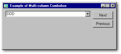
note: Move your
mouse over this form to open and close the mCombo control
Introduction
The person from whom I learned how to make a custom control is Dan Howard. I took advantage of his article on a TreeDropper control to study the technique of a dBL World expert. That TreeDropper control was made out of an entryfield, a pushbutton and a treeView object, all these placed inside a container. This container was thereafter transformed into a custom control.
Since dBASE Inc. acquired the rights on dBASE from Borland-Inprise, many bugs have been killed, first in VdB 7.5, then in dB2K version 0.1. One these prevented us from making stable applications when they contained a grid inside a container object. Since the container is the glue that holds together the components of a complex custom control, it is essential to create multi-components controls. Its allergy to the grid class had the consequence that no multi-column combobox control is available even if many developers expressed the wish to use such a beast. Actually it was possible to do a multi-column combobox, but it couldnt be transformed into a bug-free custom control.
This article features the second stable multi-column Combobox class (mCombo) offered to the dBASE community. It can be used in dB2K but I do not recommend using it under Visual dBASE (as any form using a mCombo should make dBASE unstable if that VdB 7.x form is opened and closed a few times in a row). This is a preview of how it looks.
note: Move your
mouse over this form to open and close the mCombo control
If you want this control to be available to you, download it from the link at the end of this article and follow the instructions in the section called A new tool in your toolbox in the article I wrote about the MG_Mover control.
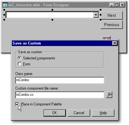
The nursery for this custom control
First I created a form called mC_Ancestor on which I placed an entryfield (soon replaced by a seeker as I thought it would be more useful), a fake pushbutton (to open and close the mCombo), a grid (to get a multi-column control), all of these placed inside a container object. I carefully avoided to count on any function or property owned by the form as it would be unavailable once the container and its components will be transformed into a custom control. For each object, I created functions based on events in order to give to each component the kind of behavior I was expecting from it.
When everything was finished, I opened it in the Form designer and selected the container. Once an object is selected in the Form designer, a new choice appears in the File menu: Save as Custom . The container object (and all its components, functions and properties) was saved under the name mCombo.cc.
The Container
When I used custom properties under Visual dBASE, I didnt get reliable results except when I created custom properties for the form itself. From the experience I had from working on this mCombo custom control, that limitation doesnt seems to exist under dB2K. For example, the mCombo control have three custom properties while its grid have one. Just one of these need to be known. It is the controls rowsShown property. It is used to display the number of rows displayed when the mCombo control is opened. Taking into account how tall the seeker is, then the cell height and the number of pixels for the horizontal scrollbar in the grid, it gives to the mCombo the exact height it needs, not a pixel more. If the mCombo is too tall for your form, do not change its height: just modify its rowsShown property. It accepts decimal values (for example: 7.5 to display seven full rows and half of an eighth one).
These calculations can only be done when the forms metric is in pixels. That doesnt mean that you must create your form based on this metric; when the mCombo is dropped unto a form in the Form designer, the latters metric is automatically changed to pixels. Once it is in pixels, you must not change it to anything else.
The control have its own onOpen() event so that the code you will place in your Form_onOpen() function will not be modified by the controls one (nor the opposite, since it is run after). The mCombos onOpen() function resizes all its components according to the seekers dimensions. Some of you may ask why is everything based on the seeker?
In the Form designer, when you drop an instance of the mCombo class, the control display a border which is used to grab the control and resize it. That border is hidden at runtime.

But the controls single pixel border is not as obvious as the seeker object. Beside its fake pushbutton, it is the only thing you will see at runtime when the closed mCombo is seen. Because it represents the closed control, the seekers dimensions are the units of measure on which the dimensions of all other components are based upon. The consequences of this are that you should not lose your time aligning the other components in the Form designer: just set the seekers position and size and all the other components will be adjusted to it.
On purpose, you could even put the fake pushbutton over the grid, move the grid away from the seeker, put anarchy and yet at runtime, everything will be at the right place. Of all the lines in the mCombos function declaration code, more than 40% are used to put all its components at their right place.
The only thing left for you to
do is to set the controls rowsShown.
By default, the rowsShown is
set to four. But it is very unlikely that one would need to display only
four rows in a rowset. So change it to whatever you like. If your rowset
is filtered or if you apply a setRange(),
you could resize the mCombo control on the fly in order to display the
right number of rows with just two lines of code:
|
form.mCombo1.rowsShown = form.rowset.count() form.mCombo1.resize_all() |
|
Note: In the Form designer, when you drop an instance of the mCombo class into a form, dB2K will automatically give the name mCombo1 to this first instance of the mCombo class, mCombo2 to the second instance, and so on.
The fake Pushbutton component
Actually, this pushbutton is an illusion created by two image objects. Originally, I wanted to create only one image object whose dataSource property would have changed on the fly. Under dB2K (as under VdB 7.x), this can be done when the image object is dataSourced to an image stored in a binary field. When it is dataSourced to a bitmap file, it doesnt seems to be possible to change the dataSource property on the fly.
So I created two images objects.
Their behavior is set by two events: the
onLeftMouseDown() and
the onLeftMouseUp().
The former is used to give the illusion that the fake pushbutton have been
pushed. Both images used the same code:
|
function Image_onLeftMouseDown(flags, col, row) this.borderStyle = 2 // Lowered return |
|
When you take an image that have its borderStyle set to none and change that borderStyle to 2 (lowered), dB2K paint a one-pixel thin gray line at the top and at the left of the image and move the image down to the right. This movement is enough to give the illusion that the button have been pushed.
The
onLeftMouseUp() code is
different for each image. When the latter is pushed while it displays
an upArrow, the grid closes, and the reverse if it displays a downArrow
(note: did you ever notice that the real Combobox have just a downArrow?).
The code needed to do that is the following one:
|
01 function Open_Combobox 02 p = this.parent 03 p.Image1.left = -300 04 p.Image1.borderStyle = 3 // None 05 p.height = p.MaxHeight 06 p.Image2.left = p.width - 24 07 p.seeker1.setFocus() 08 return 09 function Close_Combobox
|
|
What this code does is to move out of view the image on which the user clicked (lines 03 & 11), change back that image borderStyle (lines 04 & 12), stretch the mCombo control vertically (line 05) or shrink it (line 13) note: we dont need to resize the grid component because it is hidden when the mCombo height is at its minimum. Finally, the right image replaces the one thrown out of view (lines 06 & 14).
When we look carefully at this code, there is something wrong with it. For example, the code in the first example belongs to Image1. Since p means this.parent, line 03 means this.parent.Image1.left = - 300. In other words, Image1 says: Set to -300 the left property of my parents image1. Wouldnt it be shorter to replace this.parent.Image1 with simply this since it is speaking of itself? Yes that is true. Then why did I wrote this verbose code?
Simply because each of these functions is used by more than one component. When the seeker gets focus, the seeker1.onGotFocus() event runs the Open_Combobox() function. On the contrary, when the user clicks on the grid, the Close_combobox() code is run. This is why the Open_Combobox() and Close_Combobox() functions have been written in generic terms: to be valid from any component.
Precisely for that reason, if you
want to use that code for any control outside the mCombo control,
you will have to write it from the perspective of one of the mCombos components:
|
form.mCombo1.Grid1.Close_Combobox() |
|
or
|
form.mCombo1.Seeker1.Open_Combobox() |
|
The Grid component
Contrary to a regular combobox, who cant display more than 32767 items 4095 under VdB 5.x (it is a Windows limitation), the grid component works with an unlimited number of records and is much faster (since it hasnt to load all records in memory). Moreover the grid will show all the addition, deletions and changes done by you or the other users on the network while in the case of a combobox, you have to restate its dataSource property to refresh it. When you navigate in the rowset, the row indicator moves in the grid while the only time a closed combobox update its entryfield component, it is when it is both dataSourced and dataLinked to a field (in that case, you cant open the combobox big deal!). In fact, the regular combobox have just one advantage over the mCombo: its vertical scrollbar works.
When the grid receives focus, the user can navigate in the rowset with the Up or Down arrow keys. This is not the case when it doesnt have focus. I could have used on key label to set this out but as this change would have been controversial, I have decided to let that decision to the will of the developer. To distinguish more easily when the grid component have focus, its background color changes when it receives focus (from pale gray to white). Another thing that I have changed is the behavior of the Enter key.
When CUAEnter is set to on, if the user pushes the Enter key when the grid component has focus, the cursor will move to the next column in the grid. If the grid is not wide enough and with a multi-column combobox, this is more likely the user may be puzzled to see a value displayed in the seeker which is different from the one the highlighted in the grid (as the grid switches to the next column). Or he may be puzzled by the fact that the displayed column in the grid is suddenly unindexed. To avoid that behavior, the first time the grid receives focus, a custom property of the grid (called oCUAEnter) is created and it is used it to store the value of CUAEnter effective at that moment. While the grid still have focus, CUAEnter is set to off: it is changed back to its original value when the grid lose focus. That said, in the special case of the mC_Ancestor form, the Enter key seems to move the cursor to the next row because it gives focus to the Next pushbutton.
If another control on your form need the value of CUAEnter to be otherwise, it will it be unaffected by these changes. Because all this is encapsulated in the grids code, all the other controls are even unaware that these changes took place when the grid received and lost focus.
When I coded the mCombo control,
I presumed that when the user click on a row in the grid, it was to select
it. So the mCombo closes and the seeker displays the selected value. If
you want the mCombo to close only when the user explicitly click the UpArrow
of the fake pushbutton, load mCombo.cc
in
the Code editor and, in the grid constructor code, disable the line that
says:
|
onLeftMouseDown = class::CLOSE_COMBOBOX |
|
Once dropped unto a form in the Form designer, your instance of the mCombo class will hide its grid because the height of mCombo1 will be just tall enough to show the seeker. So move its lower border in order to fully see the grid. Since the borders of the container are closed to the seeker component, it might be helpful to select the container from the combobox near the top of the Inspector.
The grid component have all the properties and functions of the grid class. That means you can set it to display only the fields you want, change the cell height, use another font to display the data, etc.
The only property which is fixed is the width of the grid. Whatever you do in the Form designer, that width will always be resized to equal the width of the seeker when the form opens. But who am I to decide what is good for your applications? Since a multi-column combobox is a new type of control, its characteristics could be different from what we are used to see from plain old comboboxes. For example, you could want a grid which is twice as wide as the seeker.
So if you want it to be different,
you will have to change two lines in mCombo.cc:
the first to make the control wider and the second, to do the same with
the grid. Where are these two lines? Answer: in the
Resize_all() function.
To add 200 pixels, one would write this:
|
s = this.Seeker1 width = s.width + s.left + 5 + 200
|
|
If you would like to multiply by
a value instead of adding a number of pixels, you would use
floor() to avoid getting
fractions of a pixel:
|
s = this.Seeker1 width = floor((s.width + s.left
+ 5)*1.5)
|
|
The Seeker component
I hesitated between using Ken Chans
Seeker or Peter Rorlicks zSeeker. I finally
opted for the latter for two reasons: it reacts to the use of the backspace
and refuses to navigate when you type a value that doesnt exist in the
rowset. If you try the mC_Ancestor form, it is linked to a rowset whose
indexed field contains nothing but letters from A to M: if you type any
other letter, the zSeeker will refuse to navigate. I also create an empty
row to allow the user to empty the zSeeker. If you would rather use a regular
Seeker, there is just two lines of code to be changed in the
mCombo.cc file; at the
beginning of the code, replace the two lines shown below in red with the
ones in grey.
|
class mCombo(parentObj, name) of CONTAINER(parentObj, name) custom with (this) set procedure to zSeeker.cc additive * set procedure to Seeker.cc additive onOpen = class::CONTAINER1_ONOPEN onDesignOpen = {; this.borderStyle = 0;this.grid1.height=6;this.height=33} parent.metric := 6 visible = false borderStyle = 3 left = 9 top = 8 width = 305 height = 27 endwith this.SEEKER1 = new zSEEKER(this)
|
|
Note: If you would like to use an entryfield instead of a seeker, just replace the second red line with this.SEEKER1 = new ENTRYFIELD(this).
When the seeker receives focus,
I wanted it to display the grid in the mCombo control as if we had a combobox
whose autoDrop property
was set to true. Since the Seeker base class already had an
onGotFocus() function,
in order to run the code in the seeker component and the one in the base
Seeker class, I wrote:
|
Function Seeker1_onGotFocus class::Open_Combobox() // equivalent to autoDrop = true Seeker::OnGotFocus() // to run the code in the base Seeker class return |
|
But I had a greater problem. How do I refresh the value displayed in the seeker component when we move from one row to another one in the rowset? There are two means: with the onNavigate() event of the form or the one of the rowset, using the parent property as we did to change the form.metrics. But the onNavigate() event is very practical and very often used: there would be a real risk that a rowset.onNavigate() written by the developer in the calling form would create problems.
Are these the only solutions? No,
there is a secret alternative. It is the grid components
onSelChange(). Since the
rowSelect property of
the grid component is set to true,
the onSelChange() event
is run each time we navigate in the rowset. This solution have the benefit
that the risk to see someone overriding the mCombos code is nil except
on purpose. Here is the code I used:
|
Function Grid1_onSelChange this.parent.seeker1.value = this.parent.parent.rowset.fields[this.parent.parent.rowset.indexName].value this.parent.seeker1.keyboard("{End}") return |
|
That function will also work when the user navigates from outside the mCombo control even when the grid component is not visible as it is the case when you push the Next or Previous pushbutton in the mC_Ancestor form.
Conclusion
When I began writing this conclusion, I remembered that the first article submitted by Dan Howard to the dBulletin was not about his TreeDropper control but about another one. That article had to be dropped because of the bugs in the included custom control. I also remembered that while we tried to iron out the bugs in that control, we discovered that the bugs were related to an allergic reaction between two stock controls: the container and the grid. Now that many of these bugs were corrected, would Dans control works?
When I looked back at his control, my first surprise was that it was also a multi-column combobox (I had forgotten this). Moreover, when I tried it, it was working perfectly well under dB2K. So I contacted Dan who agreed to publish the article he wrote a year ago, with minor corrections. That explains why you have two multi-column comboboxes published in the same issue of the dBulletin. Even if they serves the same purpose, they use different techniques to achieve their goal. So it is up to you to compare and use the type of control best suited to your needs.
Up to now, because of the incompatibility between the container class and the grid class, many useful custom controls couldnt be done under Visual dBASE. That situation exited for so long that we even forgot that we gave up trying to create these custom controls. Dans article and mine, both about a multi-column combobox custom control, are a way to unofficially open the race for new kinds of controls.
dB2K just opened the door to our creativity: lets make our imagination run wild
To download the mCombo
control, click here
(its a 31 Kb zipped
file)